 ISAAC WOOTEN

DeathJazz
Death metal meets jazz. A chrome wordmark, four CD covers, and the brand world they implied.
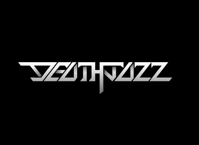
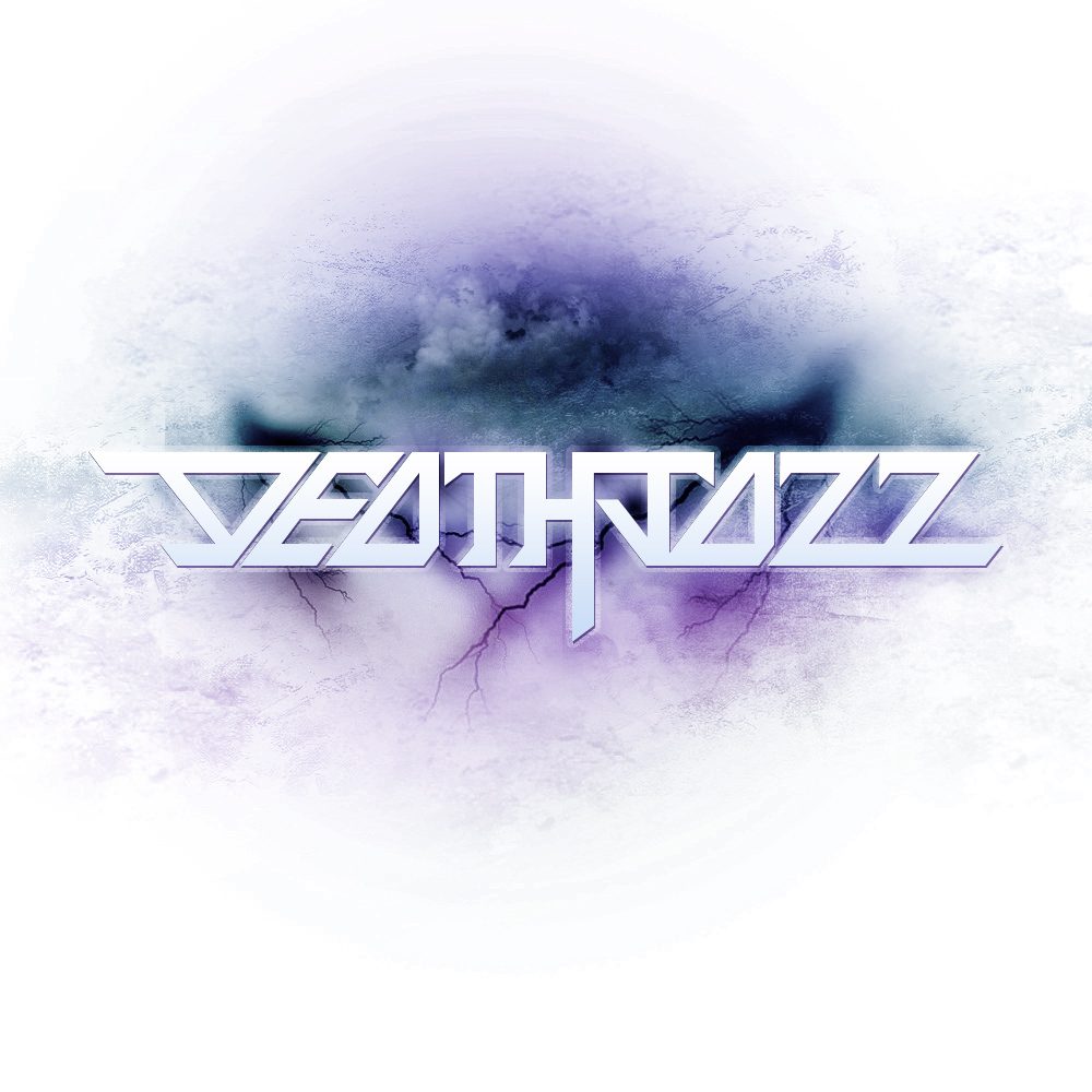
An identity for a band that refuses to pick a genre. DeathJazz played death metal and jazz at once, out of San Francisco. At Levid Media in 2010 I designed the wordmark and four CD covers: one mark, cut like chrome, that could sit in a storm, a prismatic burst or on plain white and still read as the same band. In 2026 I extracted that work's DNA in Northlit and rendered the brand world it implied.
The brief
Brutality and virtuosity in one mark. Heavy enough for a metal crowd, precise enough for people who know their scales.
Metal logos are usually illegible on purpose, and jazz identities are usually polite. The wordmark splits the difference: faceted, angular letterforms with a chrome bevel, aggressive in shape but set on a clean baseline you can read from the back of a room, with a single spike dropping below the line. The covers then do the atmosphere, so the mark never has to.
Chrome, not gore
Beveled steel letterforms instead of the dripping, tangled marks of the genre. The aggression is in the angles.
Monochrome first
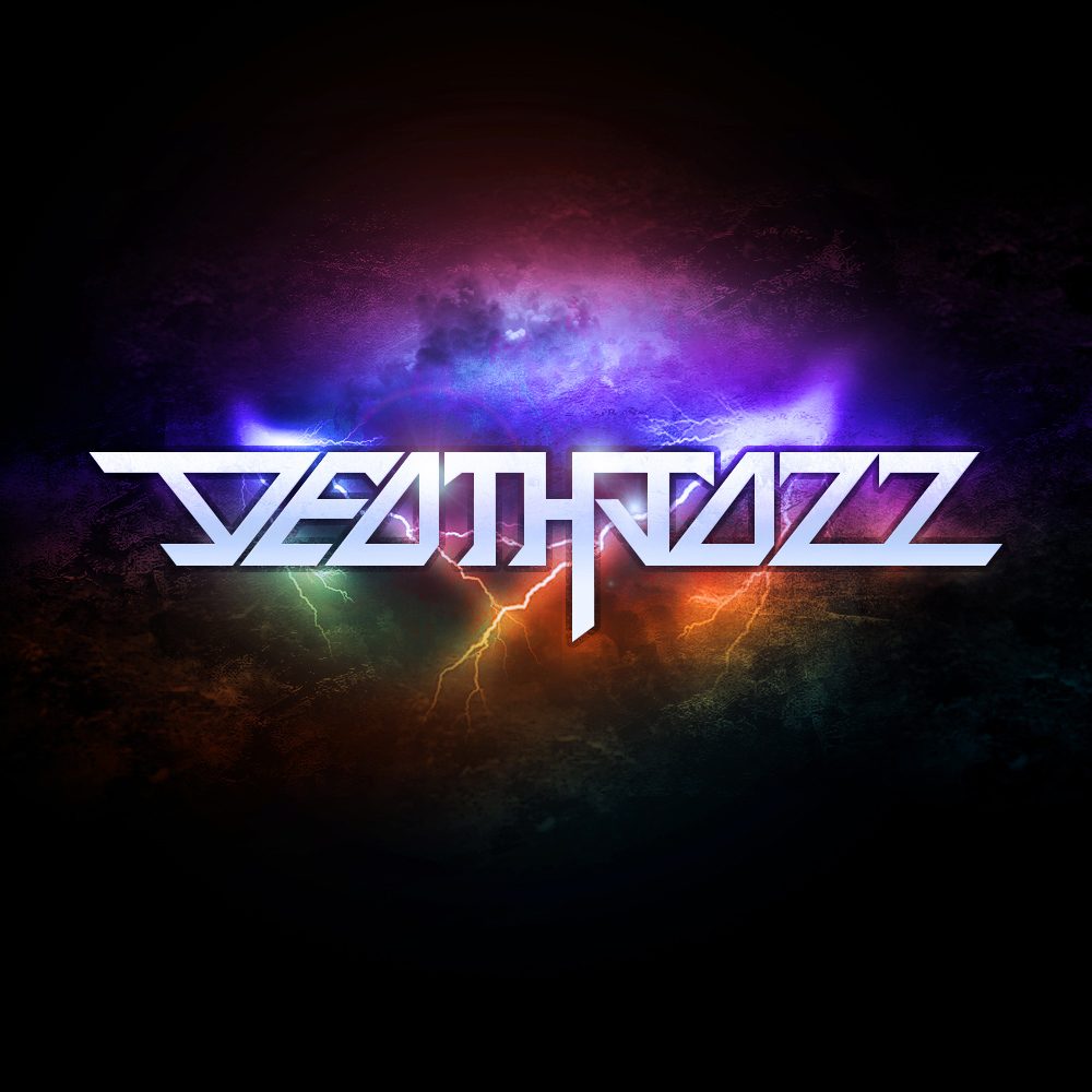
Black, bone white and steel grey carry everything. Colour arrives only as light, violet, cyan and ember bursting from behind.
Weather as texture
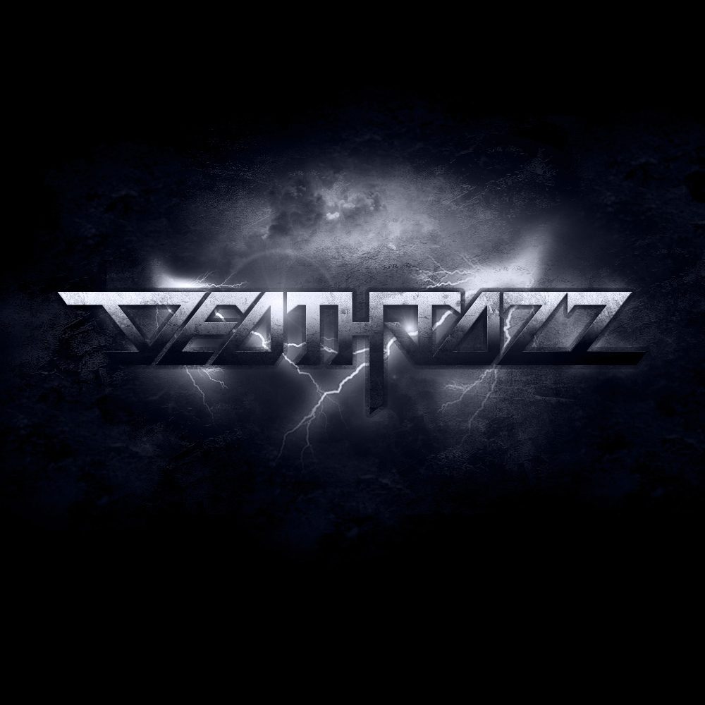
Storm cloud, lightning and cracked stone behind the mark, so each cover feels like a place rather than a pattern.
One mark, four moods
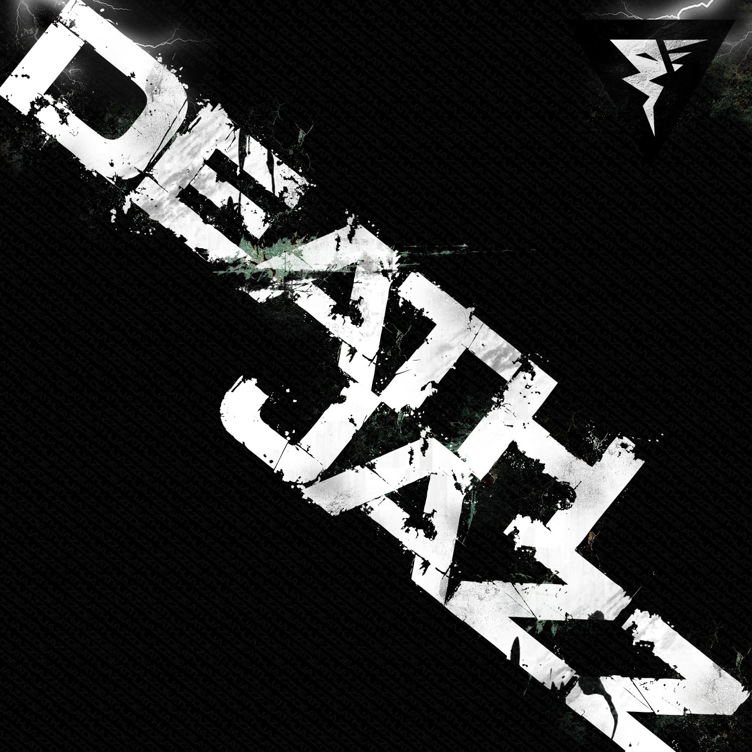
The same wordmark in a storm, a prism, a stencil and on white. The covers change; the band does not.
The work
Brand system
A wordmark and four covers are a record sleeve, not a brand. To see what the band would have looked like on tour, I pointed Northlit at the work: void black, bone white and chrome, prismatic light as the only colour, faceted display type over a neutral sans, lightning and stone as the imagery, extracted and locked as brand DNA. Then every surface was rendered from that source rather than designed again: identity, print, stationery, packaging, merch, social, a presentation, product UI, out of home, and the brand world itself. Tap any tile to open it.
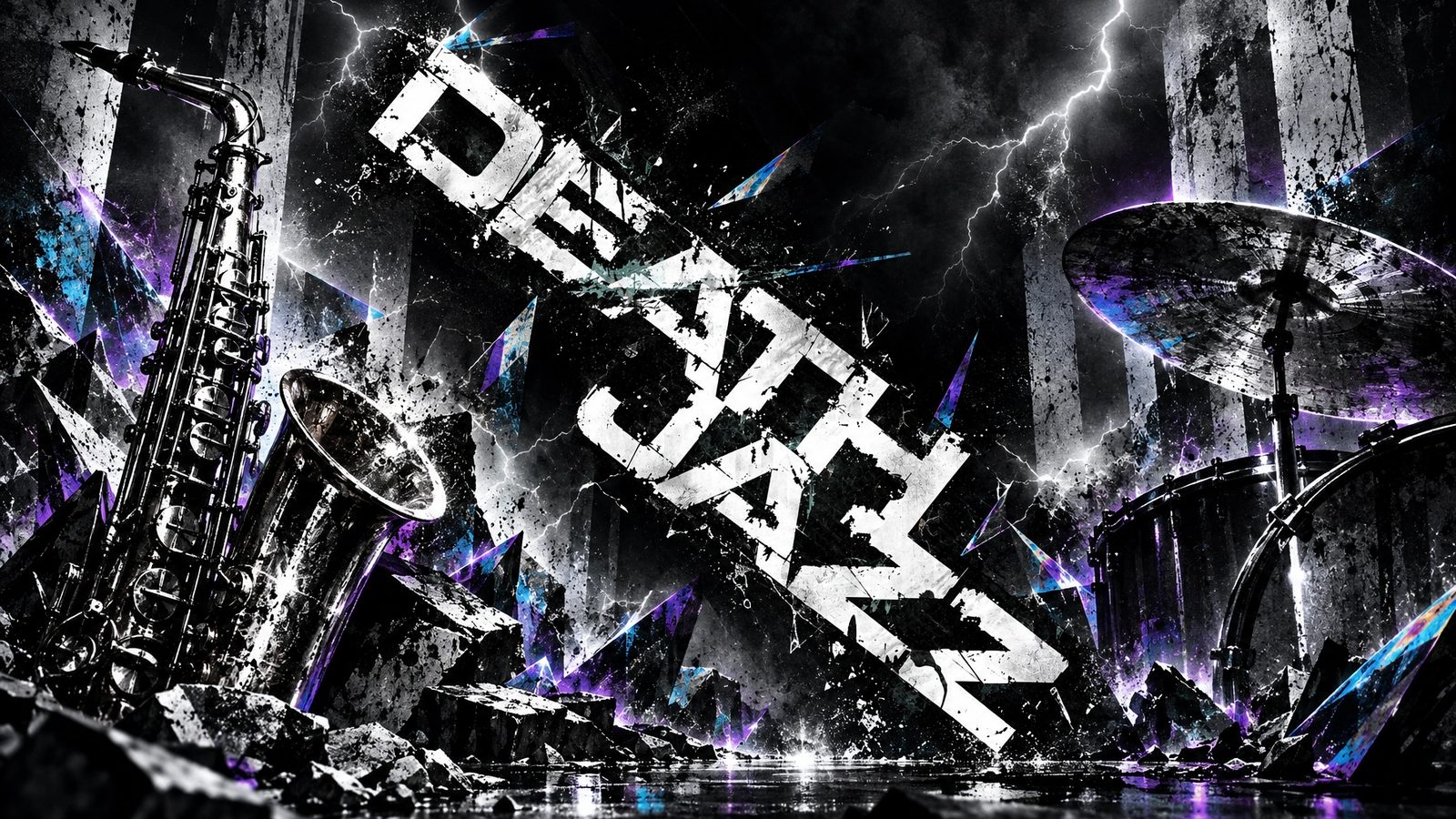 Brand world · rendered in Northlit from the locked brand DNA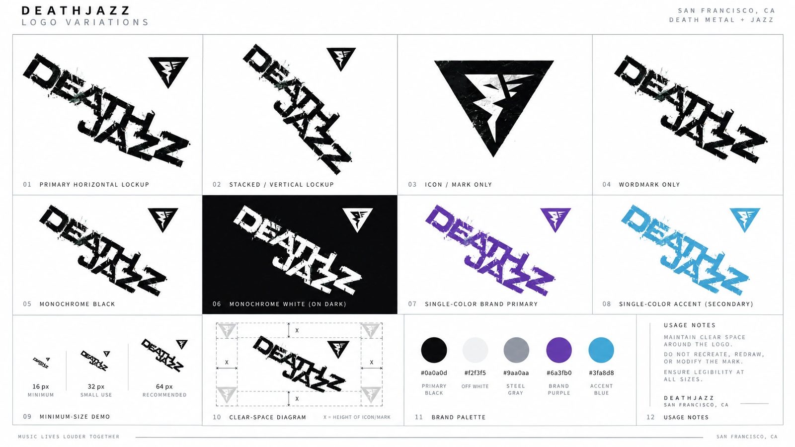
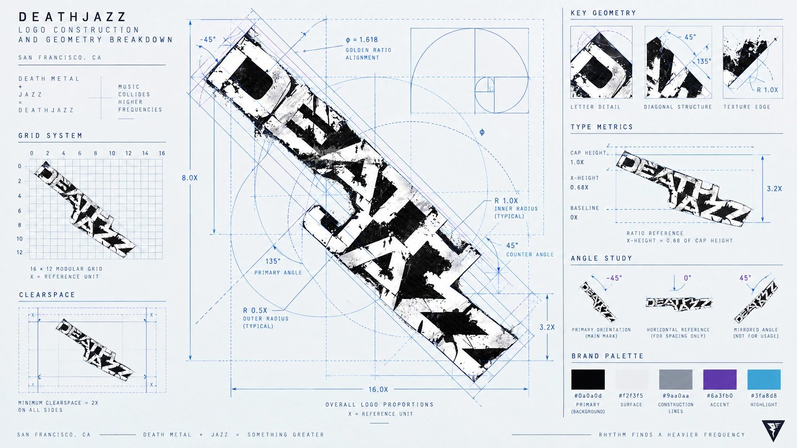
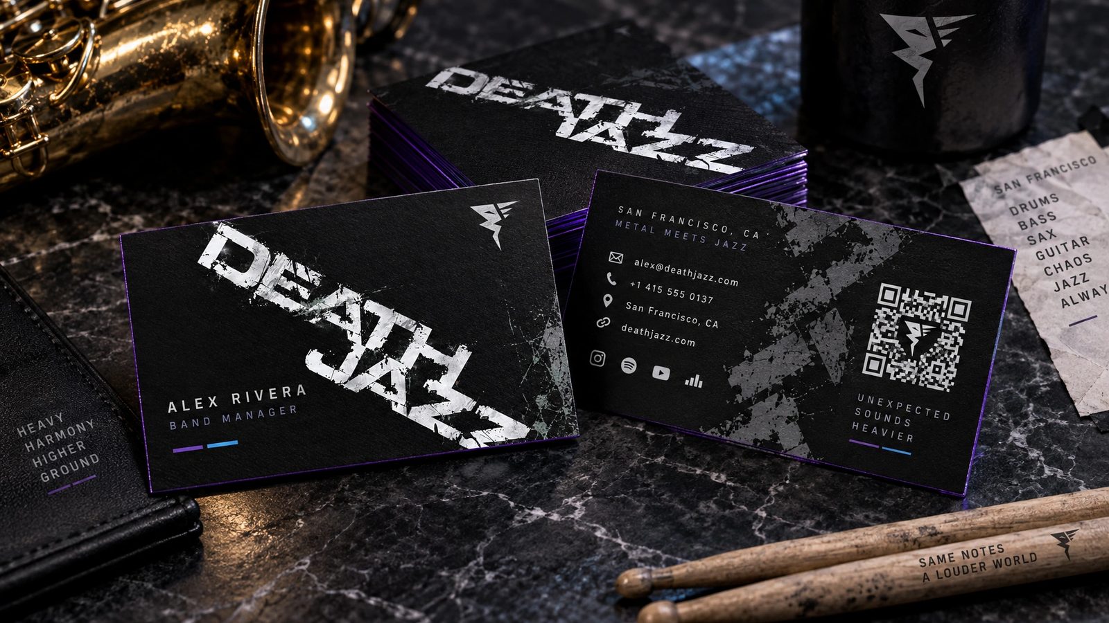
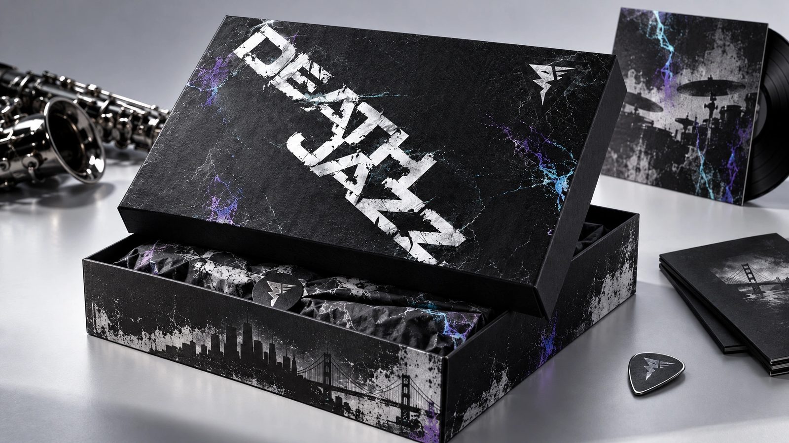
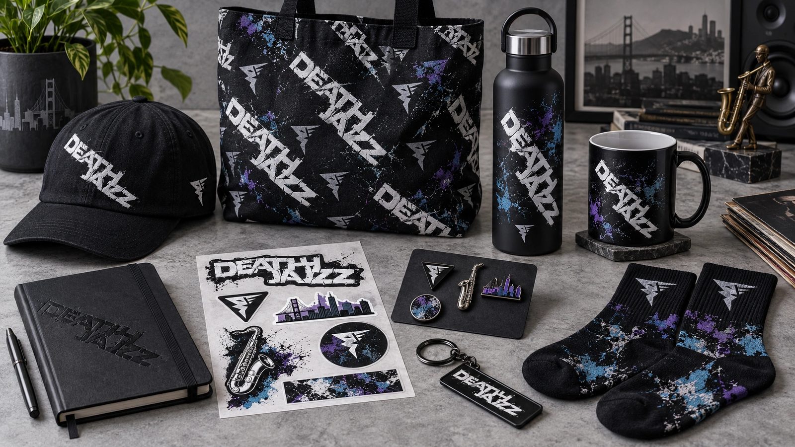
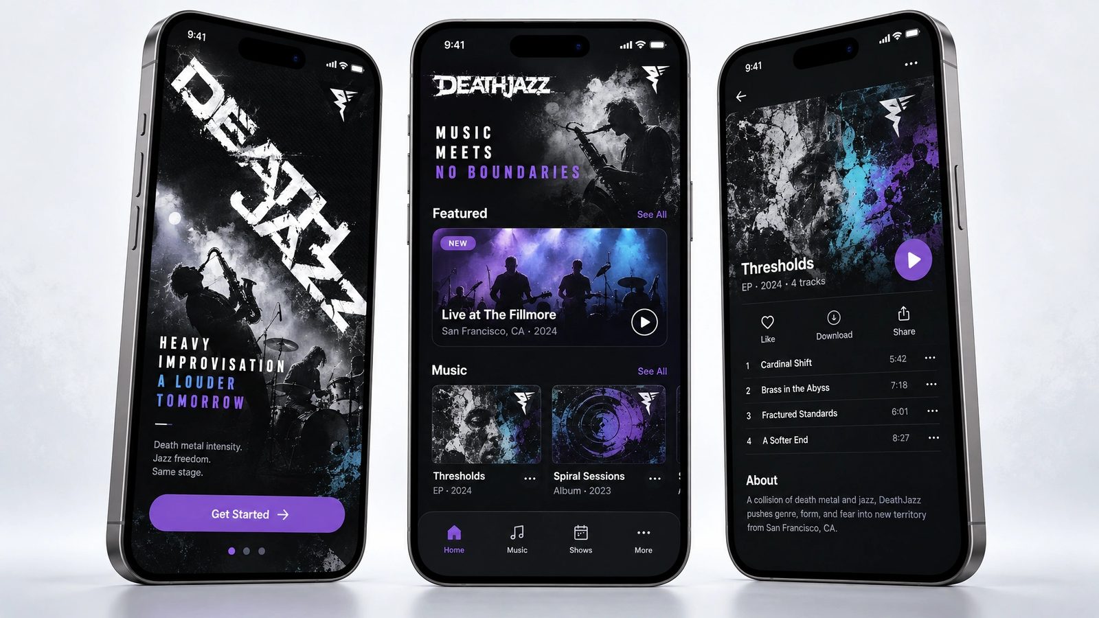
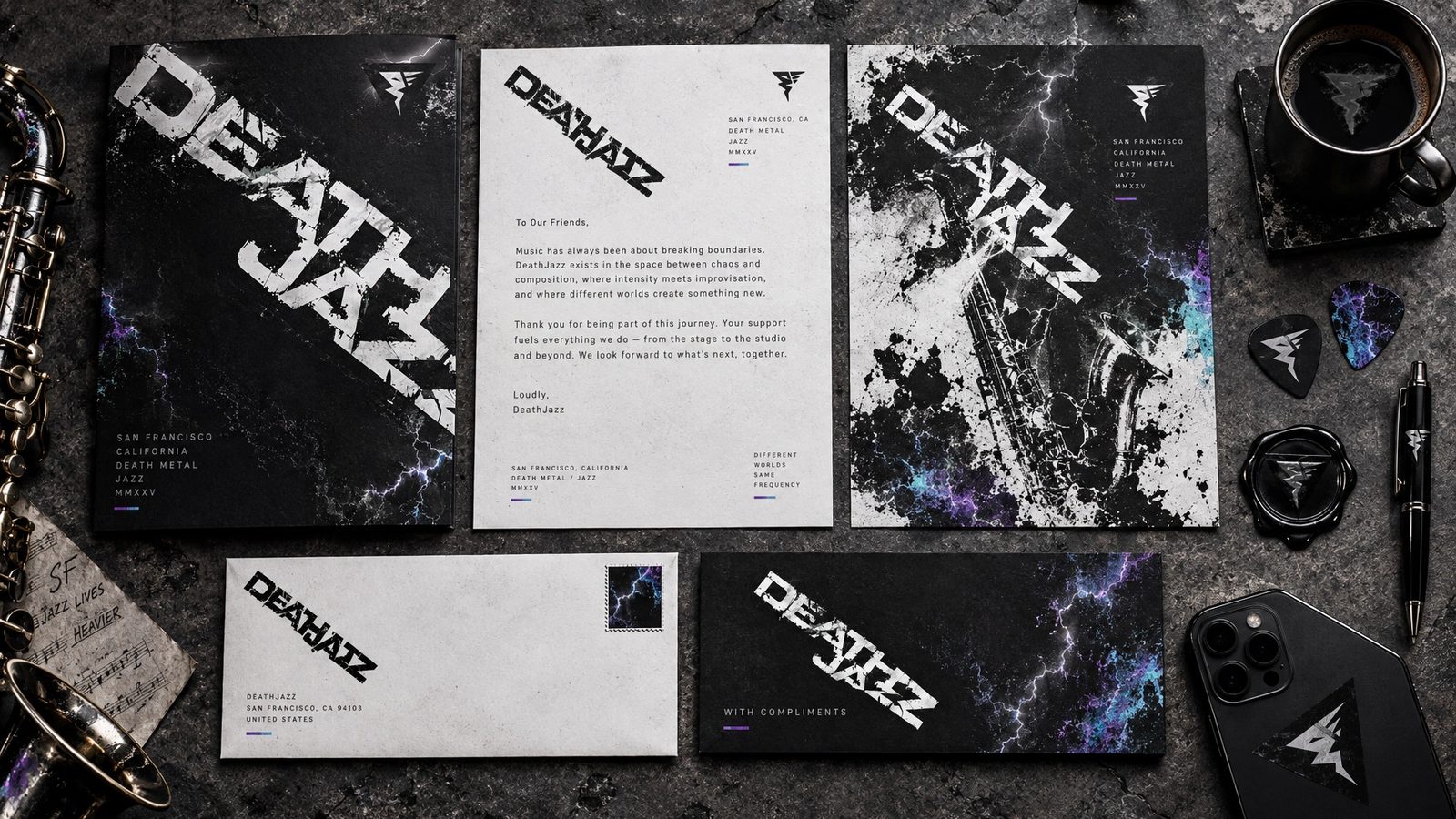
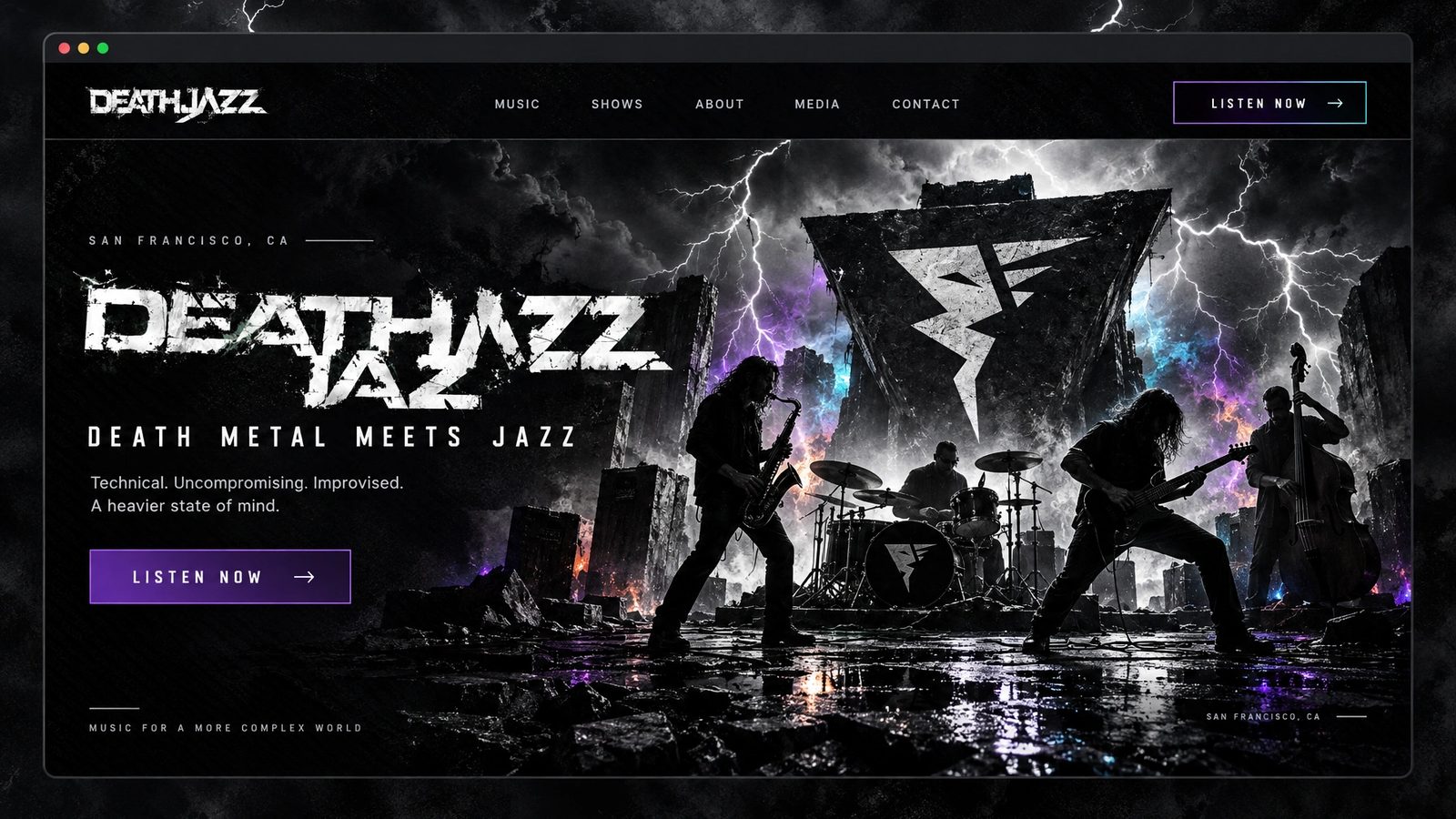
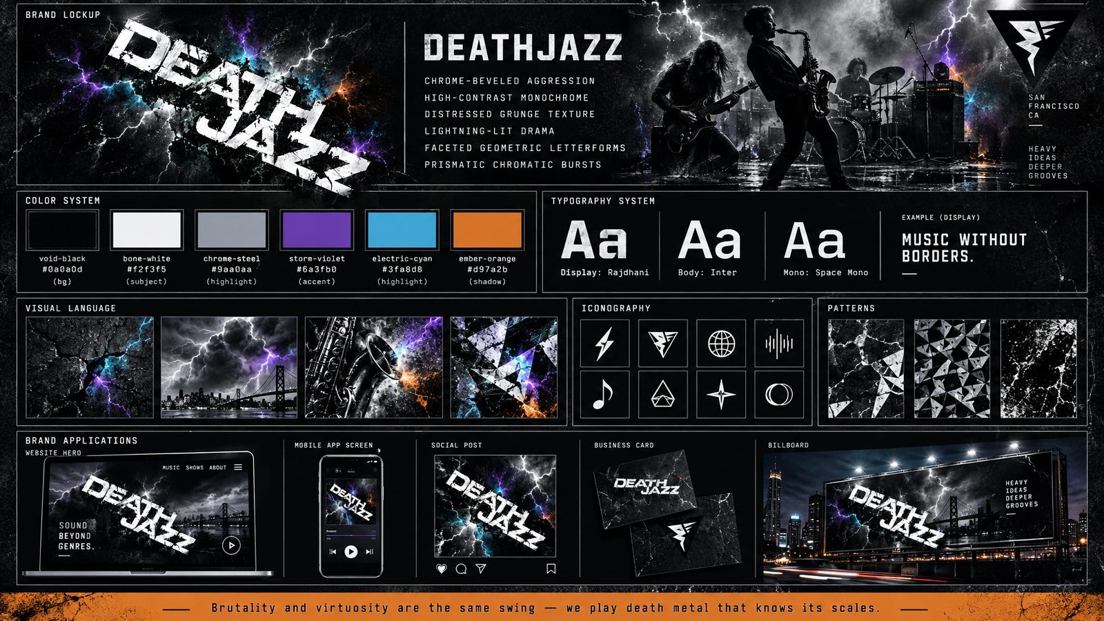
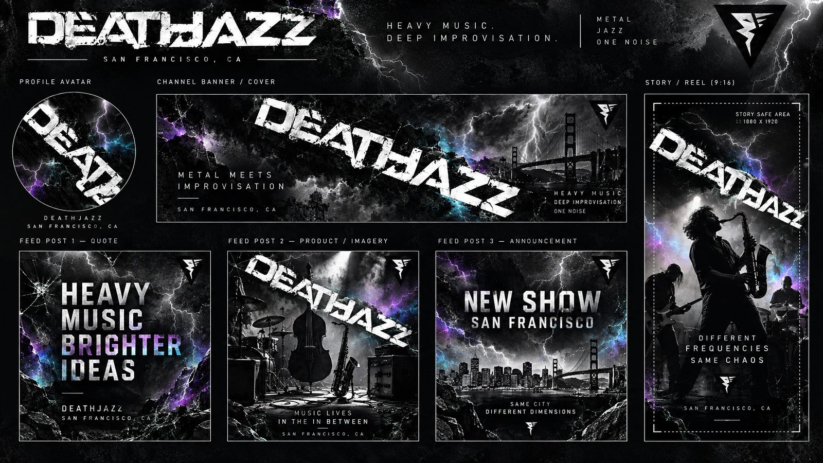
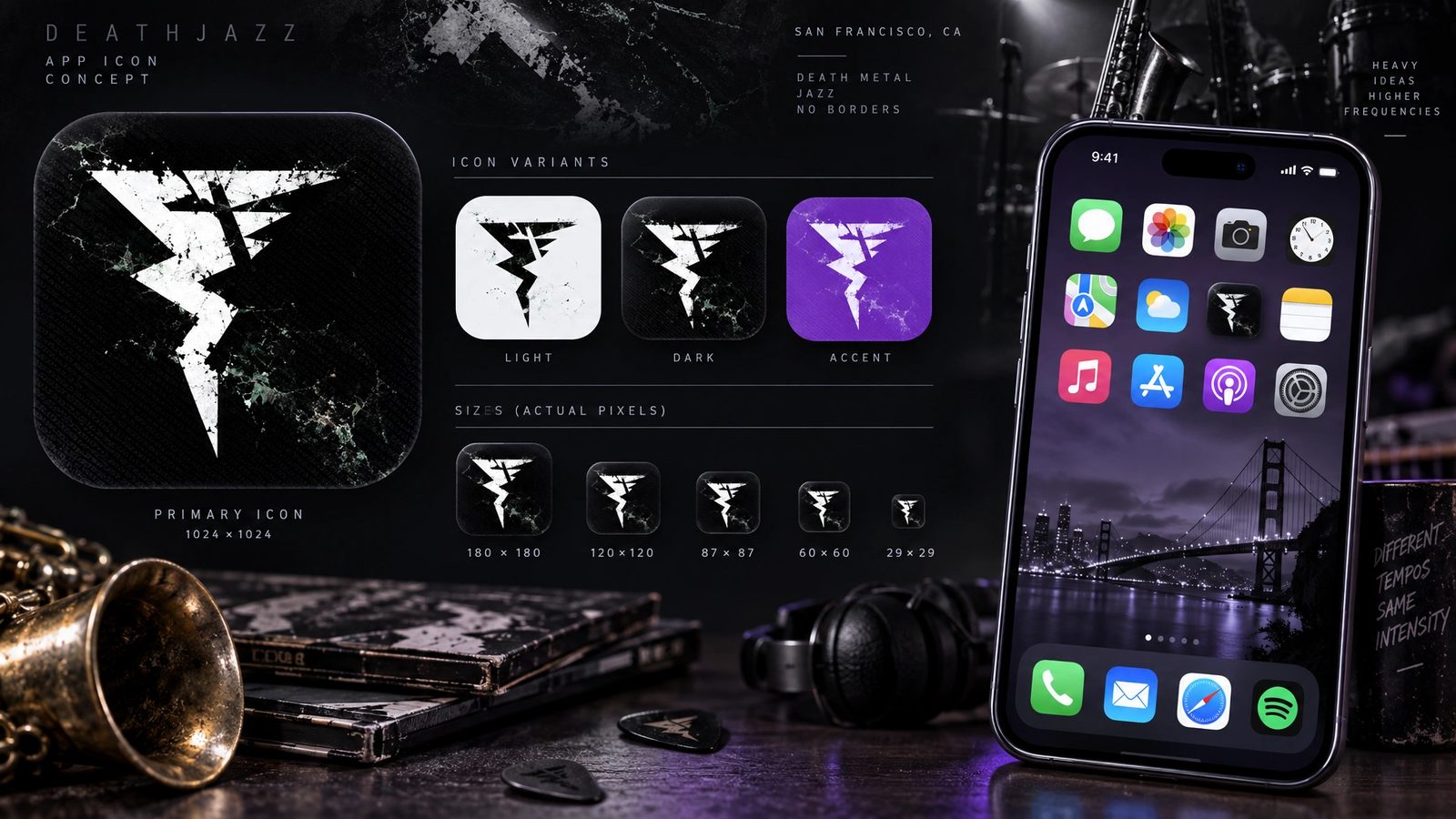
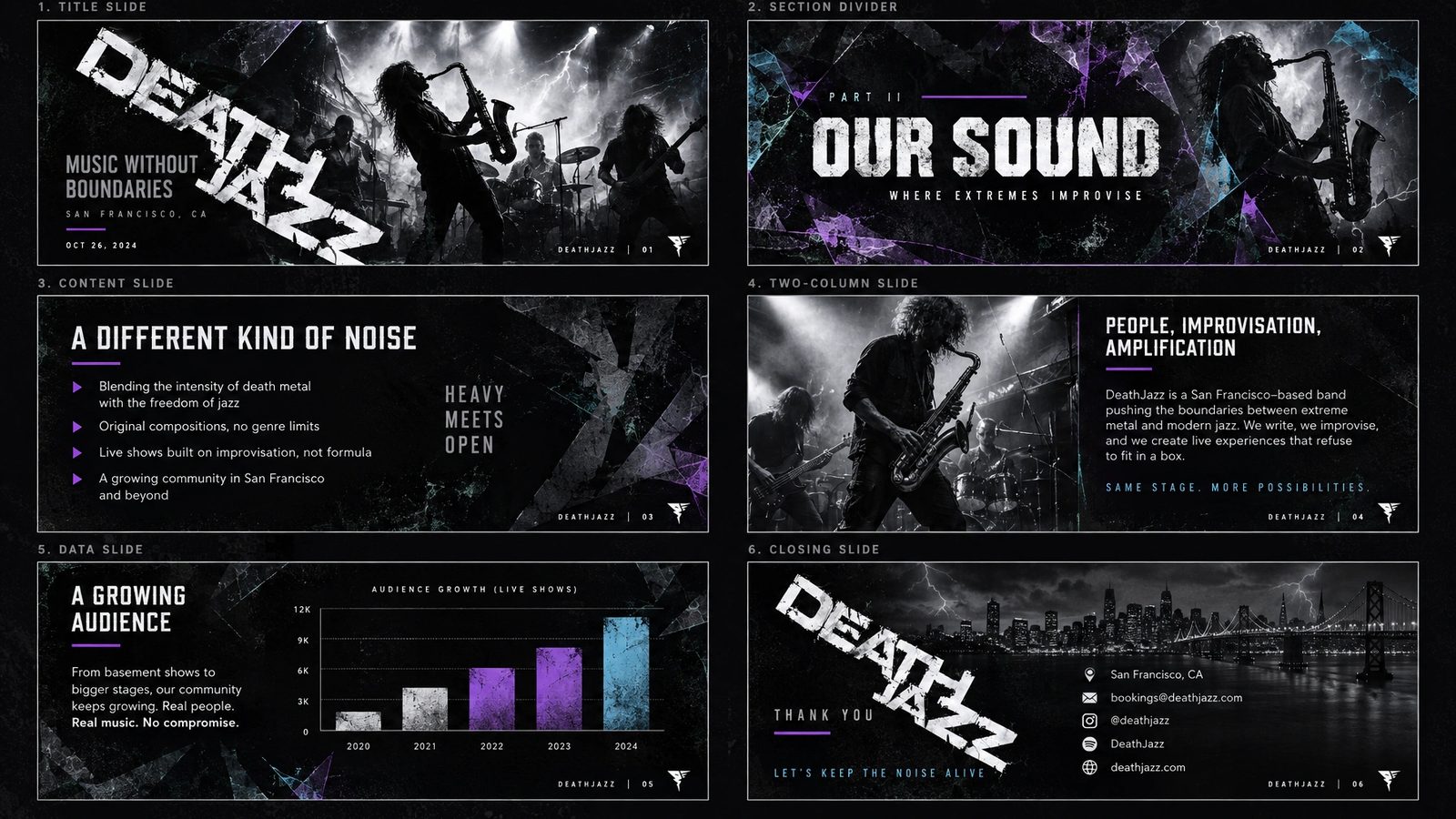
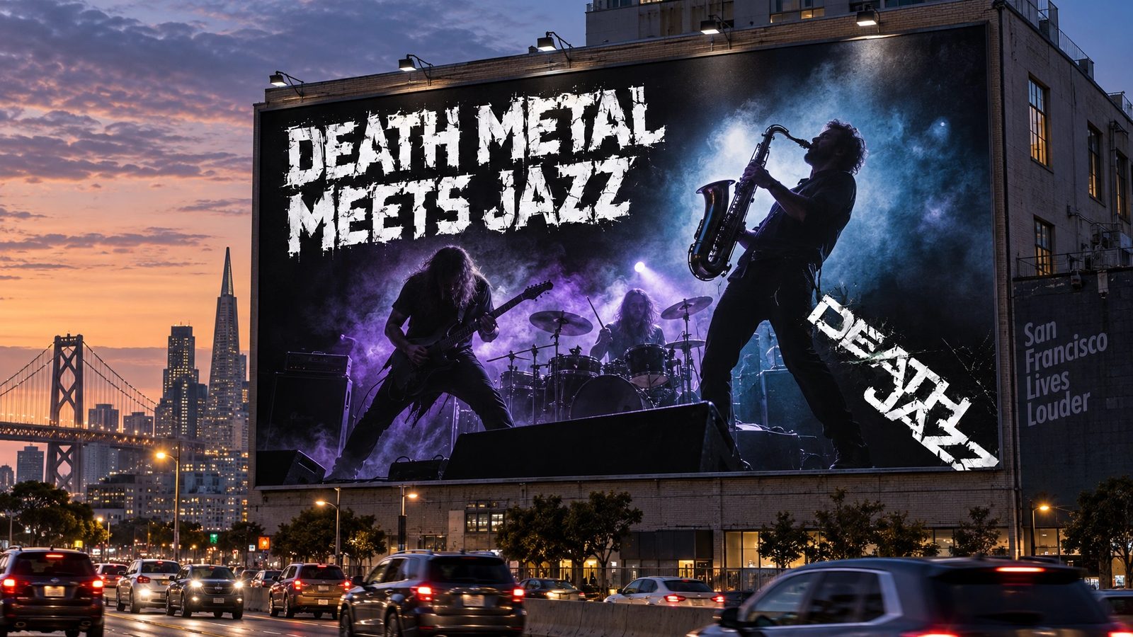
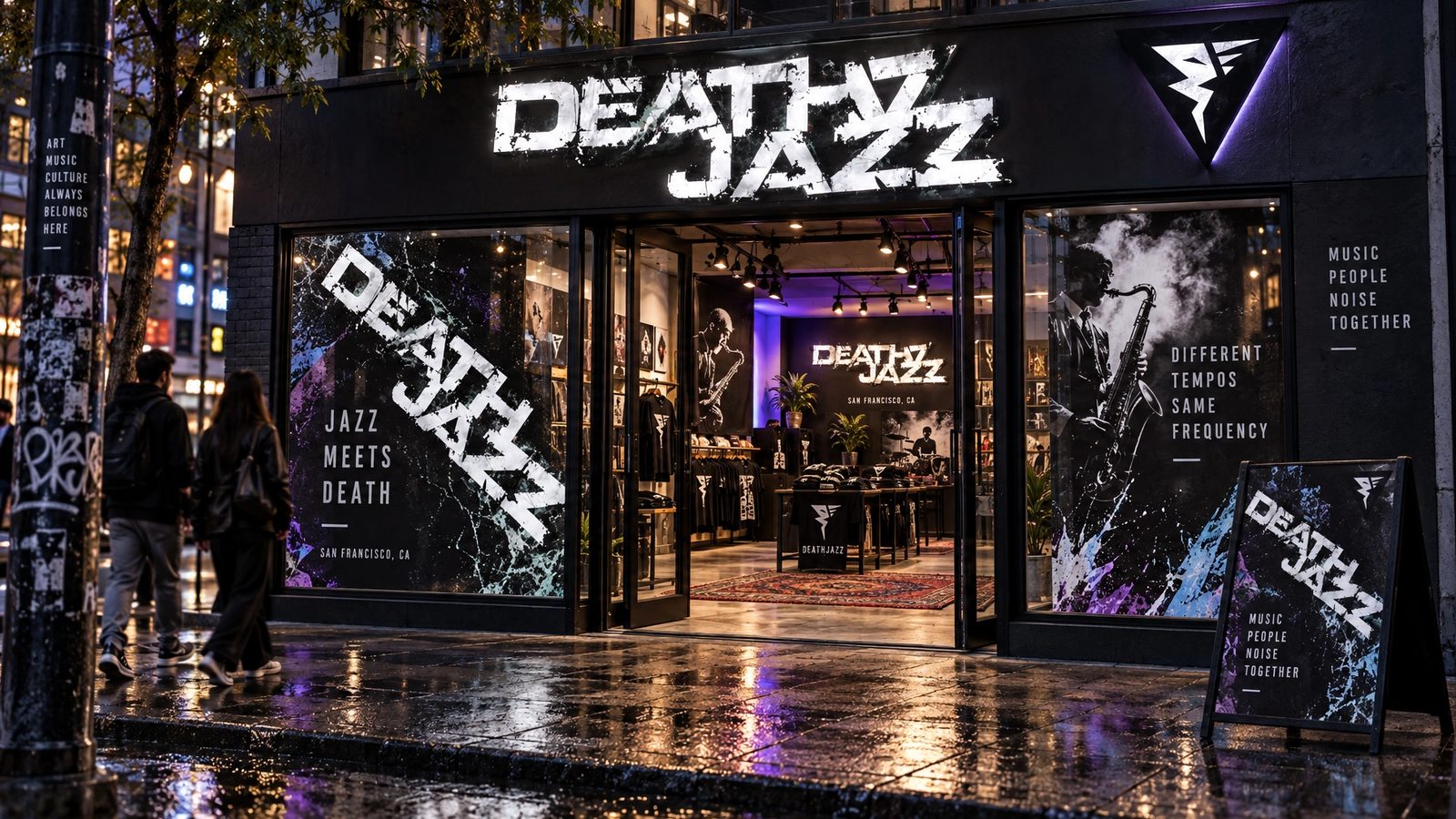
The wordmark and covers are the design. The brand world is a 2026 study made with my own tool from that work, not work delivered to the band.
Brutality and virtuosity are the same swing.
DeathJazz, the brand line
Role
Levid Media in 2010 for the wordmark and covers. Northlit in 2026 for the brand world.
Creative direction
Founder and creative director at Levid Media, the agency that took the brief.
Wordmark and covers
The chrome wordmark and four CD covers, designed end to end.
Brand DNA
Extracted from the covers in Northlit and locked: palette with roles, display and body type, imagery rules, anti-defaults.
Fifteen surfaces
Logo system, cards, stationery, packaging, merch, social kit, a presentation, web, app and app icon, billboard and venue signage, rendered from the locked DNA.
- Logo design
- Album art
- Art direction
- Music identity
- Brand DNA extraction
- Northlit
Next
The covers live in the archive with forty-three other projects from the agency years.
Browse the archive →