 ISAAC WOOTEN
GigSpark
A map-based gig finder for bands and venues, 2010. Every stage on the map, a tour you can draw along it, and the brand world it implied.
It only takes one gig. GigSpark matched bands with venues on a map. A band set a radius, a genre and a date range and saw every venue that fit; a venue posted open gigs and found acts nearby. I designed the identity, a wordmark with a burst of electric blue and the line It Only Takes One, and the app around the map: Spark Maps with a tour builder, a list view for the same search, a gig board and a dashboard. What it taught me: find the shape of the problem first. Booking is geography, so the map had to be the product.
The brief
Booking is geography. Put it on a map.
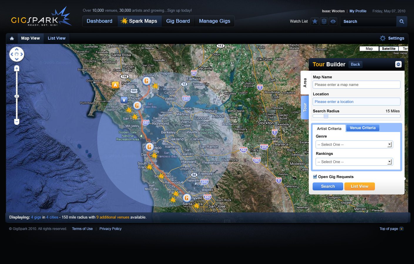
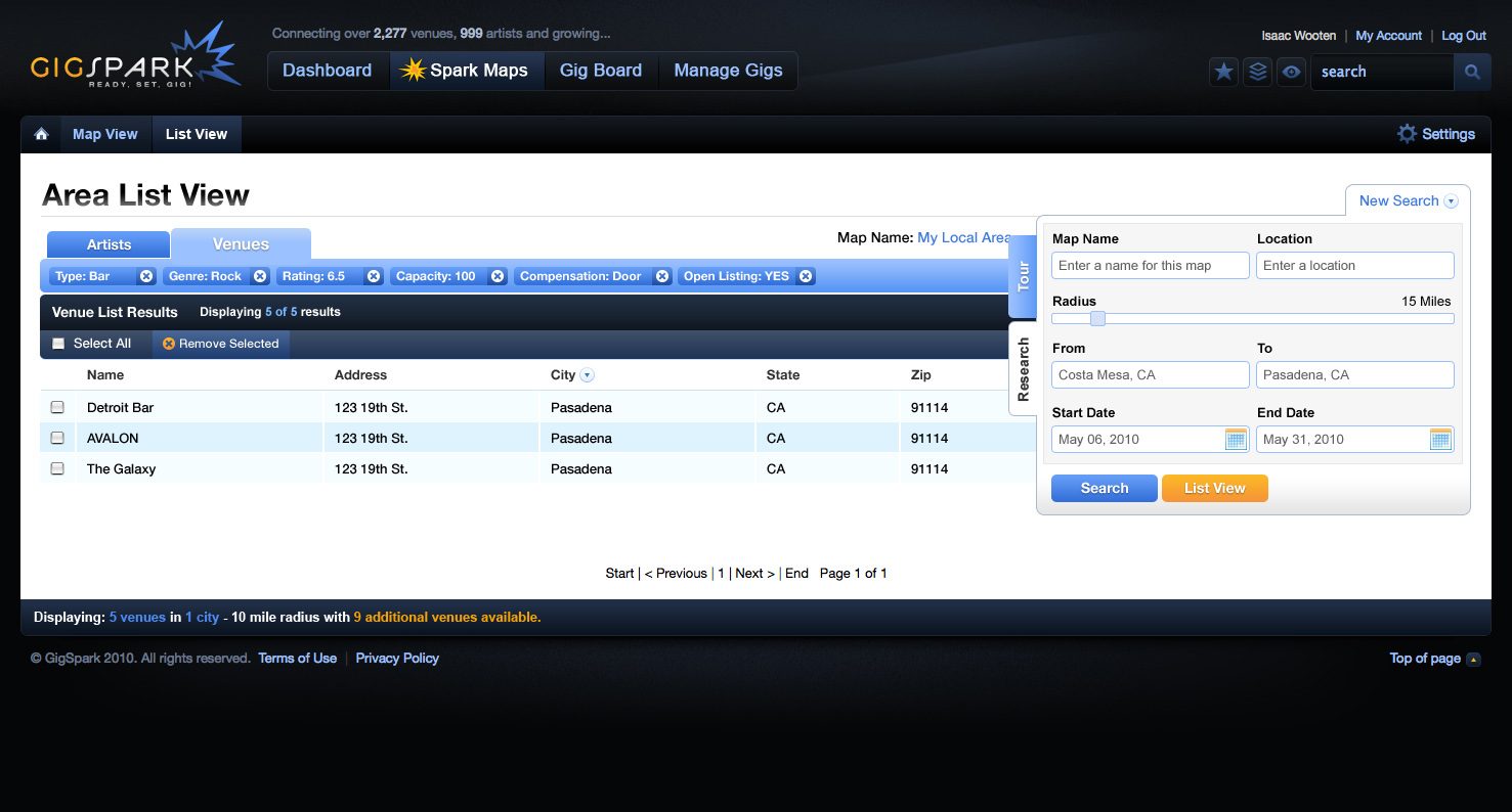
A band on the road thinks in routes, and a venue thinks in who’s close enough to play on Friday. So the map is the product: a search radius drawn on satellite imagery, gig pins along the coast, and a tour builder beside it that filters by genre and ranking and turns the pins into a route. When a map is the wrong tool, the list view runs the same search as a table, with filters for venue type, genre, rating, capacity, compensation and open listings. Around it, night-mode chrome with an amber spark: the feeling of a club before the set.
The map first
Pins, a radius and a route, so a tour is something you draw rather than a spreadsheet you fill in.
Same search, as a list
One query, two views: switch to a filterable table when you need to compare venues side by side.
Amber and electric blue
Warm amber for GIG, a blue burst for the spark, on deep blue-black: stage light on a dark room.
It only takes one
The line under the mark, and the promise of the product: one good booking can start a career.
The work
Brand system
An app and a logo only hint at a brand, so I followed the hint: ink blue-black with spark amber and electric blue, wide squared type, dark stages lit by a single warm light. Locked as brand DNA, it carried into print, packaging, a campaign and the street.
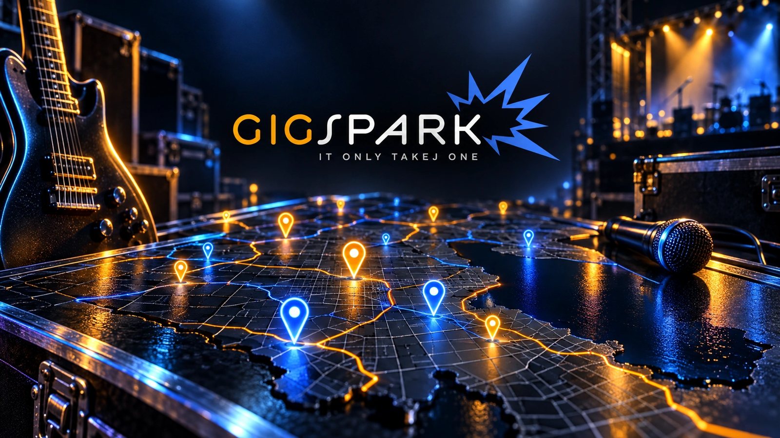 Brand world · rendered from the locked brand DNA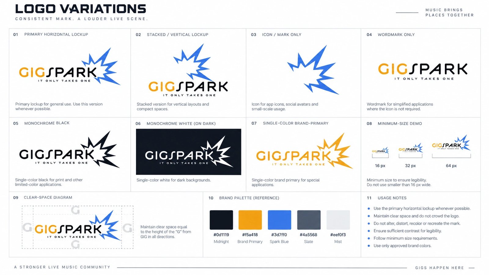
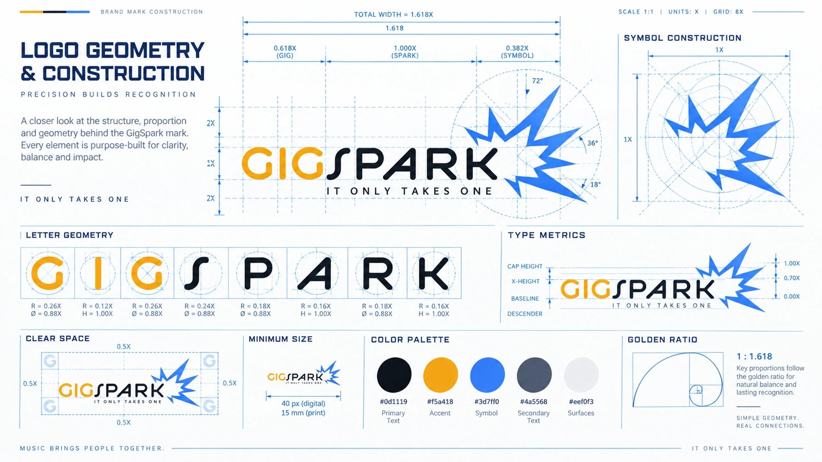
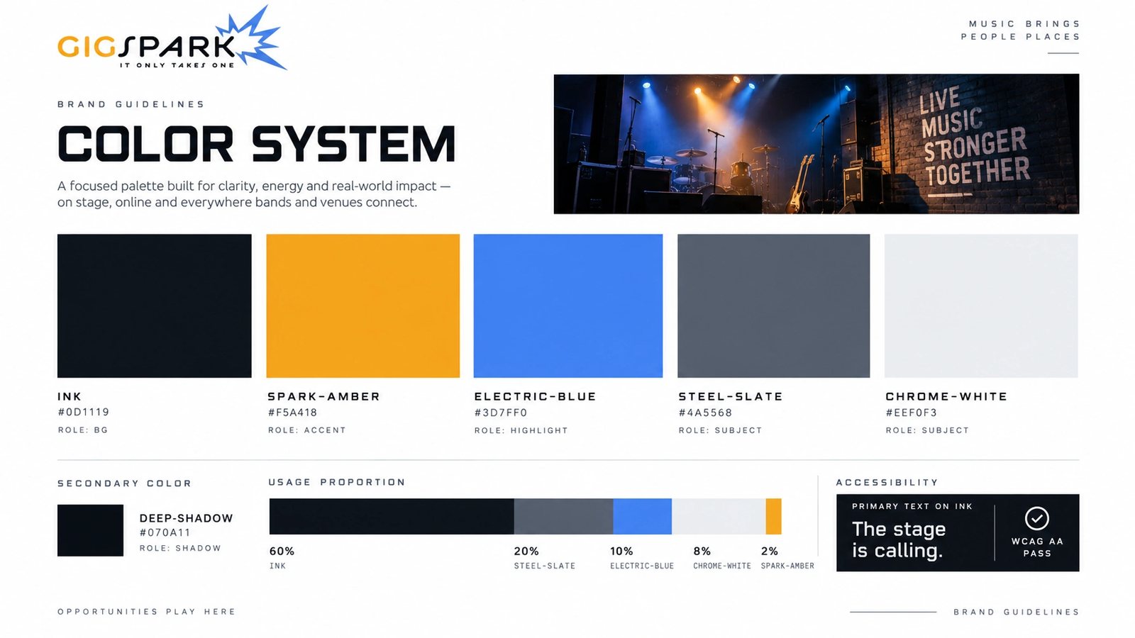
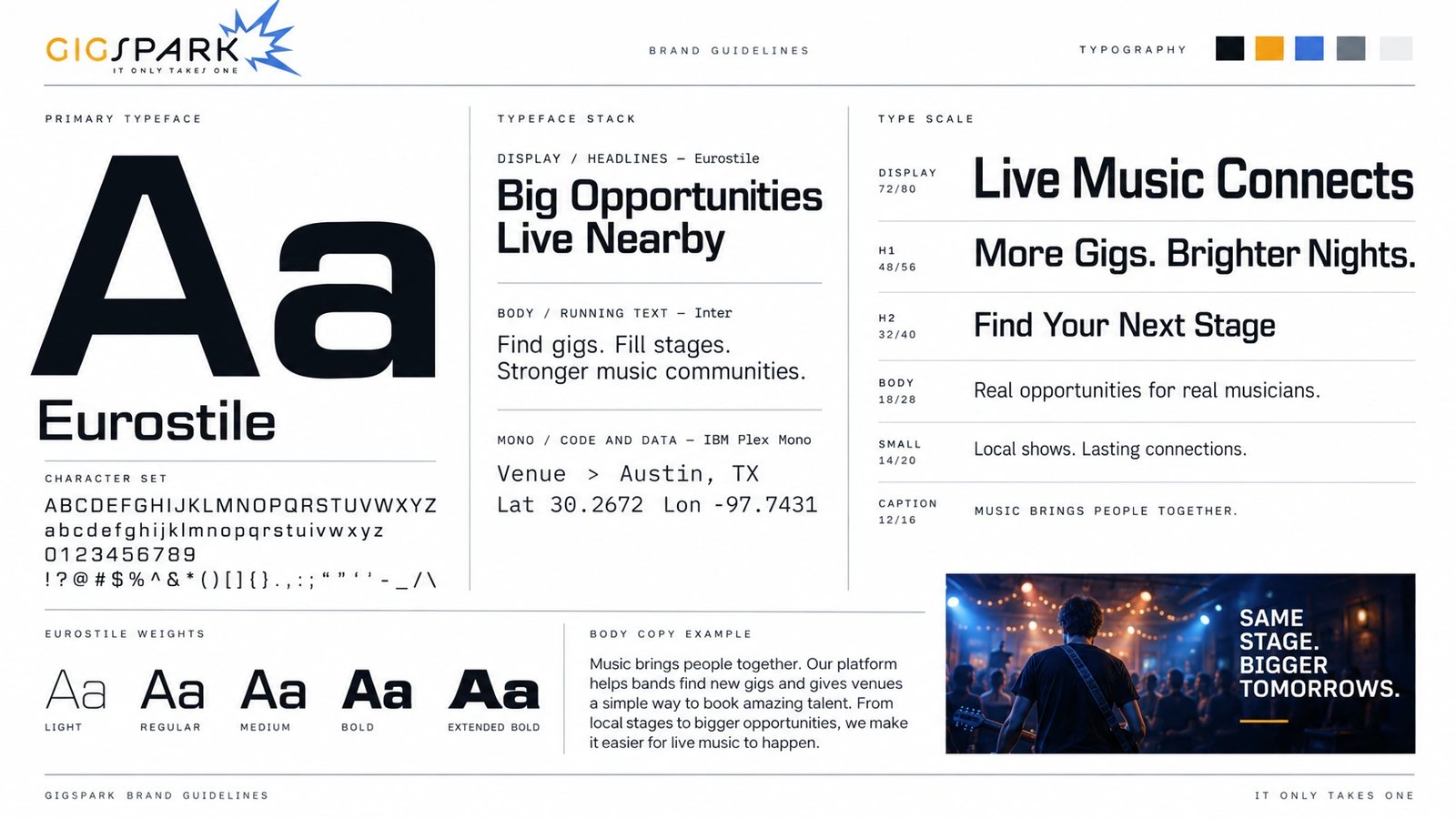
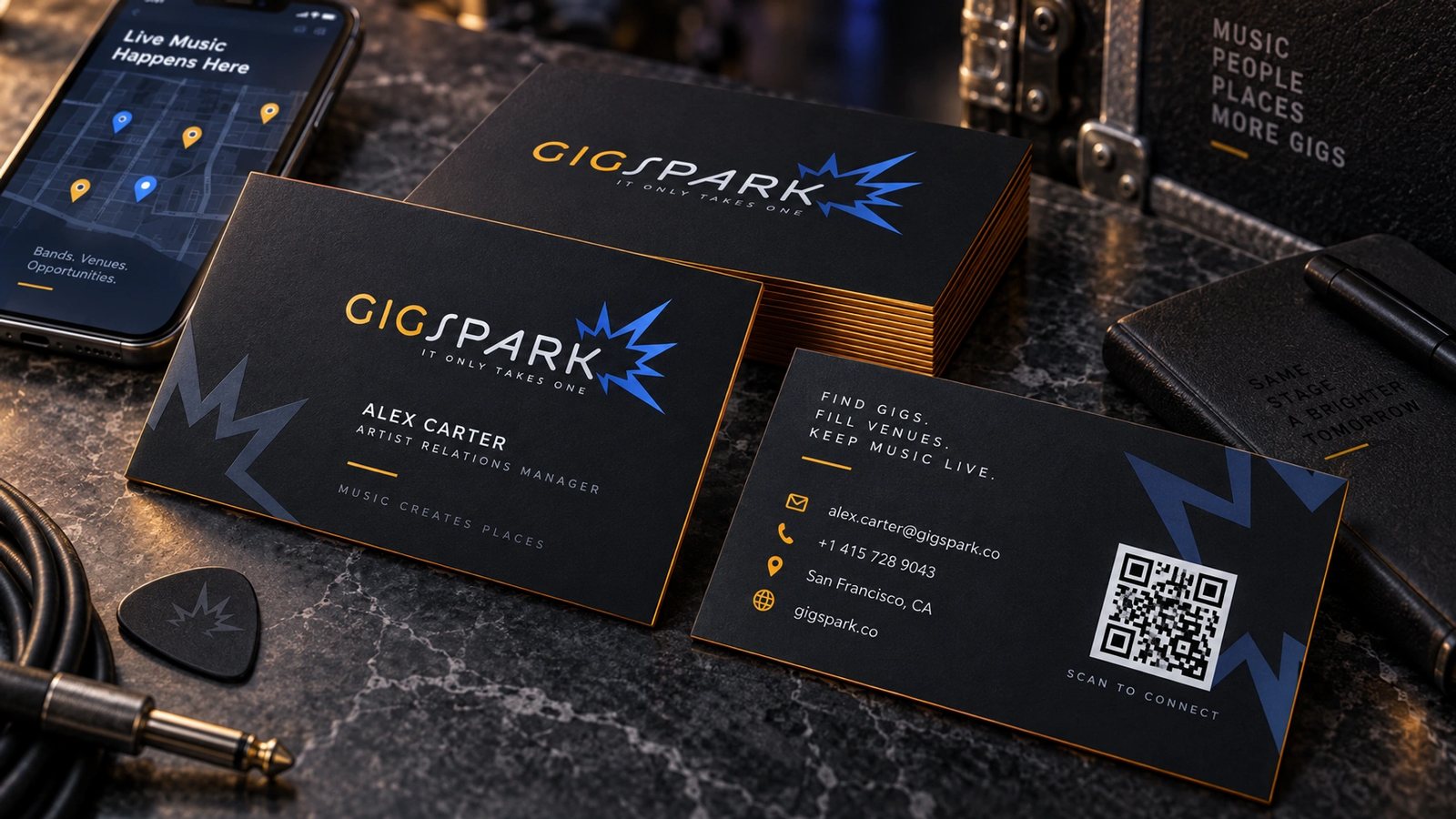
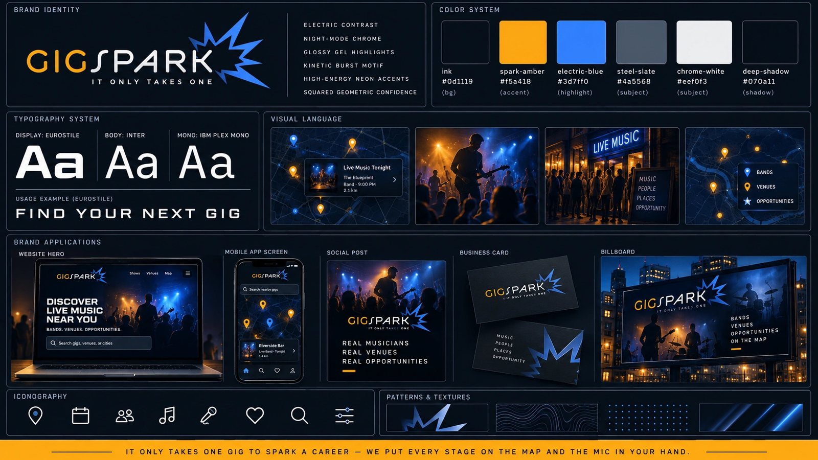
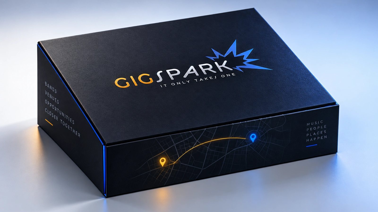
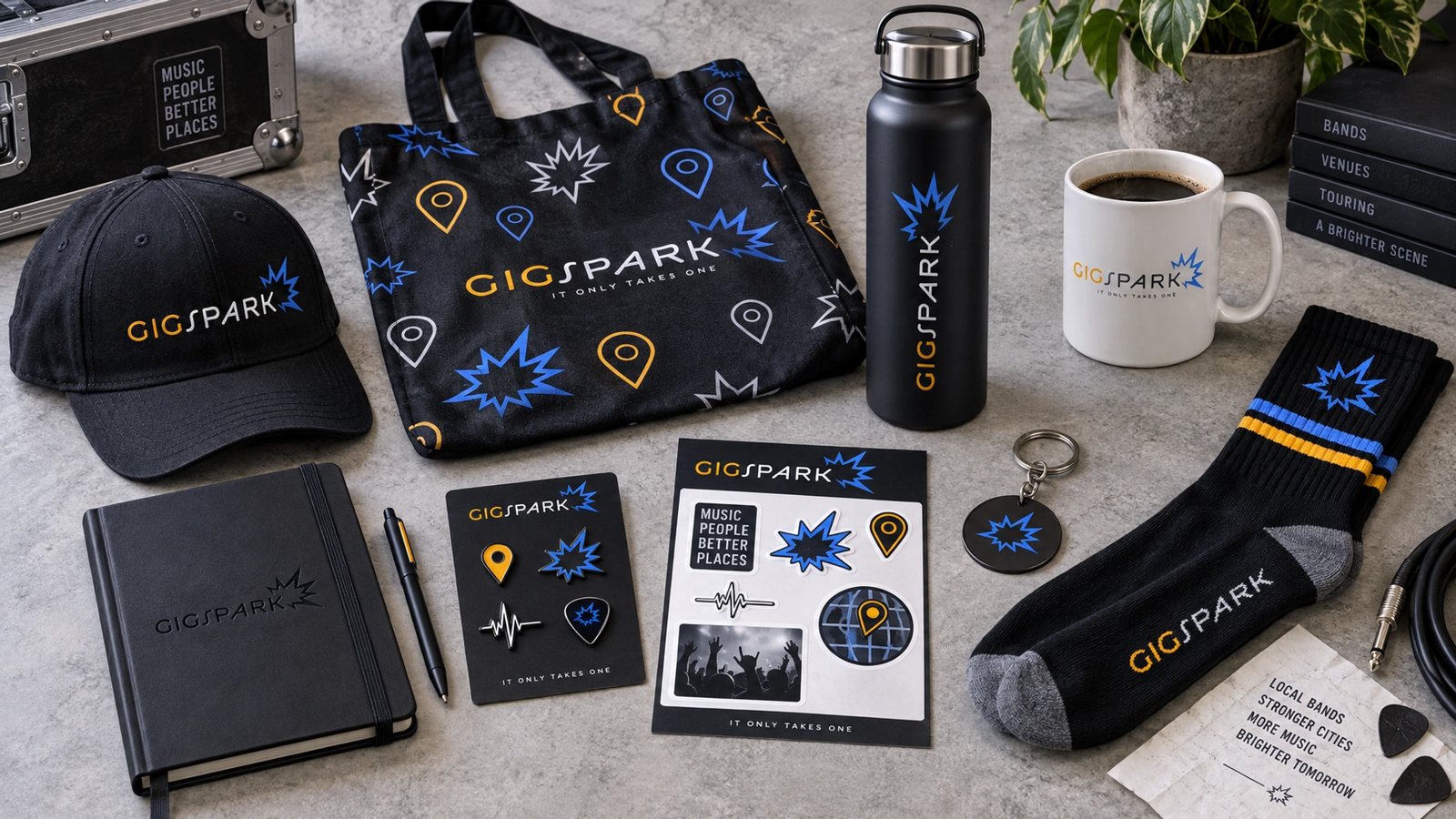
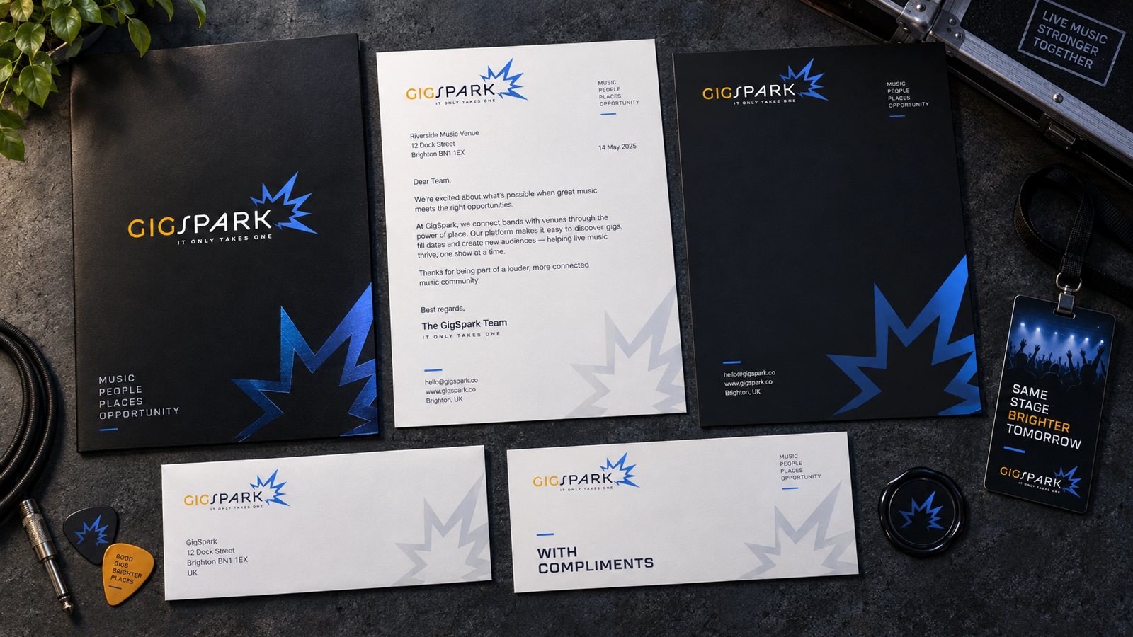
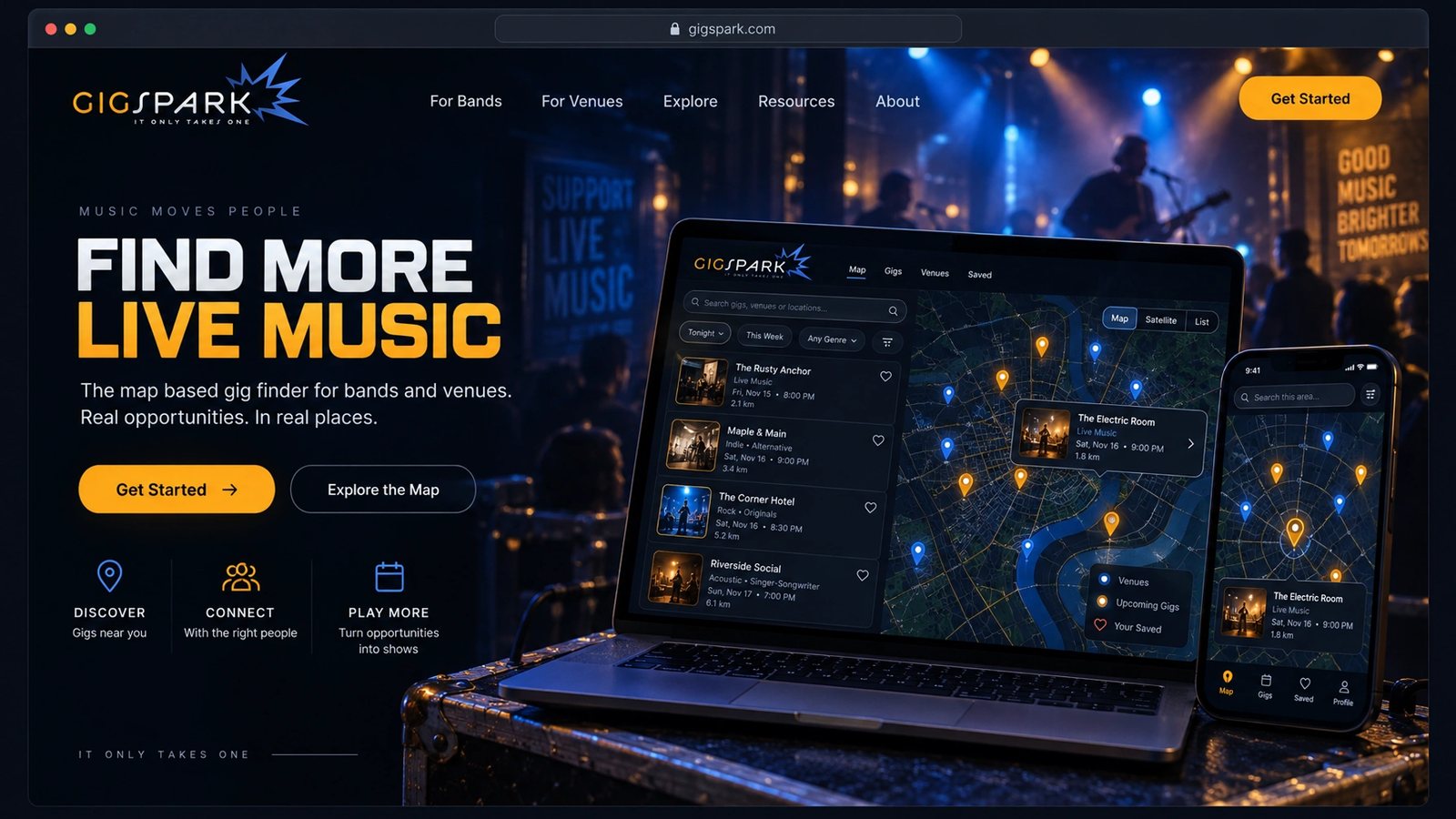
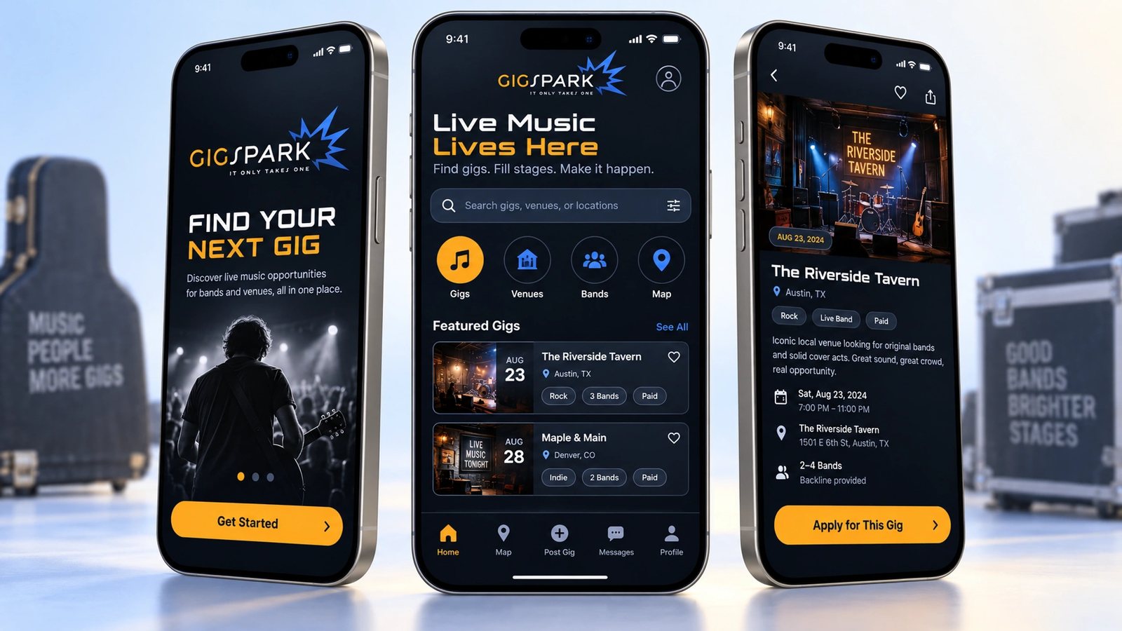
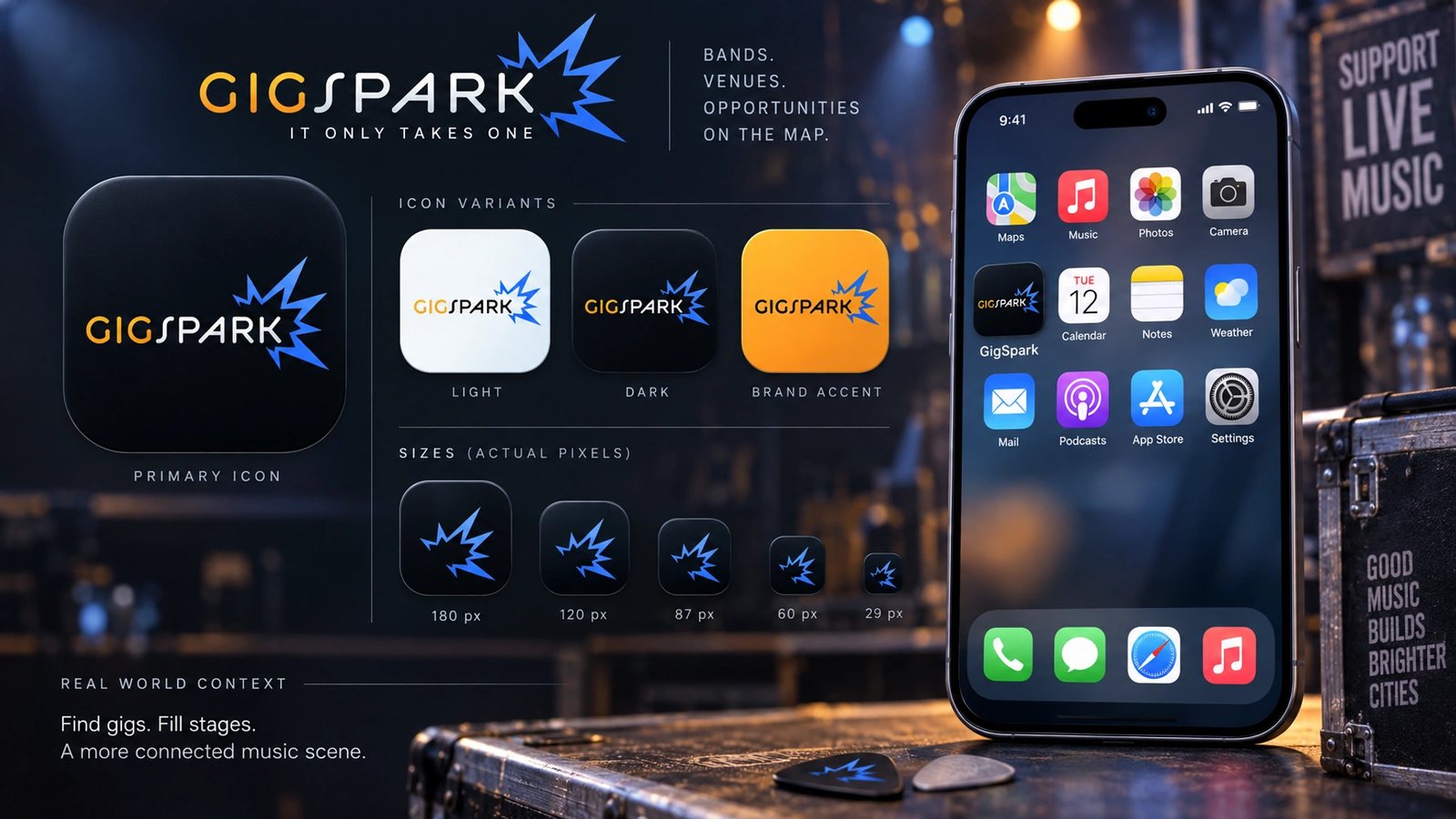
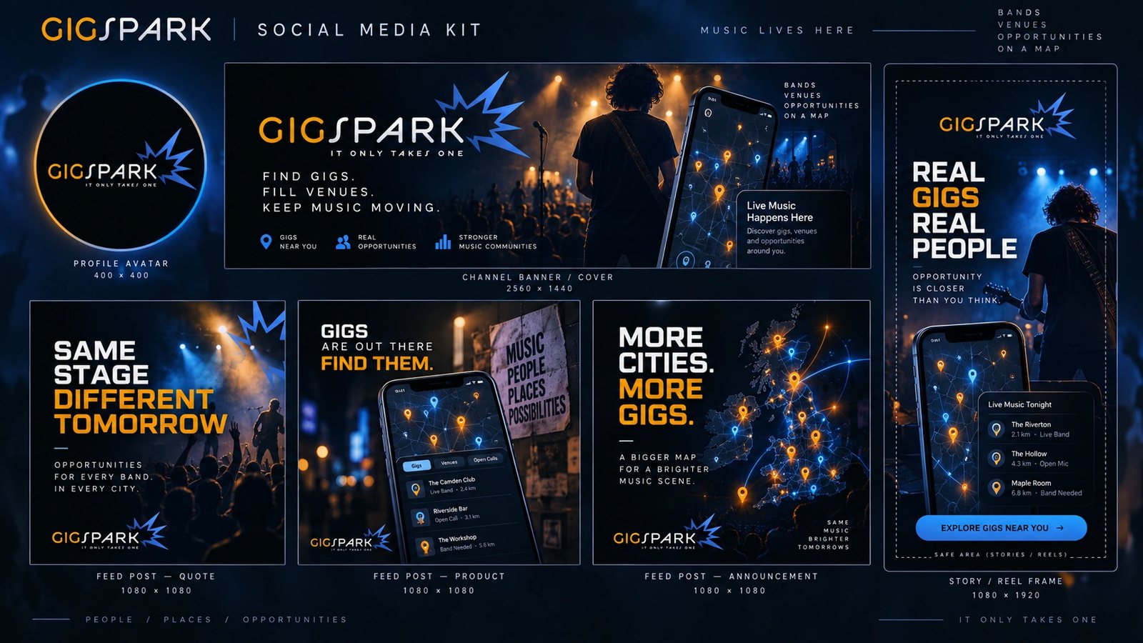
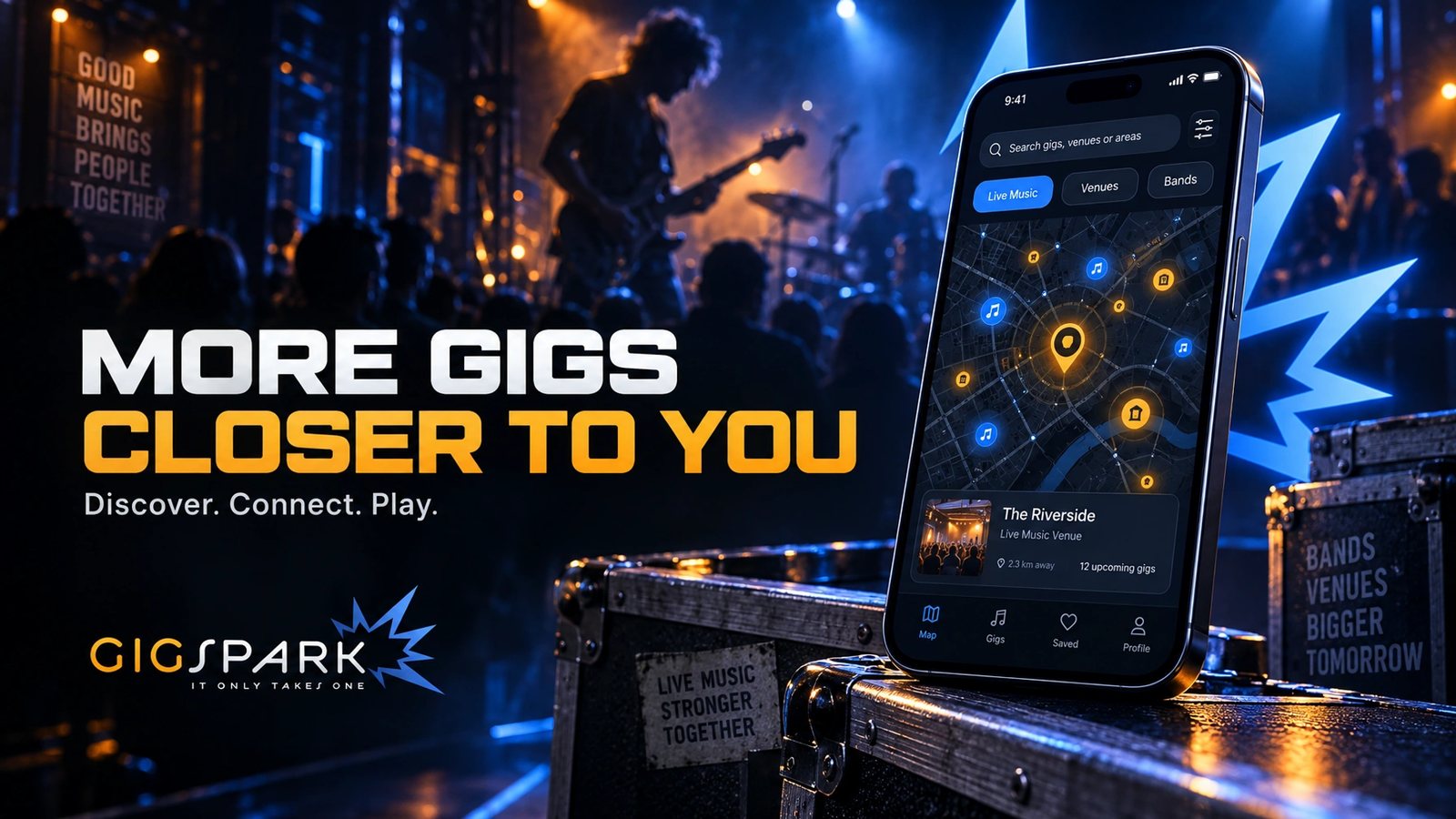
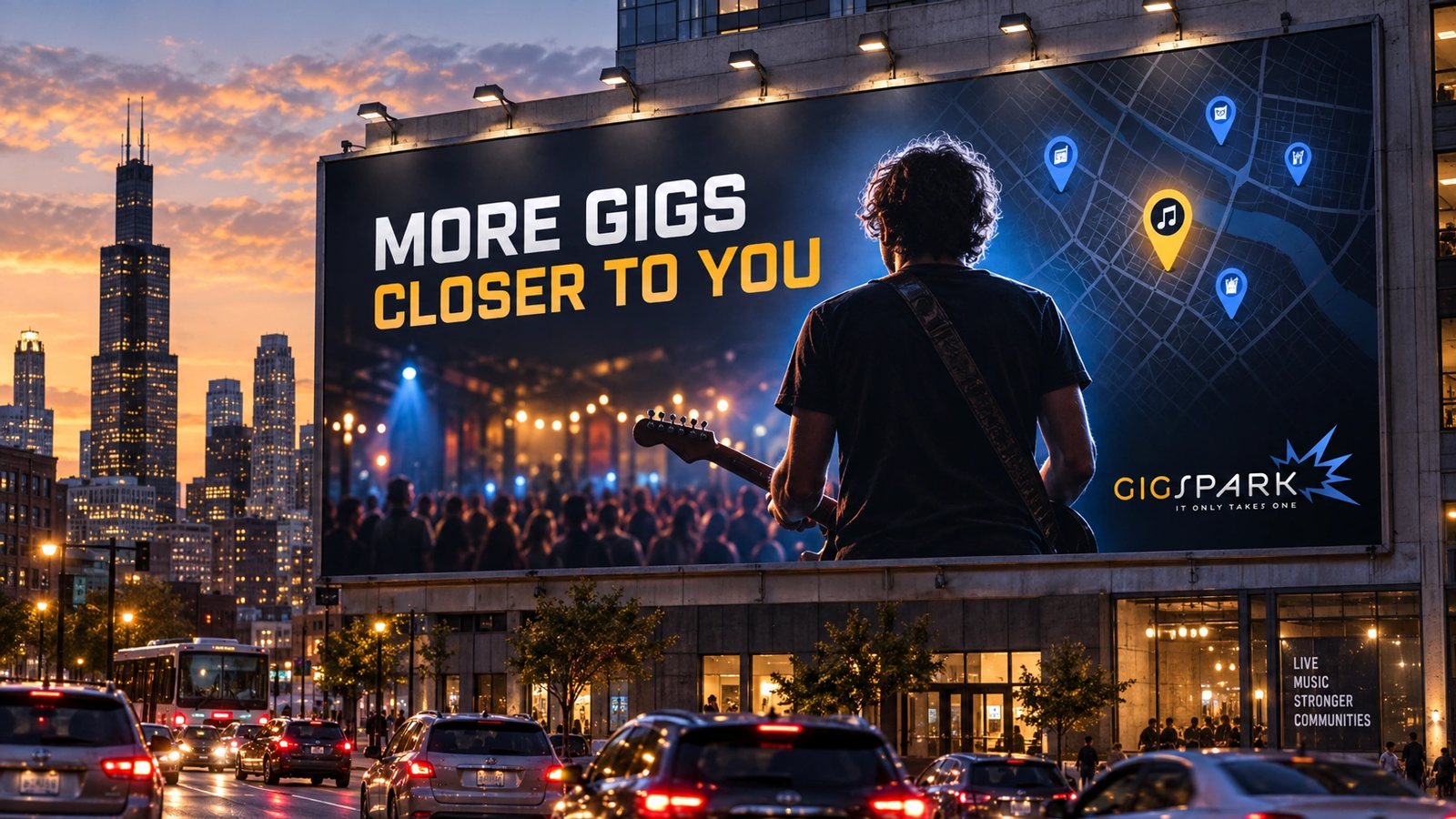
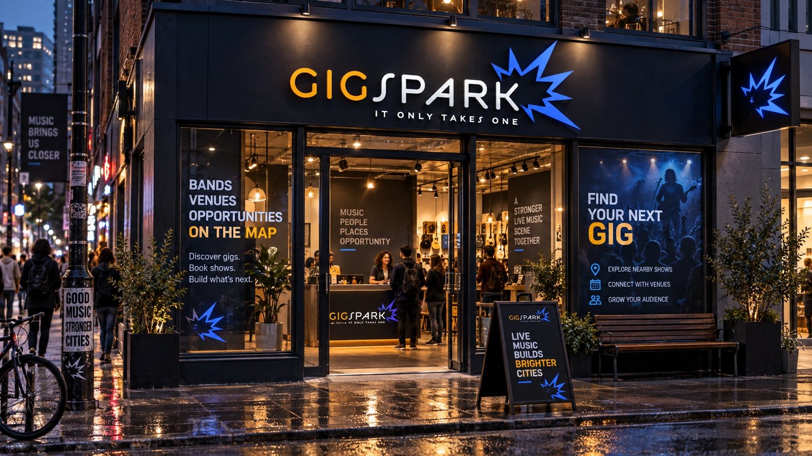
The screens and the logo are the design. The brand world is a 2026 study made with my own tool from them, not work for GigSpark.
It only takes one gig to spark a career.
GigSpark, the brand DNA
Role
The identity and the app in 2010. A 2026 study for the brand world.
Identity
The wordmark, the burst and the line It Only Takes One, on dark and light.
Product design
Spark Maps, the tour builder, the list view and its filters, the gig board, the dashboard and sign-in.
Brand DNA
Extracted and locked: palette with roles, display, body and mono type, voice, imagery rules.
Seventeen surfaces
Logo system, colour, type, cards, stationery, guidelines, packaging, merch, web, app and app icon, social kit, a campaign, billboard and storefront.
- Product design
- Map interfaces
- Logo design
- Web apps
- Brand DNA extraction
- Brand systems
Next
The app lives in the archive with the rest of the startup years.
Browse the archive →