 ISAAC WOOTEN
ÄKTA
A web studio in downtown Chicago, later acquired by Salesforce. Its site and cards from my years there, 2010 to 2012, and the brand world they implied.
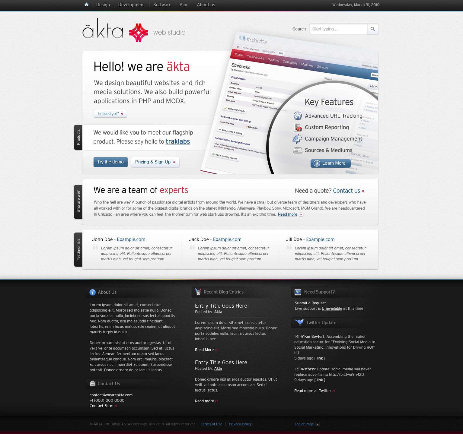
Äkta is Swedish for genuine. ÄKTA was a team of web artists in downtown Chicago: interfaces, websites and media, fierce applications in PHP and MODX, cloud software and mobile apps. As design director from 2010 to 2012 I led design on akta.com and the studio’s client and product work, among them Magento’s mobile commerce for iOS, MODX, TopGolf kiosks, Vosges Chocolate and Traklabs. Salesforce later acquired the studio. What it taught me: a studio’s own site is its first pitch, so say what you do in the time it takes to read one line.
The brief
A studio that says it builds fierce products has to look like it.
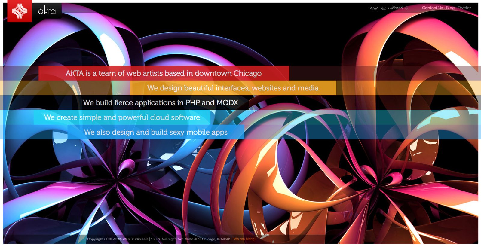
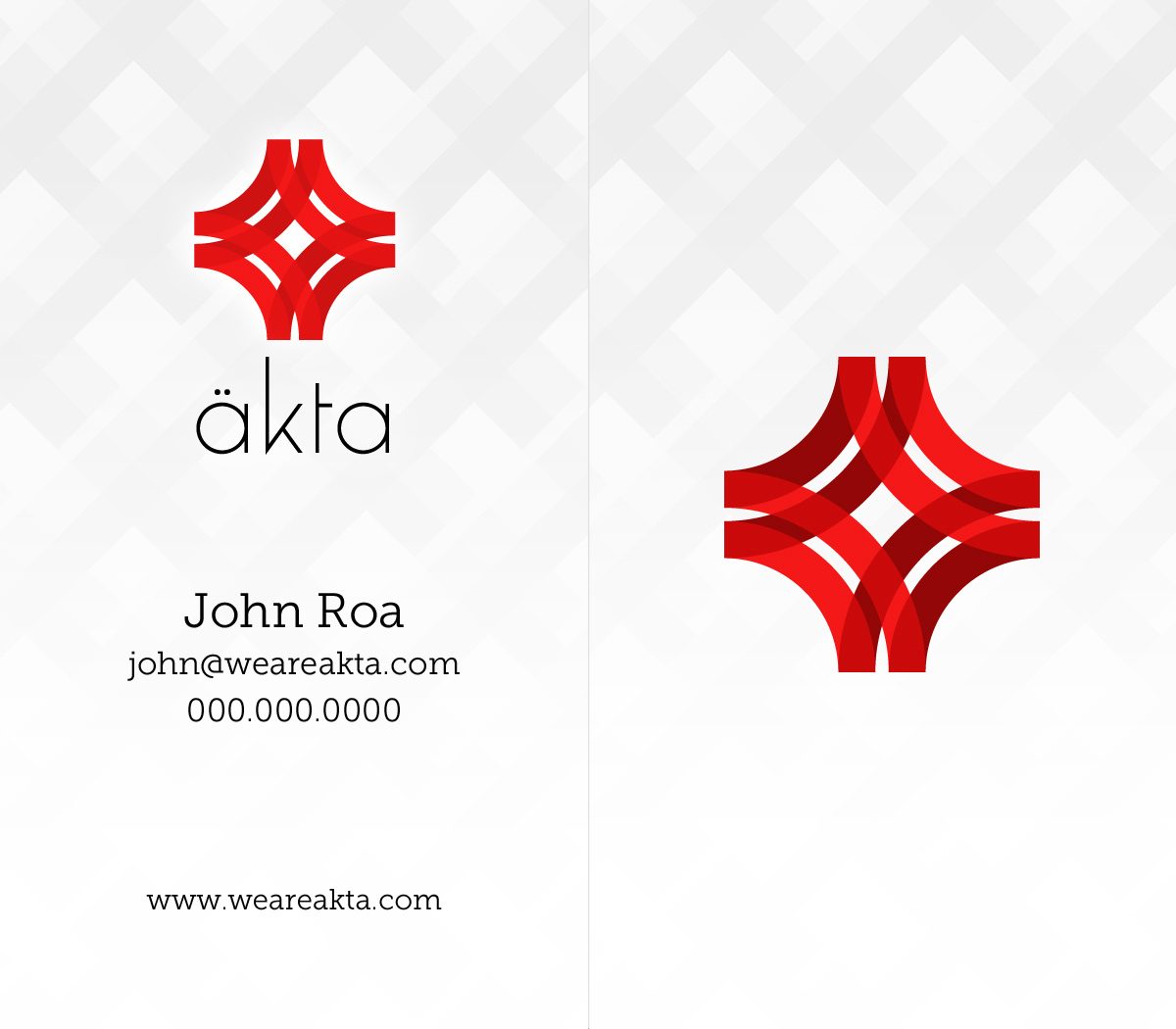
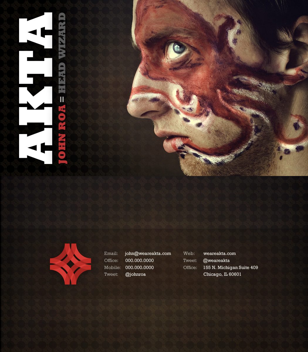
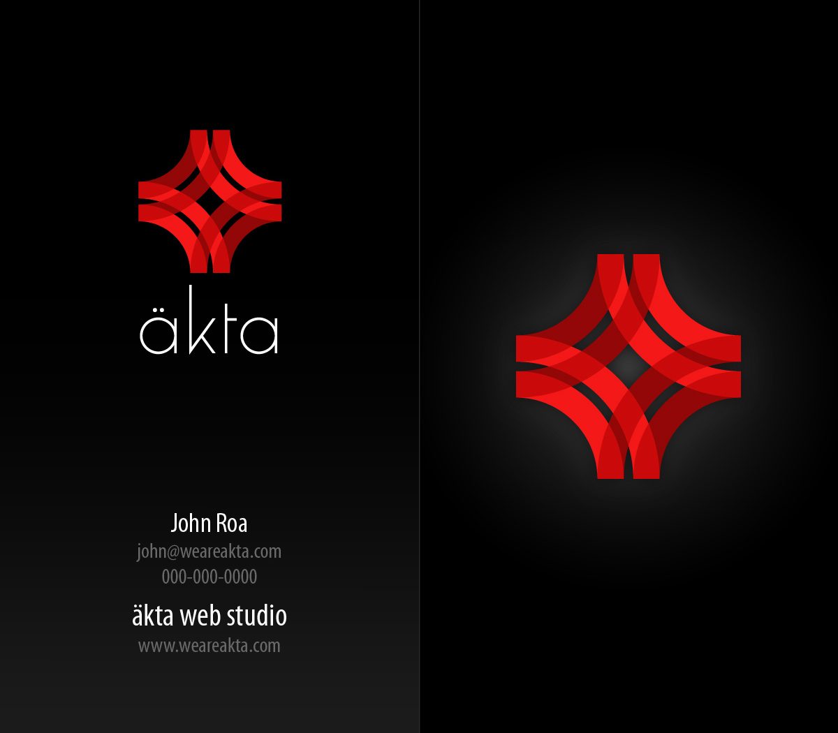
The mark is a red lattice of four overlapping arcs, and the wordmark a thin, lowercase äkta, so the identity carries both halves of the pitch: bold craft and quiet precision. The site said what the studio did in five coloured bands over glossy 3D ribbons on black, one line each, no scrolling needed to understand it. The cards did the same in miniature: a calm light set on a diamond pattern, a dark set, and one that set AKTA vertically beside a face-painted portrait for the people you wanted to remember you.
A red lattice
Four arcs woven into one mark, crimson on black or on paper, strong at any size.
Five bands, five services
The home page as a list you read in seconds: interfaces, applications, cloud software, mobile.
Chiaroscuro
Deep black, one saturated red and subjects that emerge from the dark.
Genuine
The name is the value: real, honest and a little unapologetic.
The work
Brand system
Seen again years later, the site and cards were already most of a brand. I locked what they shared (ÄKTA red and deep crimson on black and paper, a thin geometric wordmark, portraits and glossy forms emerging from the dark) and followed it into print, product, a campaign, an editorial spread and a storefront.
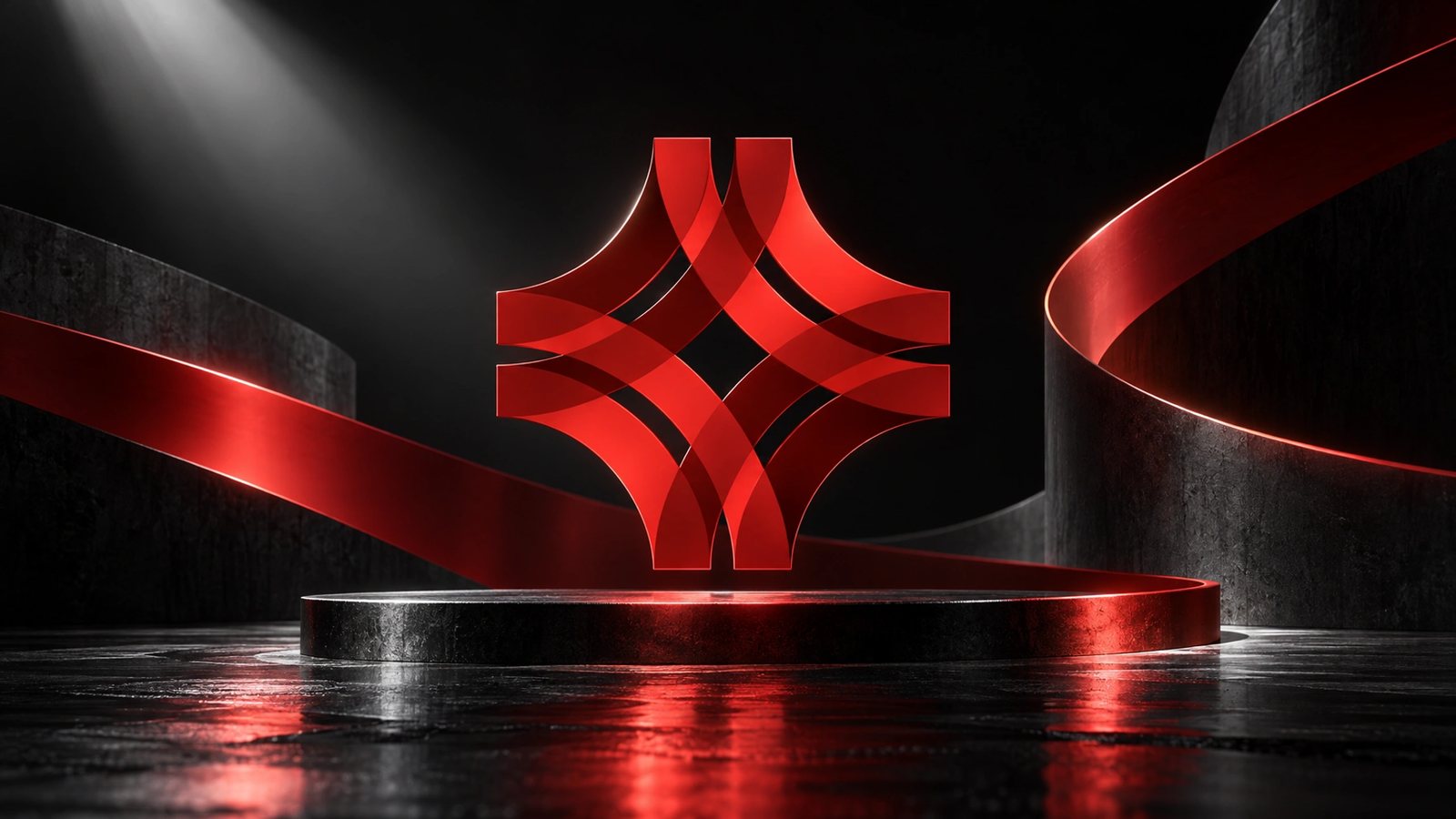 Brand world · rendered from the locked brand DNA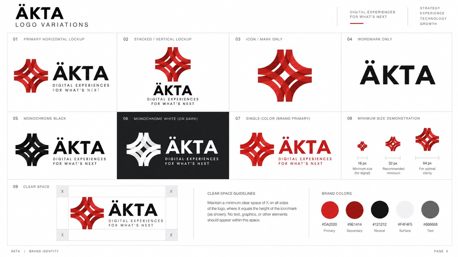
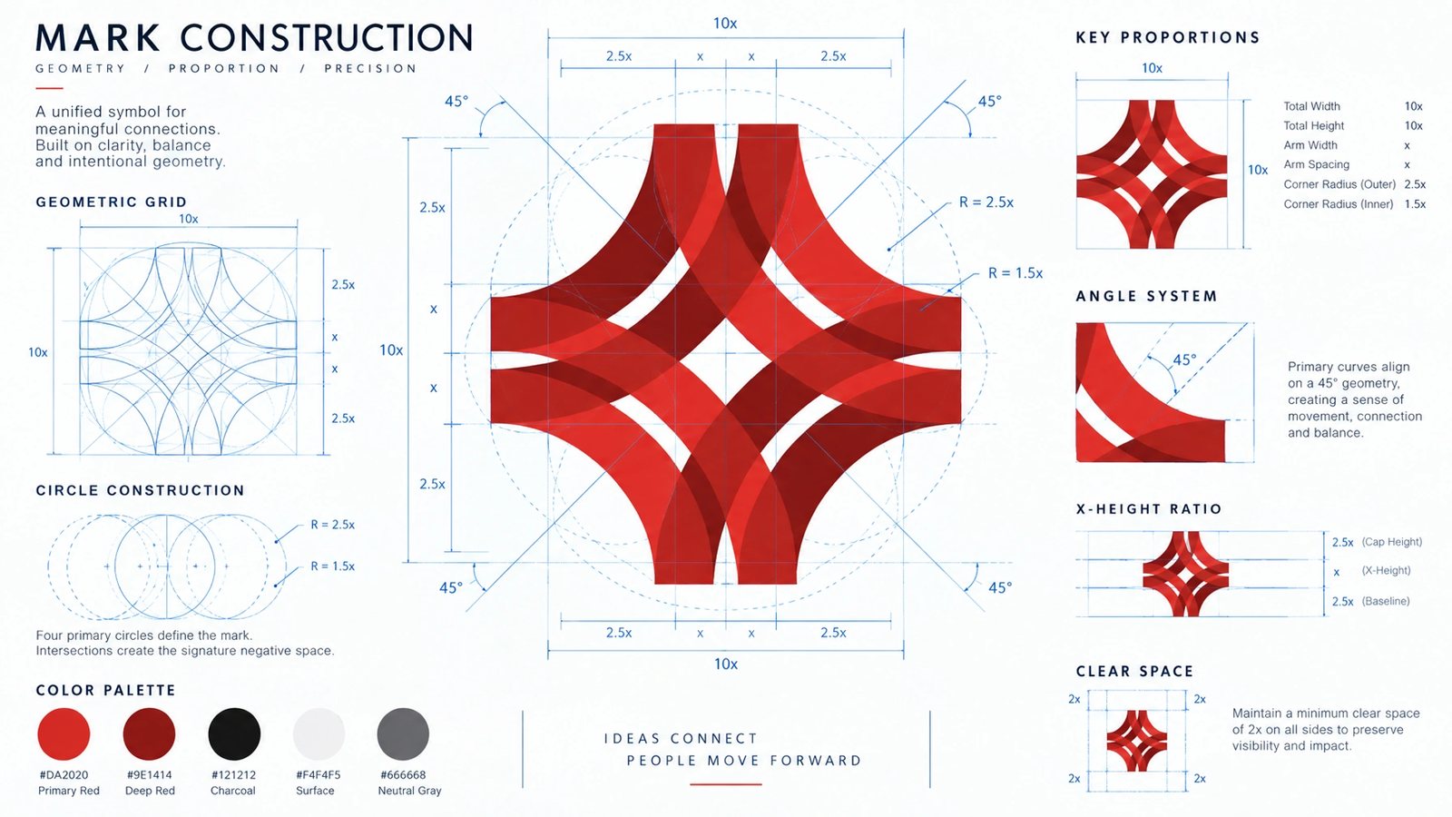
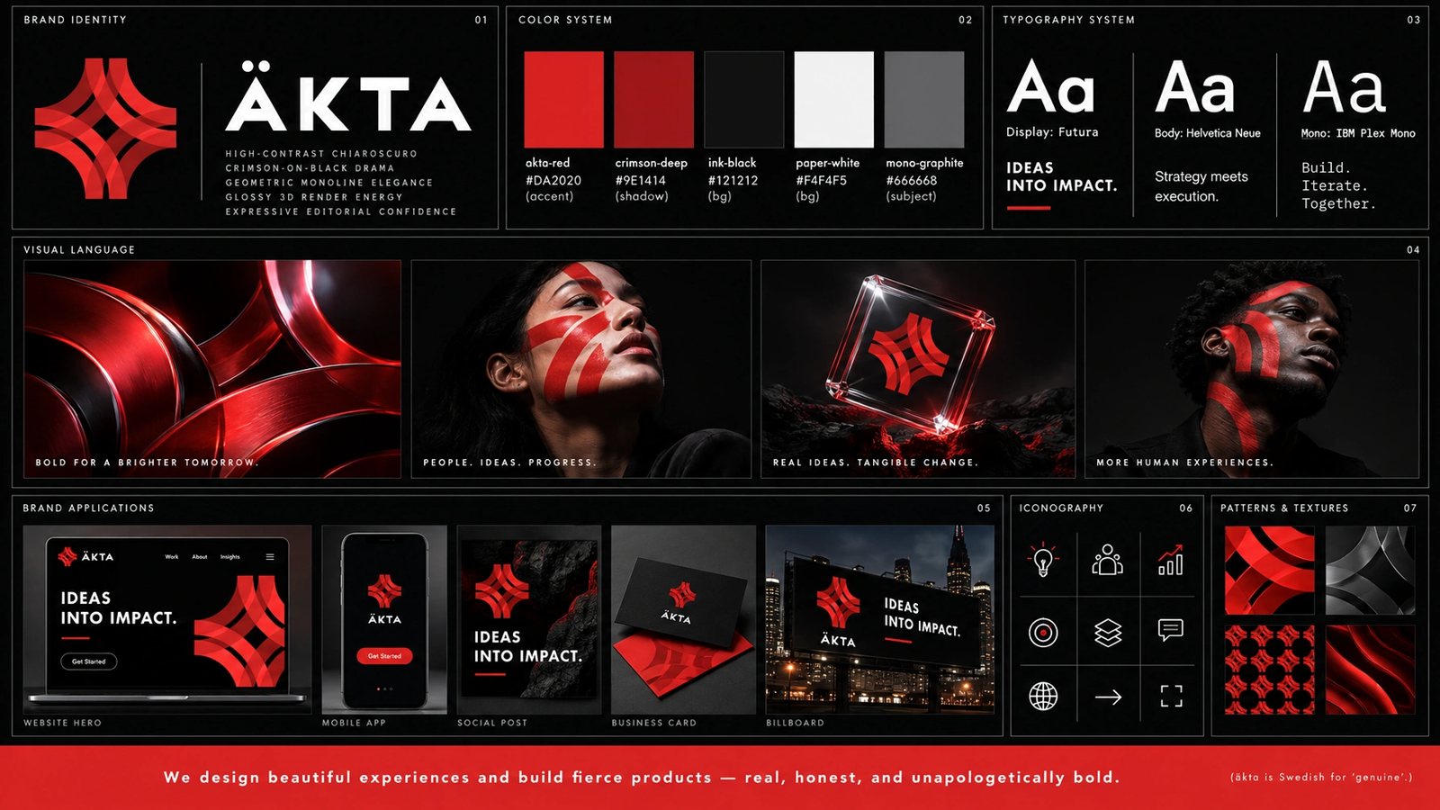
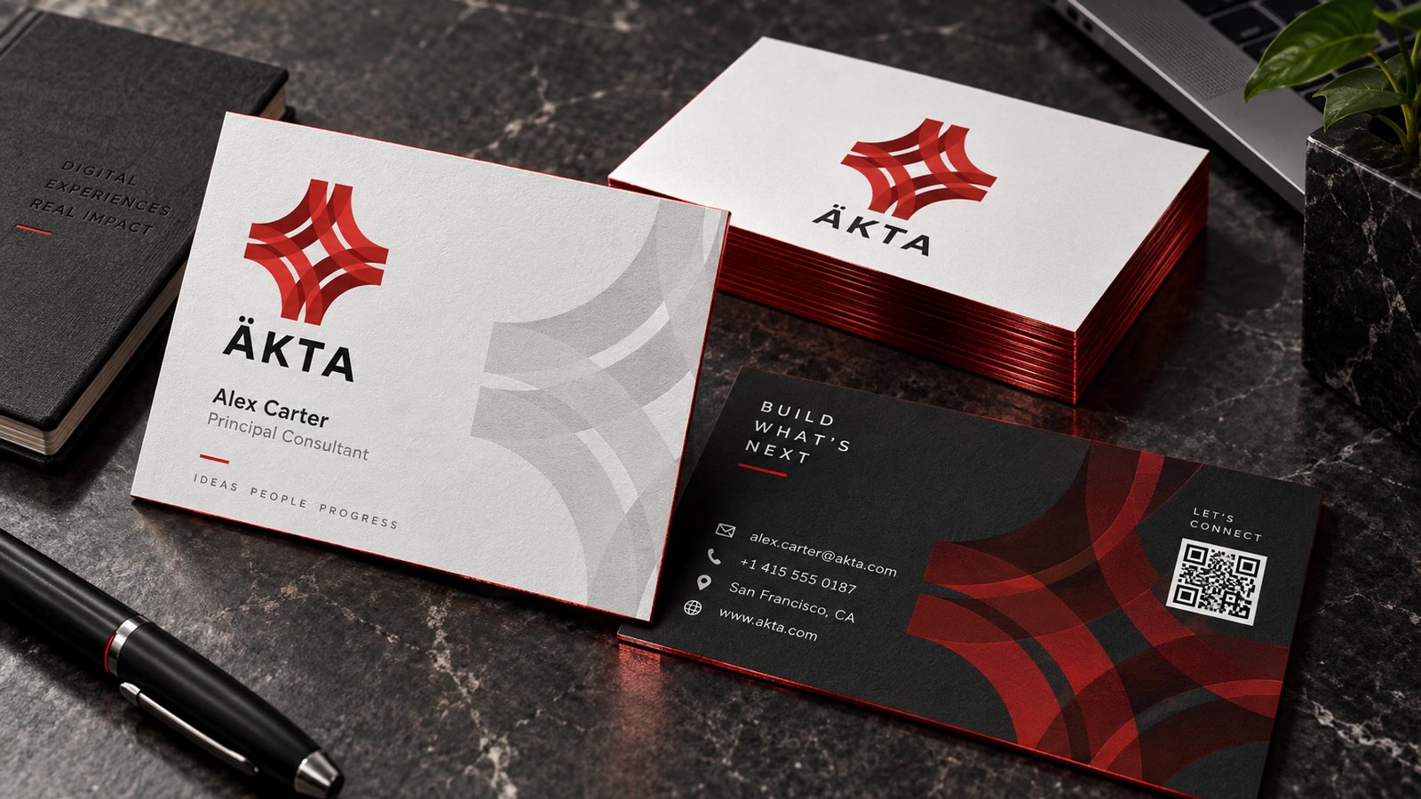
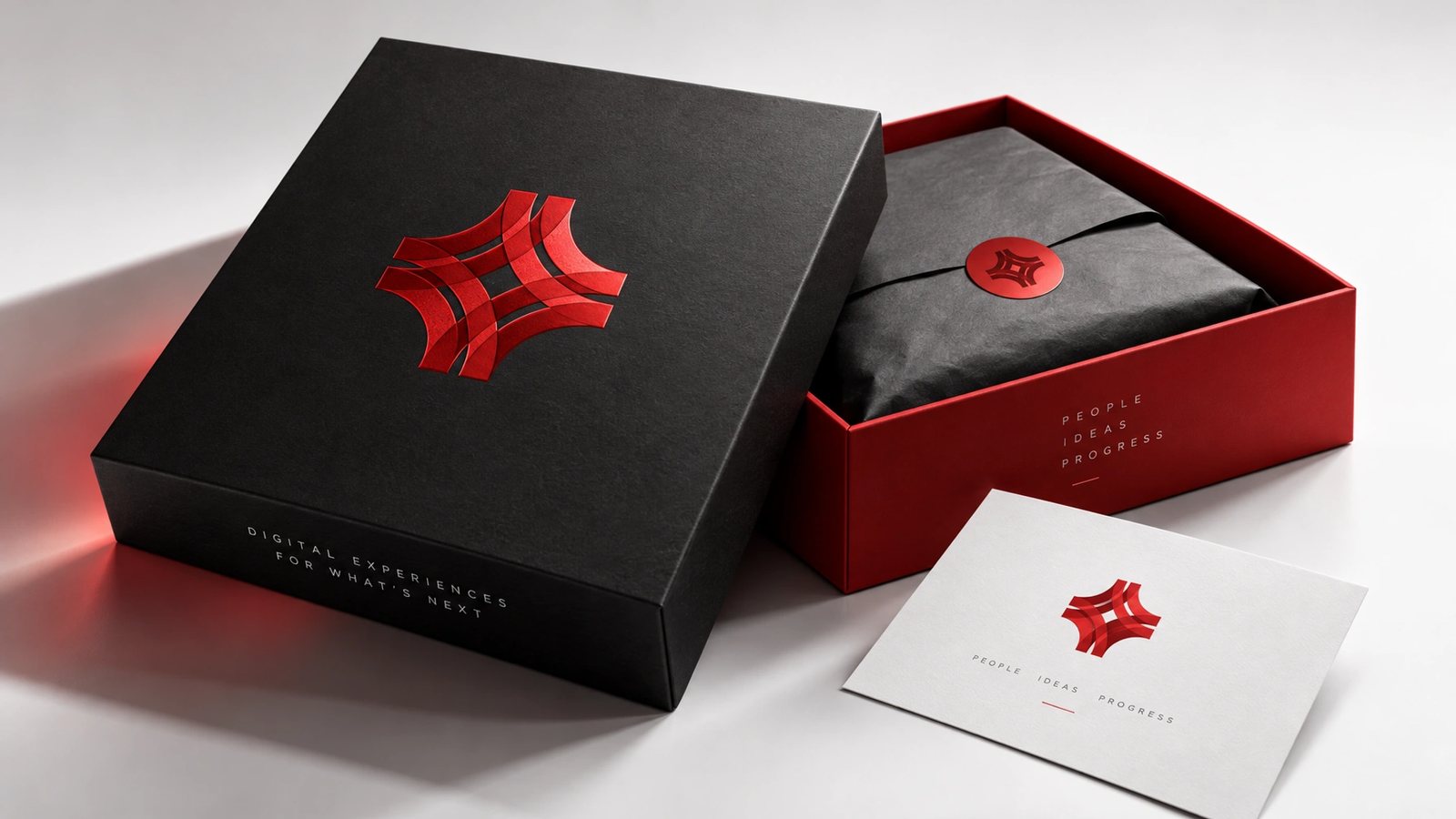
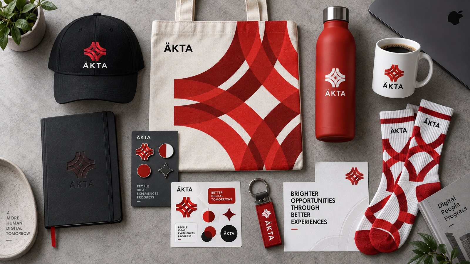
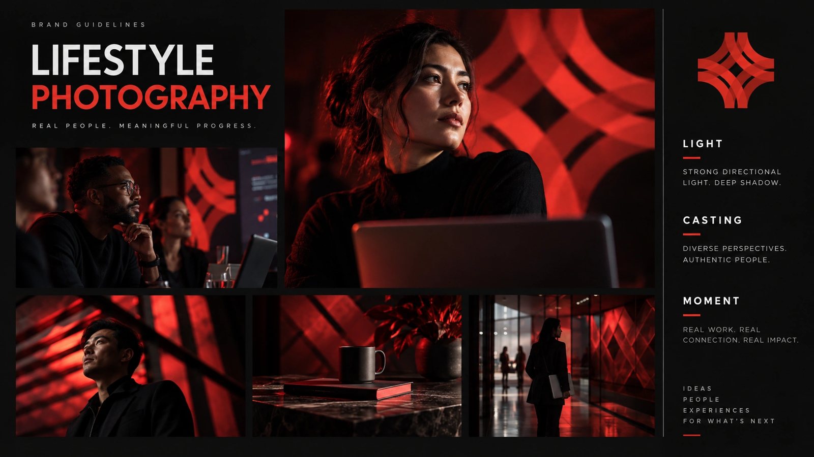
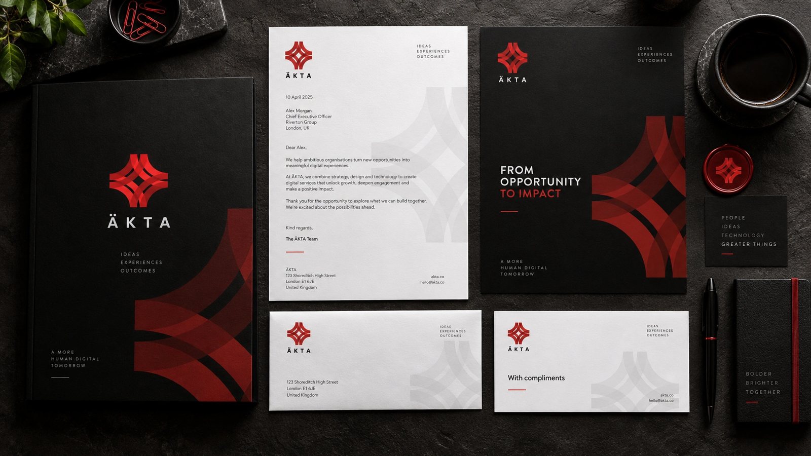
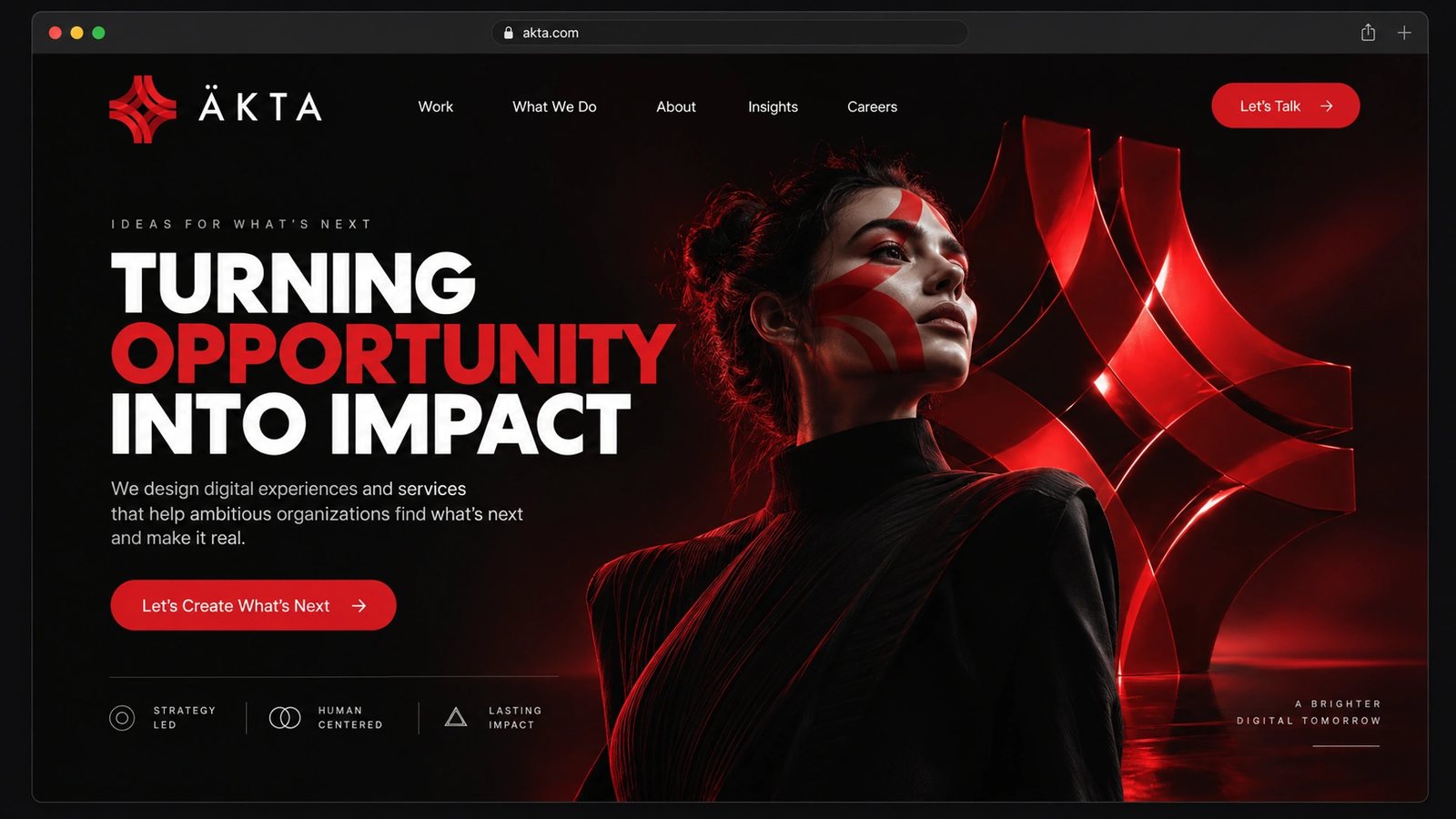
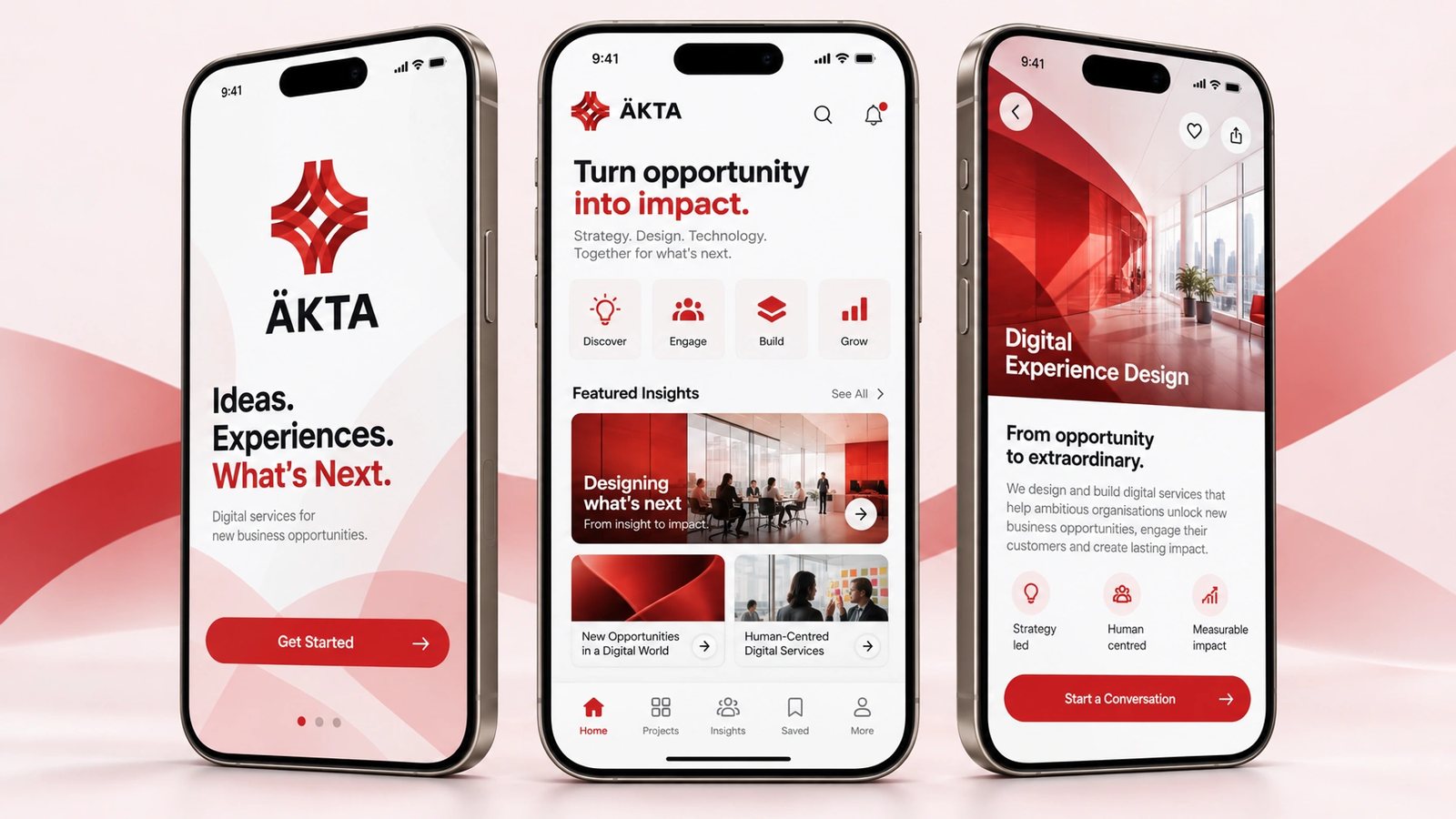

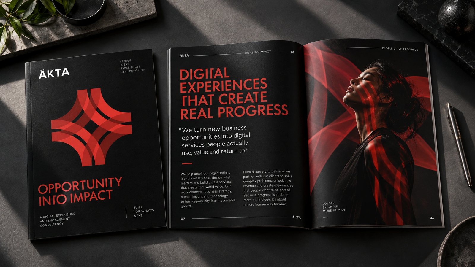

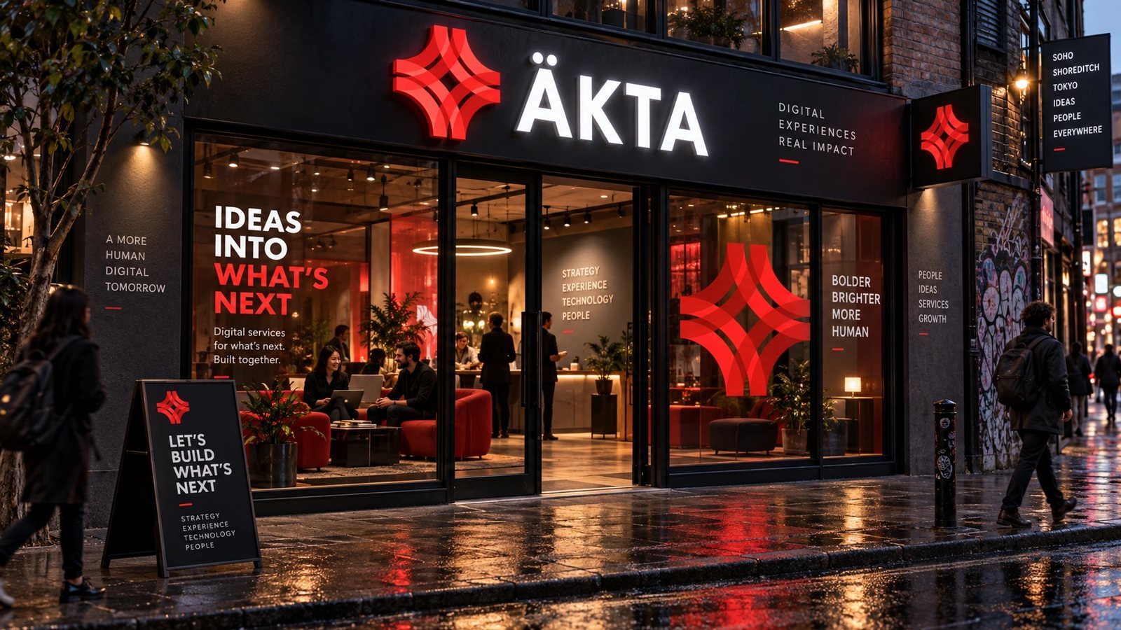
The site and cards are the design. The brand world is a 2026 study made with my own tool from them, not work for ÄKTA or Salesforce.
We design beautiful experiences and build fierce products.
ÄKTA, the brand DNA
Role
Design director at ÄKTA, 2010 to 2012. A 2026 study for the brand world.
Design director
Design across the studio’s site, clients and products, through to the acquisition by Salesforce.
The work
akta.com, Magento mobile commerce for iOS, MODX, TopGolf kiosks, Vosges Chocolate and Traklabs.
Brand DNA
Extracted and locked: palette with roles, display, body and mono type, voice, imagery rules.
Fifteen surfaces
Logo system, guidelines, cards, stationery, packaging, merch, photography, web, app, a campaign, an editorial spread, billboard and storefront.
- Design direction
- Web design
- Identity
- Studio leadership
- Brand DNA extraction
- Brand systems
Next
The studio lives in the archive with the rest of its clients.
Browse the archive →