 ISAAC WOOTEN

Destrukt Studios
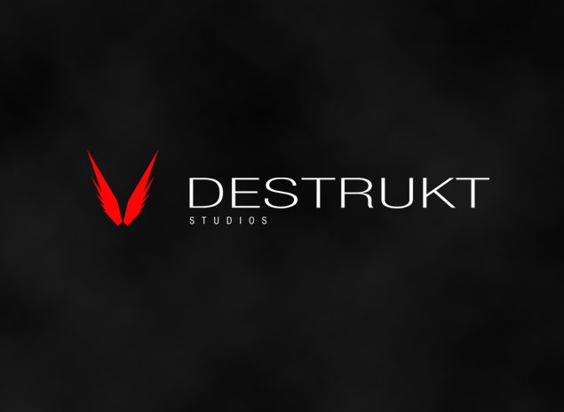
My own design studio. A winged V, a wordmark with room to breathe, and the brand world they implied.
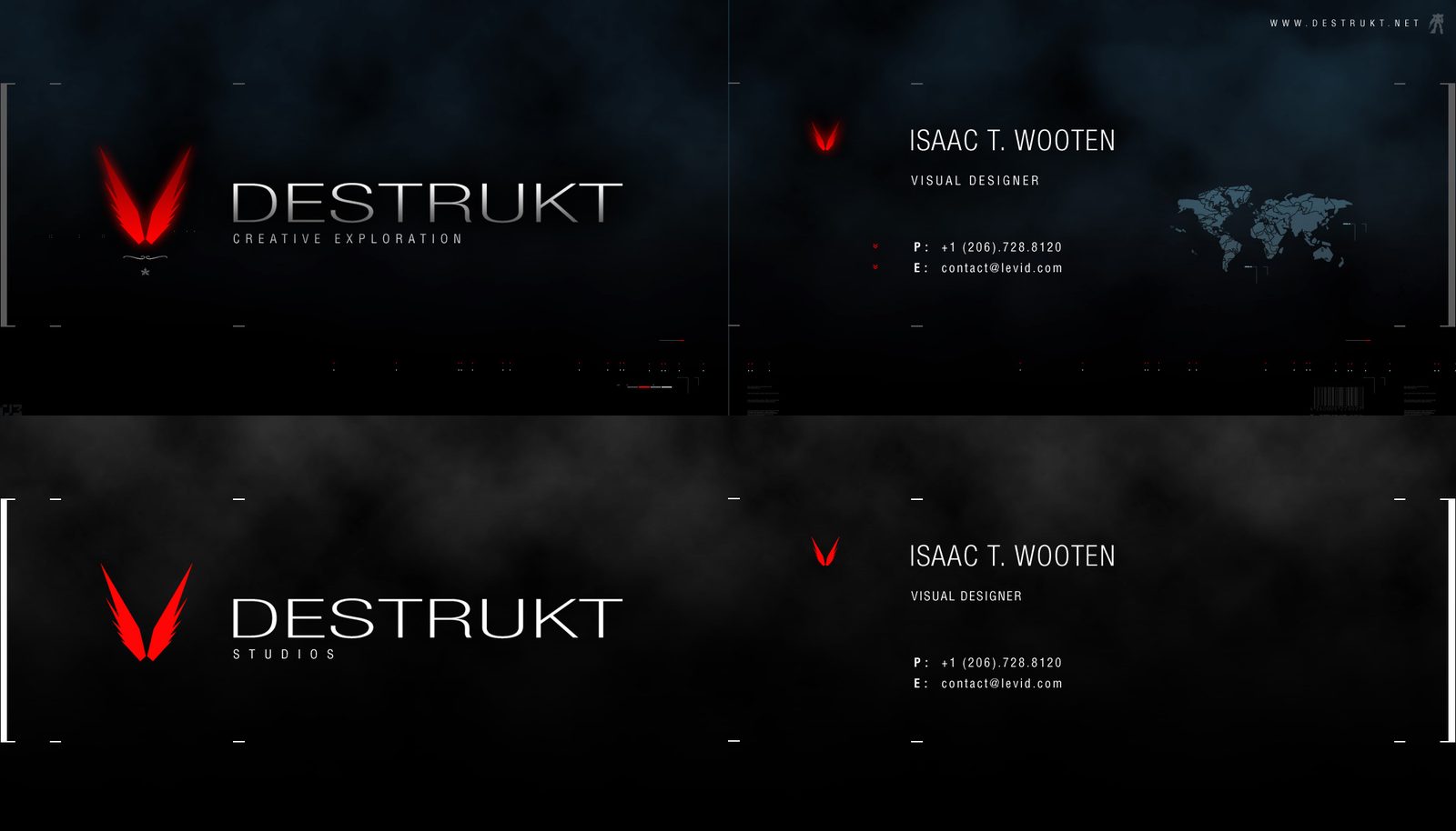
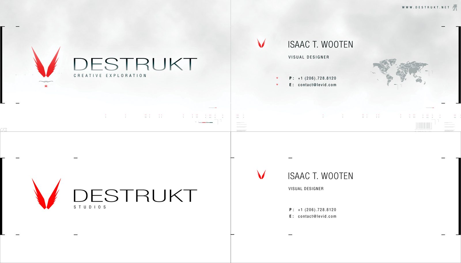
A studio of one, dressed like a film title. Destrukt Studios was my own design studio, a place for personal work outside the agency. I designed the identity for myself: a crimson V with a wing on each side, a wide, tracked-out wordmark, and business cards in smoke-black and white with a world map ghosted behind. In 2026 I extracted that work’s DNA in Northlit and rendered the brand world it implied.
The brief
No client, so no compromise. The only brief was restraint until the moment of impact.
Designing for yourself is the hardest brief, because nobody stops you. The mark is a V made of two blades that read as wings, the only colour in the system. DESTRUKT is set in wide geometric capitals with extreme letterspacing, so the name reads slowly, like a title card, with STUDIOS tracked out underneath. The cards carry my name as visual designer, a faint world map and nothing else, in a dark and a light version.
One red, one mark
Signal crimson for the V and nothing else. Everything around it is black, white and smoke.
Space as the material
Wide caps and heavy tracking make the wordmark feel expensive and slow, the opposite of the name.
Technical ghosts
A world map at low opacity on the cards, a hint of coordinates and scale without saying anything.
Dark and light
Every piece exists on black and on white, so the identity never depends on the ground.
The identity

Brand system
A mark and a card are an intention, not a brand. To see what Destrukt would have become, I pointed Northlit at them: void black, smoke grey and one crimson, wide geometric display type over a neutral grotesque, cinematic smoke and single-source red light, extracted and locked as brand DNA. Then every surface was rendered from that source rather than designed again: palette, type, identity, stationery, packaging, merch, social, data, a presentation, product UI, out of home, and the brand world itself. Tap any tile to open it.
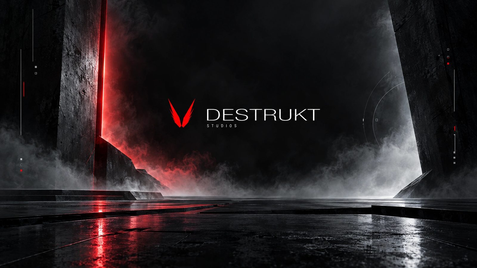 Brand world · rendered in Northlit from the locked brand DNA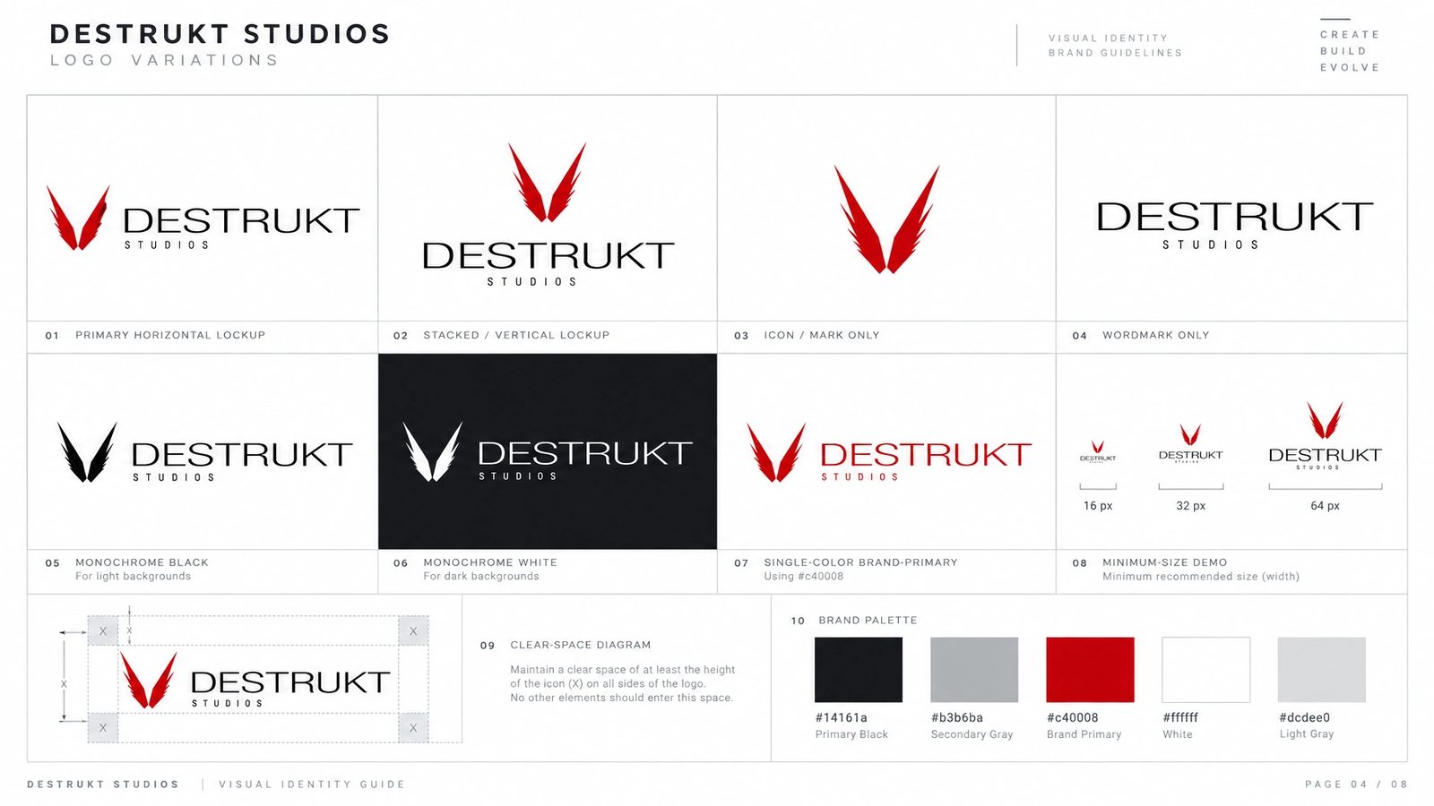
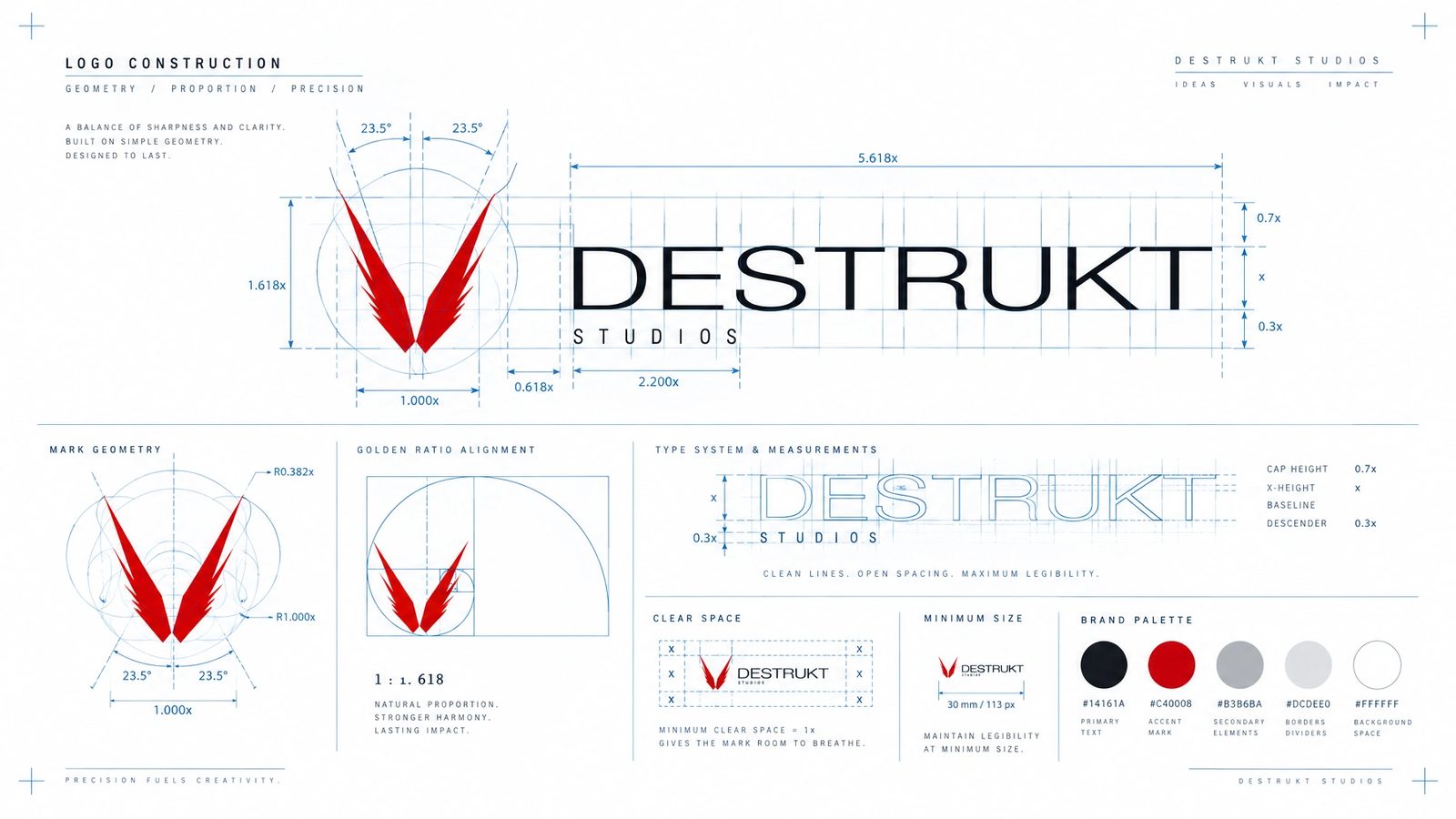
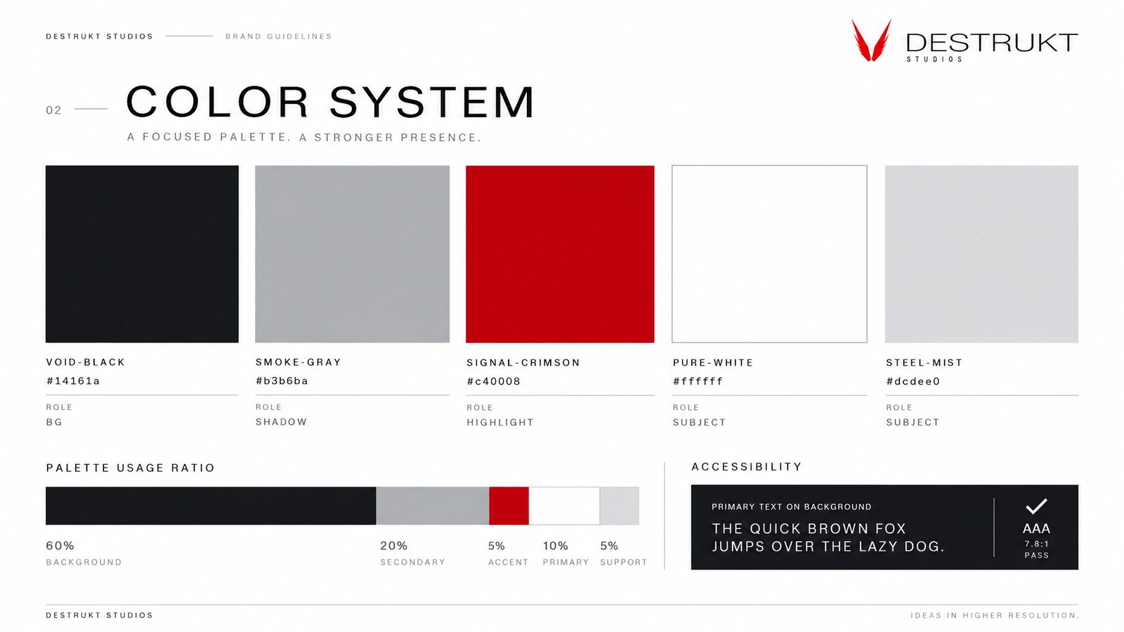
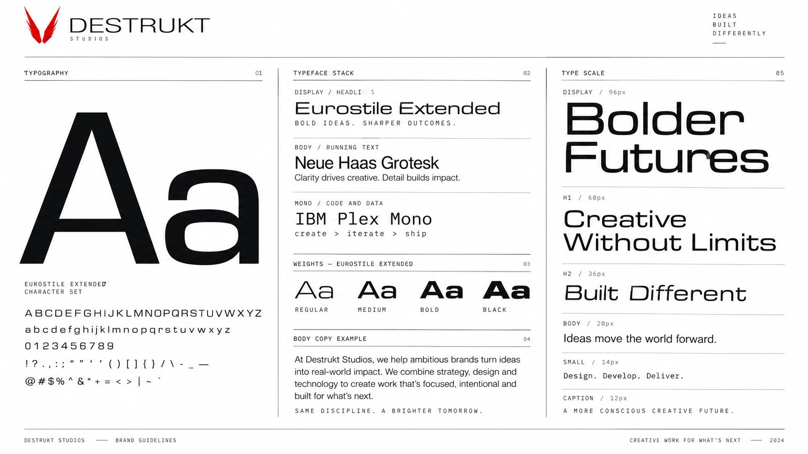
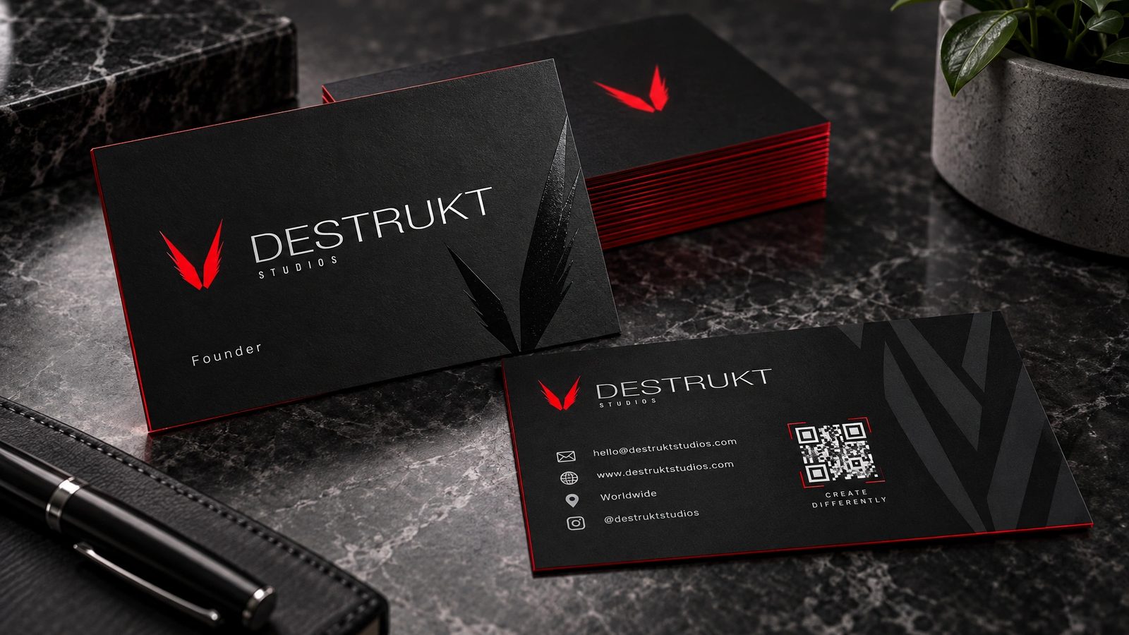
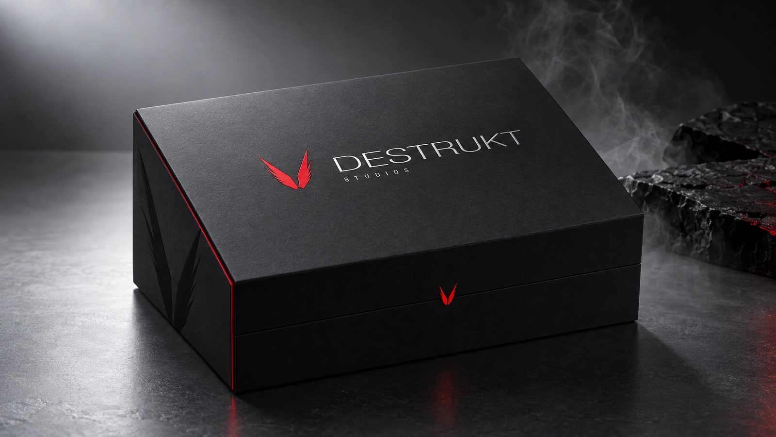
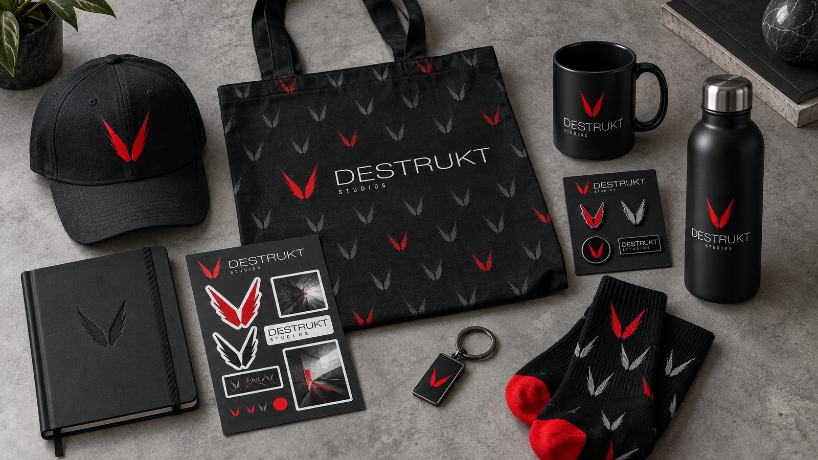
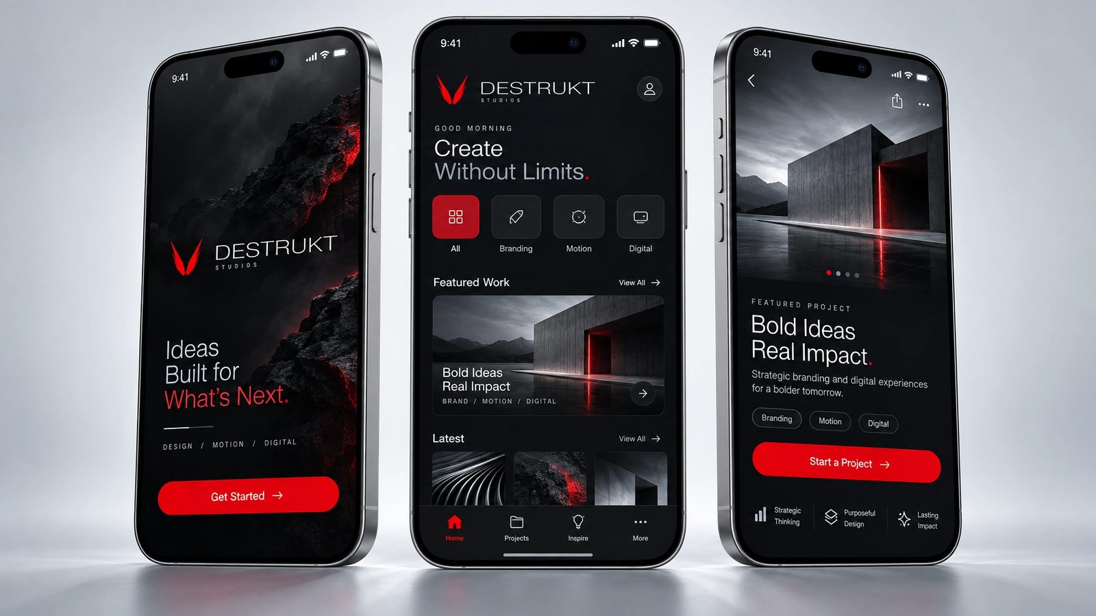
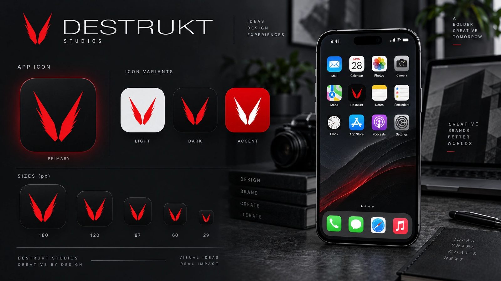
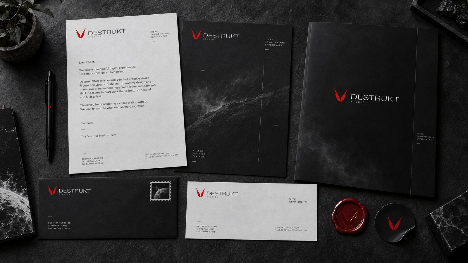
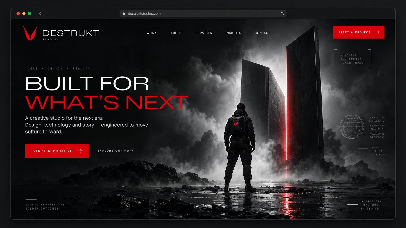
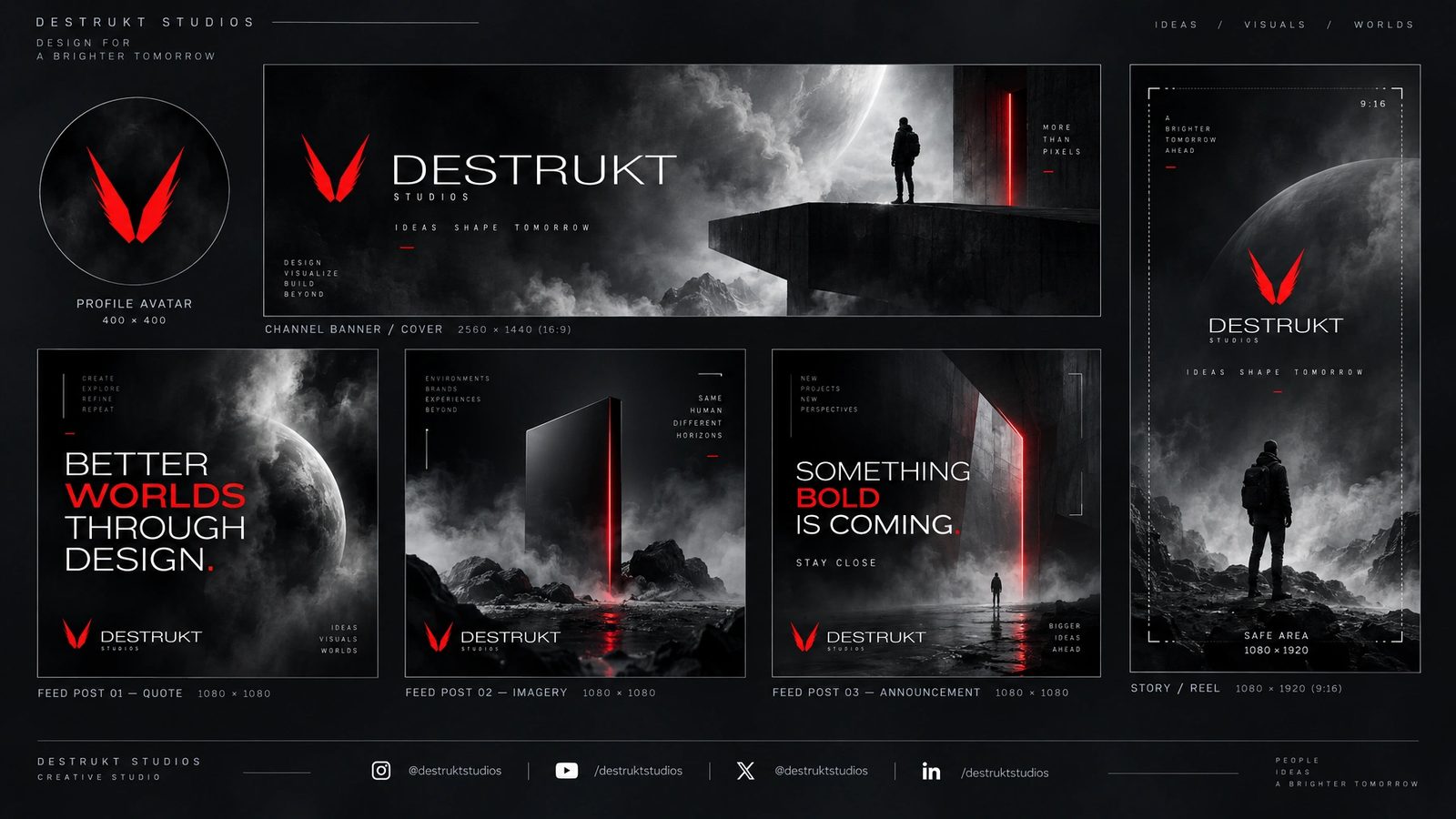
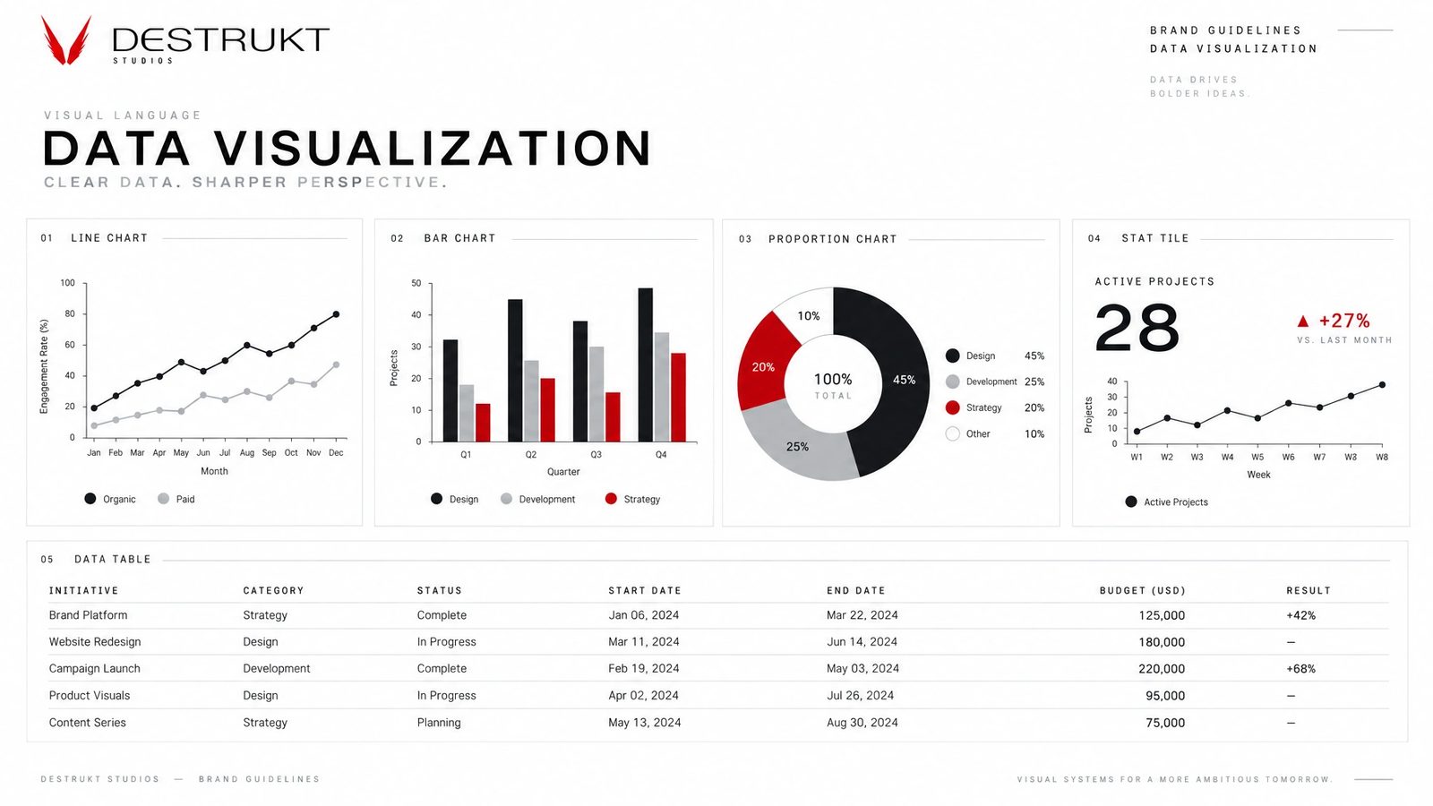
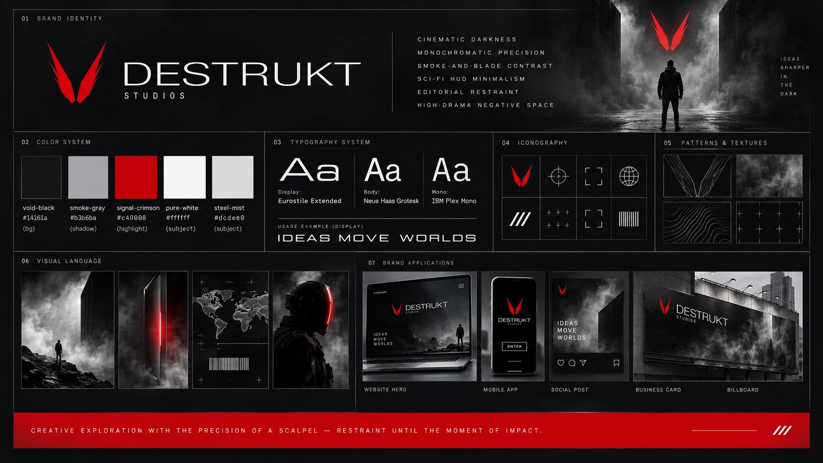
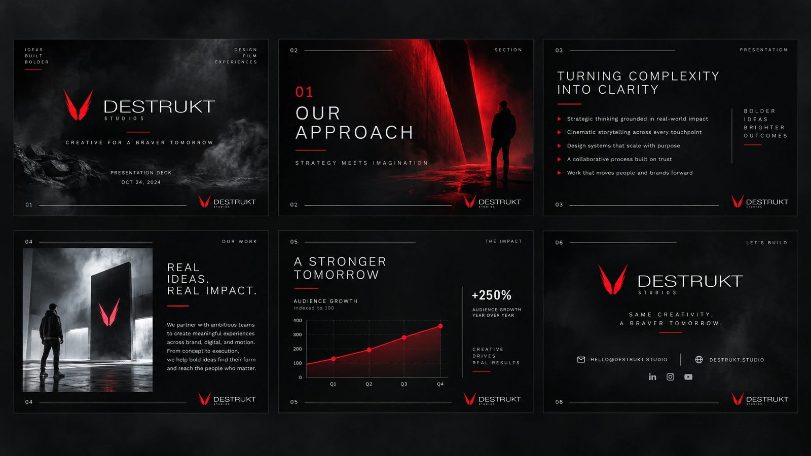
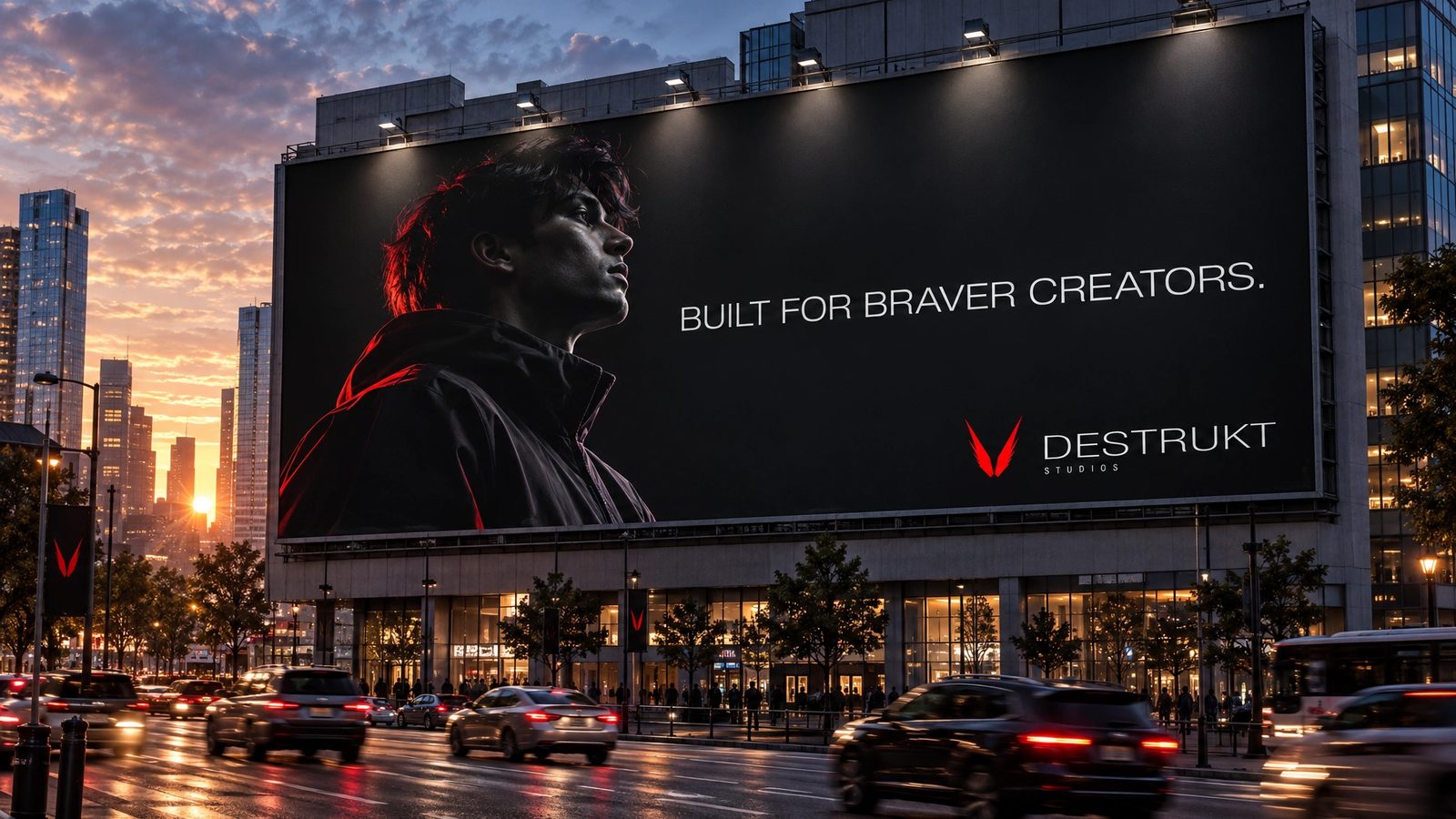
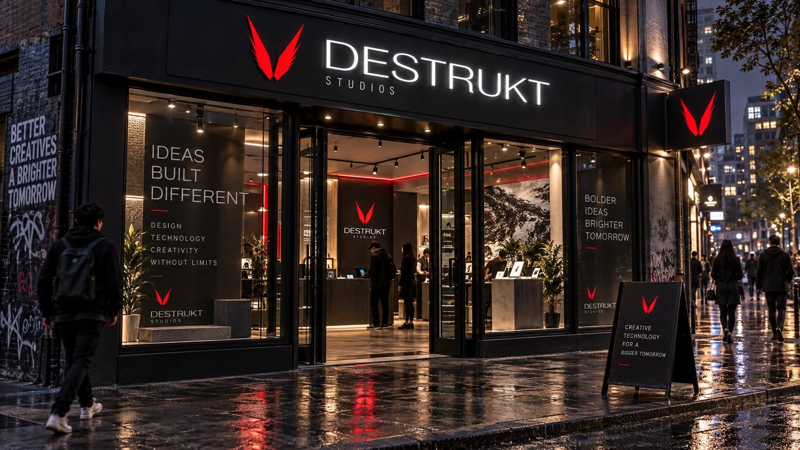
The mark and cards are the design. The brand world is a 2026 study made with my own tool from them.
Creative exploration with the precision of a scalpel.
Destrukt Studios, the brand line
Role
Designer and client at once. Northlit in 2026 for the brand world.
Founder
My own studio, for personal and exploratory work outside the agency.
Identity
The winged V, the wordmark and lockup, and business cards in dark and light, designed end to end.
Brand DNA
Extracted from the identity in Northlit and locked: palette with roles, display and body type, imagery rules, anti-defaults.
Eighteen surfaces
Palette, type specimen, logo system, cards, stationery, packaging, merch, social kit, data visualisation, a presentation, web, app and app icon, guidelines, billboard and signage.
- Logo design
- Brand identity
- Personal work
- Brand DNA extraction
- Northlit
Next
The identity lives in the archive with forty-three other projects from those years.
Browse the archive →