 ISAAC WOOTEN
Omatik
Strategy, experience, technology. A ribbon-shield mark for a consultancy, and the brand world it implied.
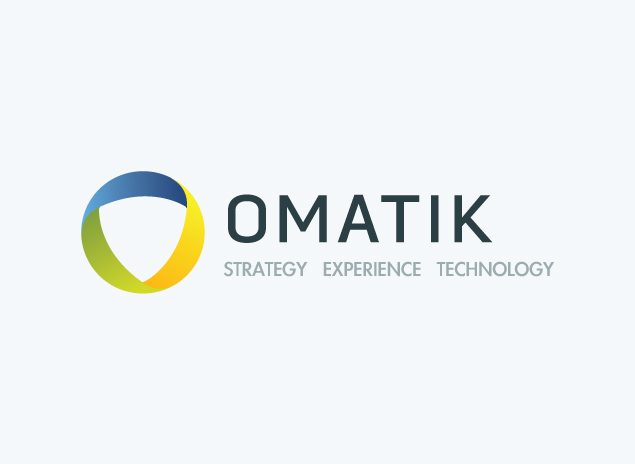
Three disciplines, one continuous shape. Omatik was a consultancy working across strategy, experience and technology. At Levid Media I designed its identity: a rounded shield drawn as a single ribbon that turns from blue to green to yellow, a wide geometric wordmark with the three disciplines tracked beneath, and business cards in light and slate. In 2026 I extracted that work’s DNA in Northlit and rendered the brand world it implied.
The brief
A consultancy that sells three things has to look like it sells one.
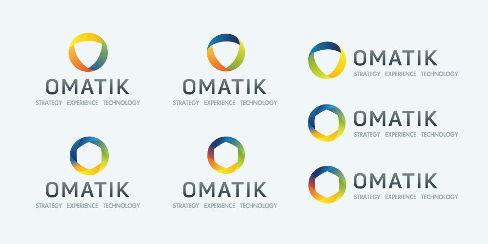
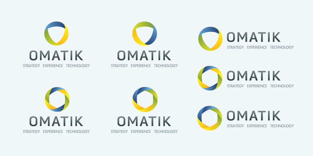
The concept sheets show the search: rings, shields and interlocking forms, each trying to hold strategy, experience and technology together. The answer was a shield made of one ribbon that folds back on itself, so the three colours read as a single continuous surface rather than three parts bolted together. The wordmark is set wide and open, its rounded O and A echoing the shield, with the three disciplines spelled out underneath so nobody has to guess what the company does.
One ribbon
The shield is a single folded band, not three shapes. The idea of the business, drawn once.
A gradient with a job
Blue, green and yellow sweep across the ribbon, one colour for each discipline, on a calm slate and paper ground.
Open geometry
Wide, rounded capitals that match the shield’s curves, friendly without going soft.
Light and slate
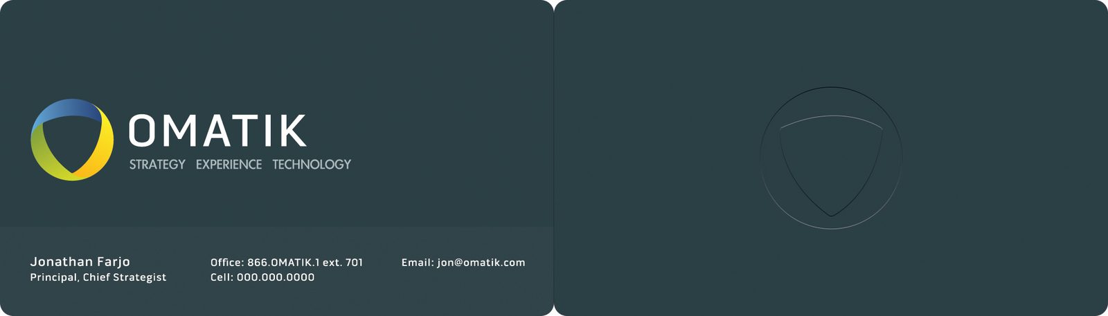
Cards in pale grey and in ink slate, the mark debossed on the dark back, so it works on both grounds.
The identity

Brand system
A mark and a card are a handshake, not a brand. To see what Omatik would have become, I pointed Northlit at the concepts, the lockup and the cards: ink slate and paper with a blue-green-yellow sweep, geometric display type over a clean sans, bright architecture and ribbon-like light, extracted and locked as brand DNA. Then every surface was rendered from that source rather than designed again: palette, type, icons, rules, identity, stationery, packaging, merch, social, data, a presentation, product UI, out of home, and the brand world itself. Tap any tile to open it.
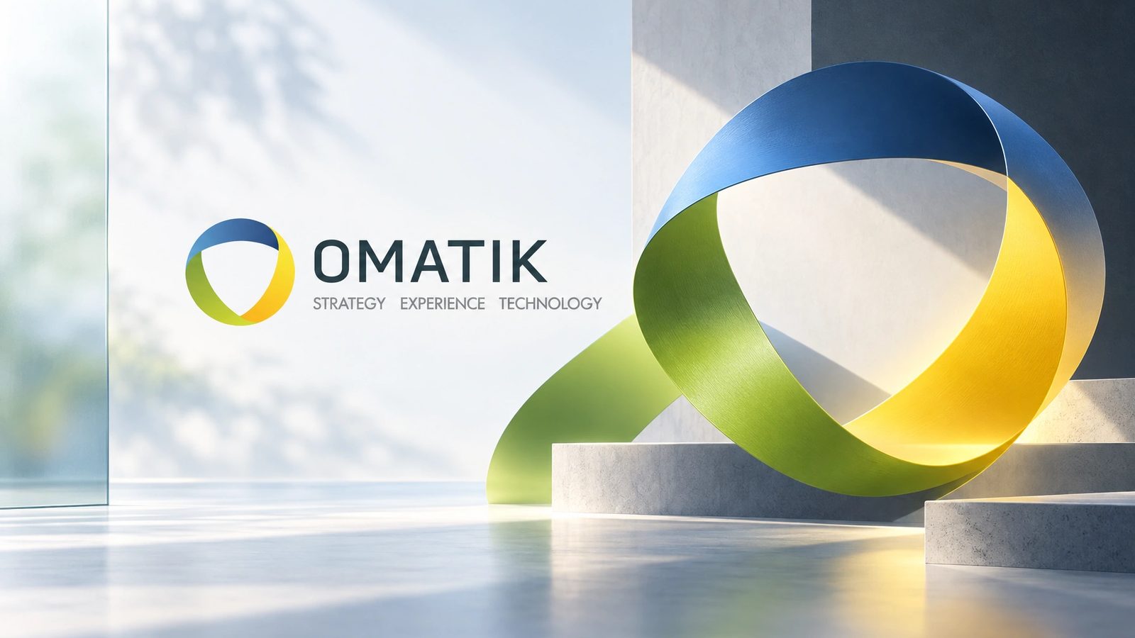 Brand world · rendered in Northlit from the locked brand DNA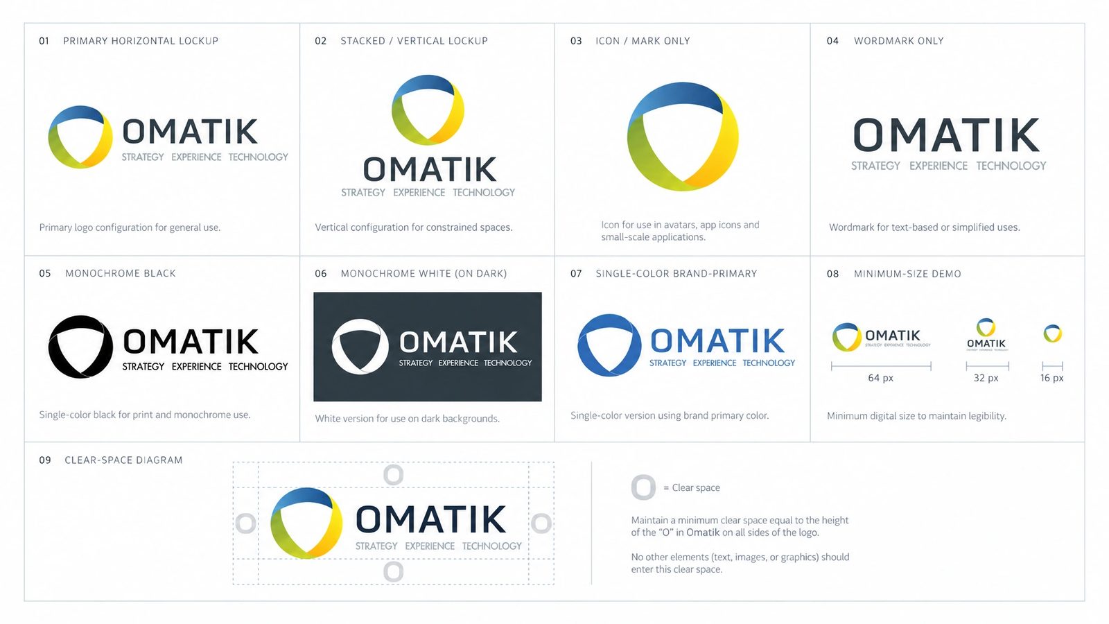
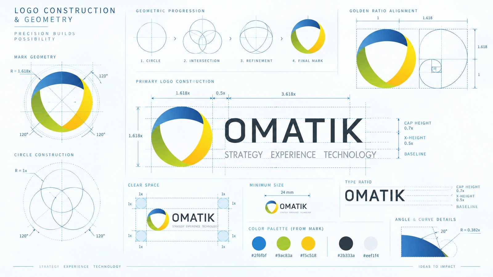
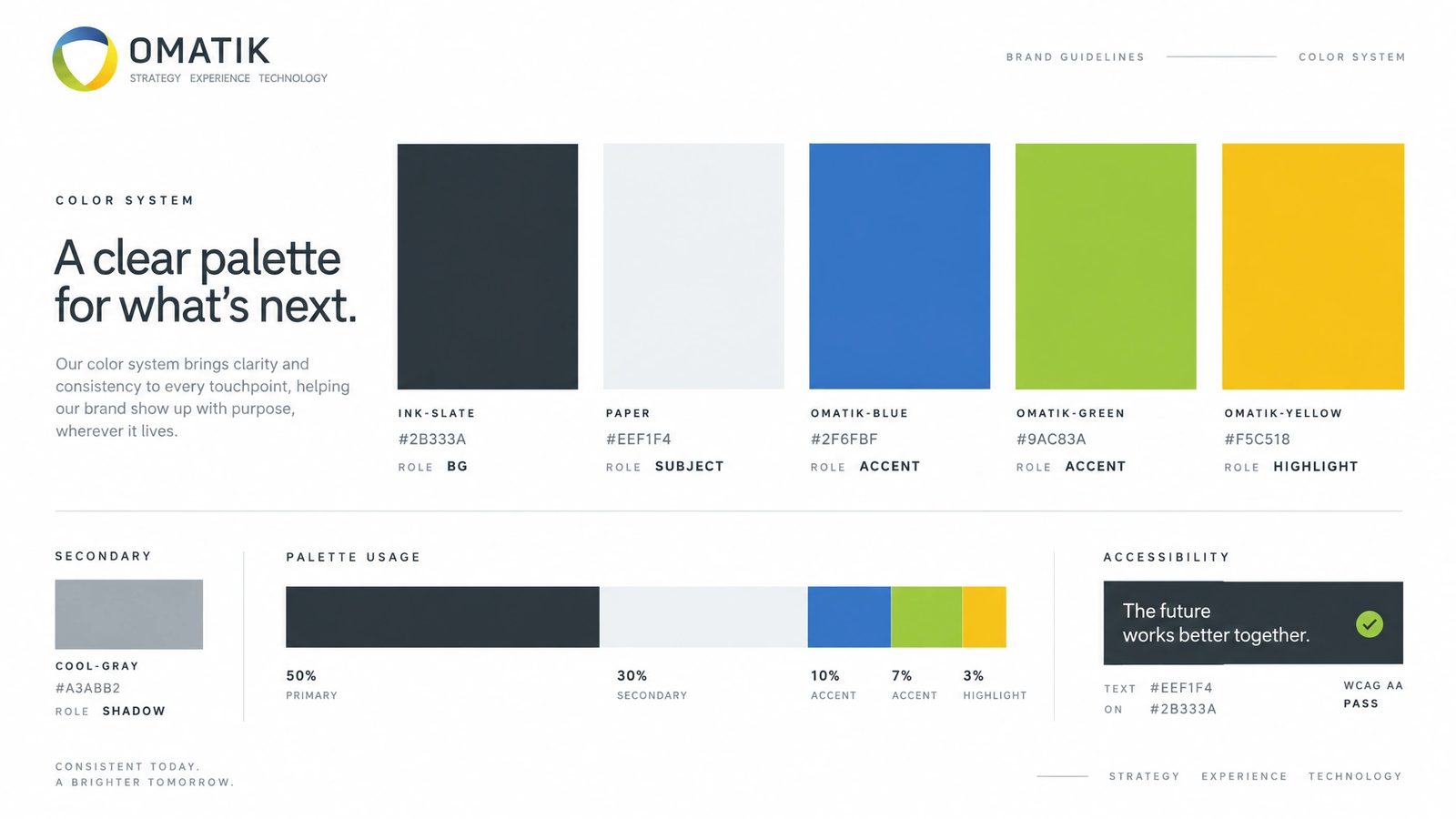
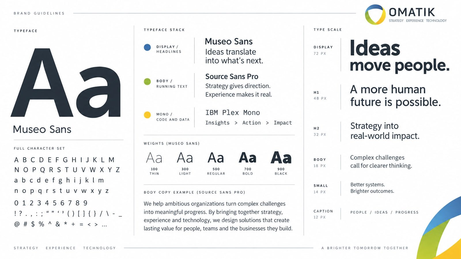
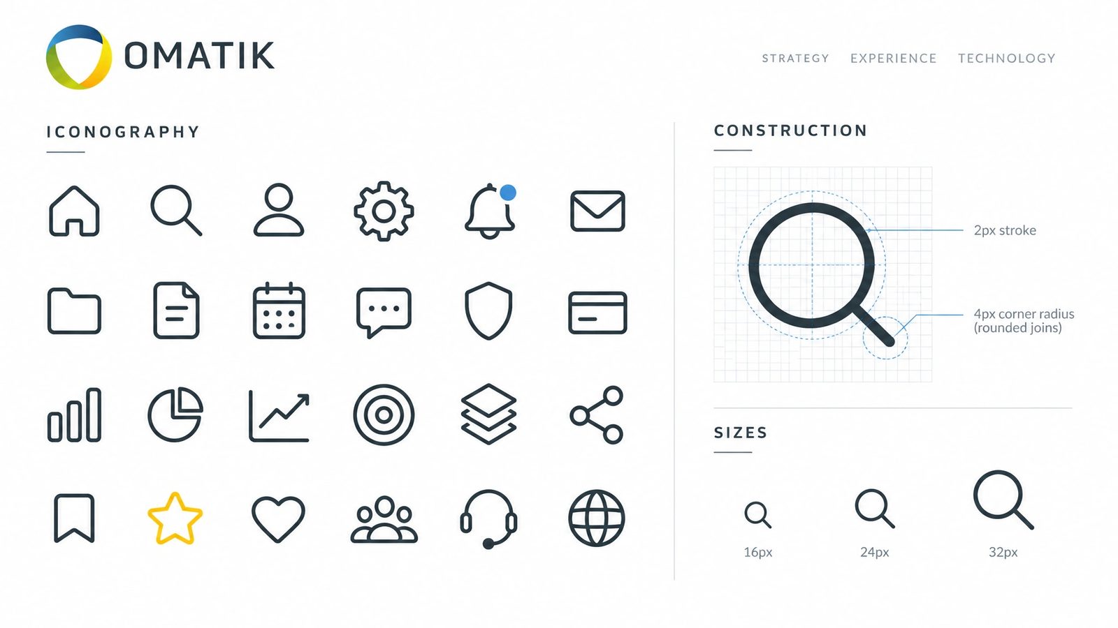
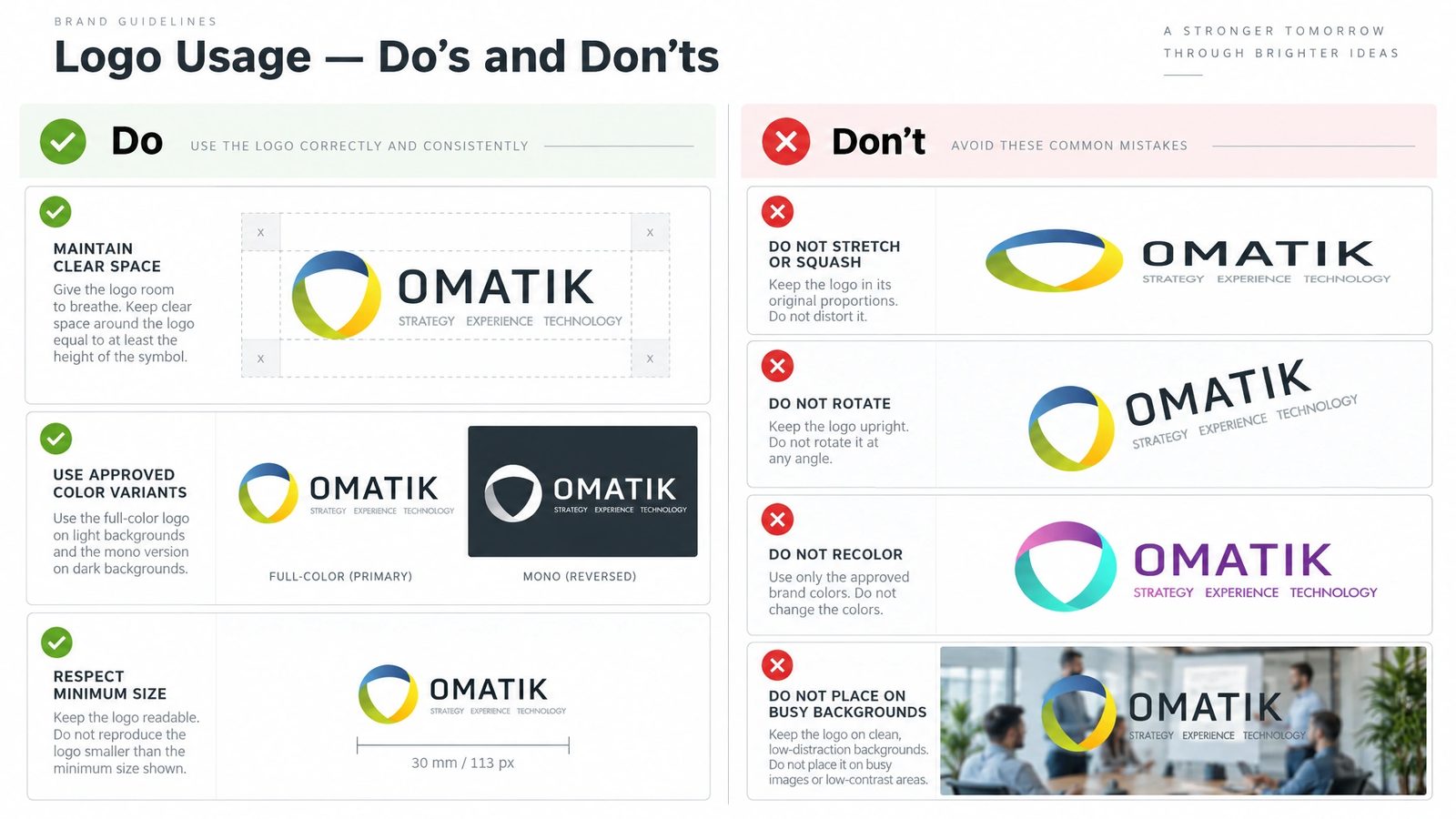
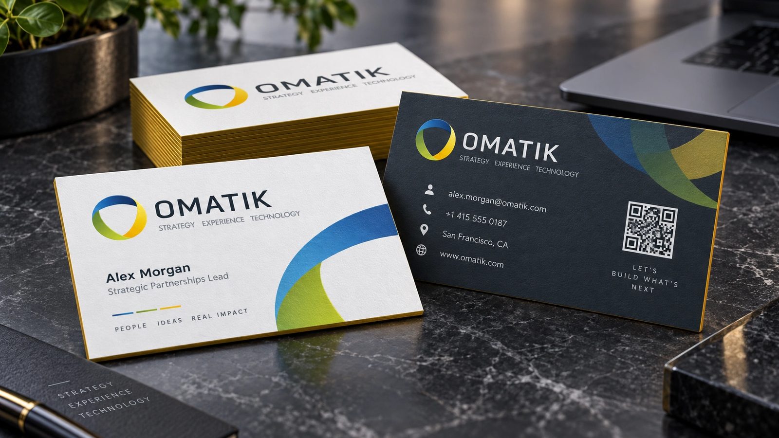
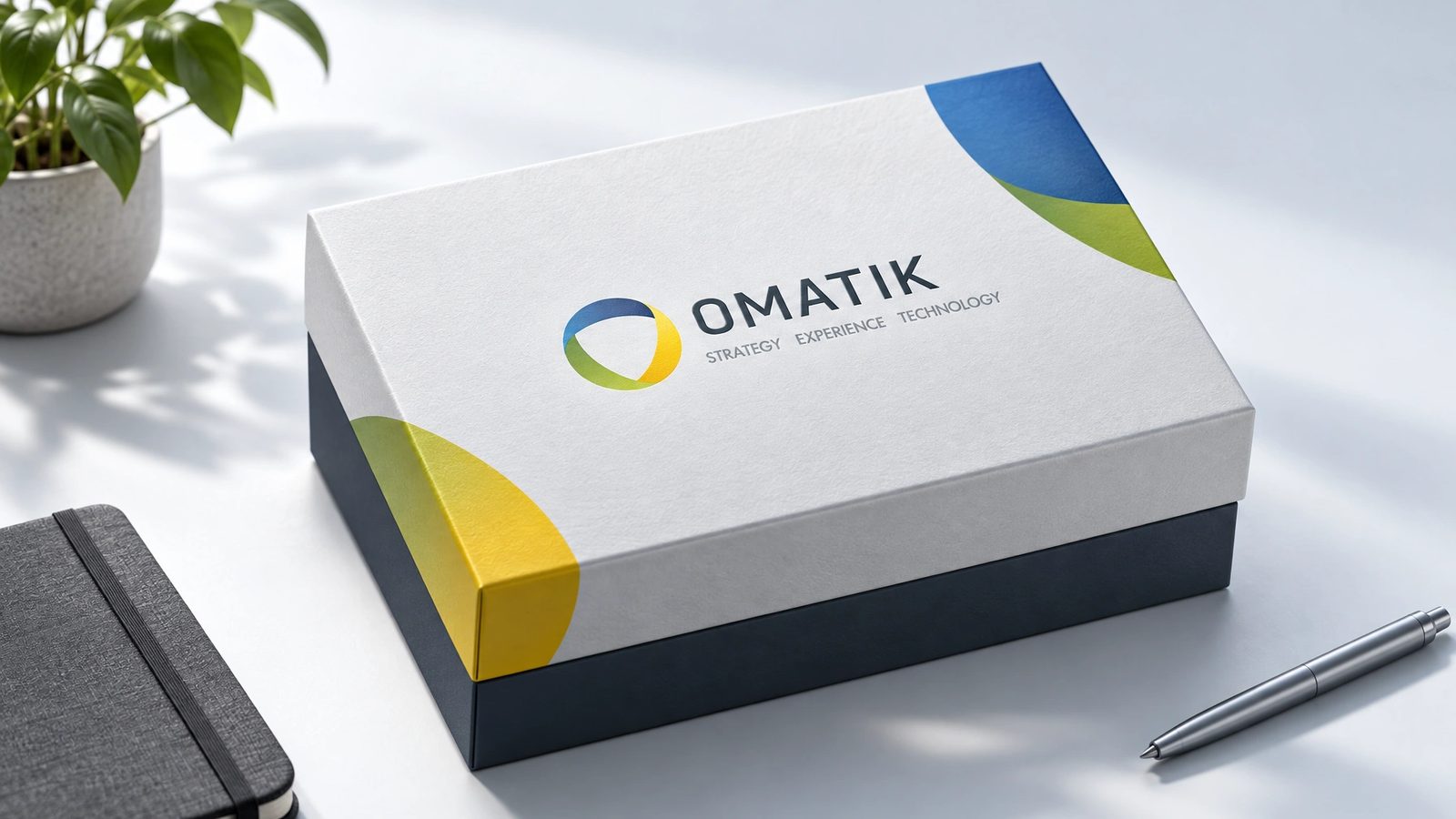
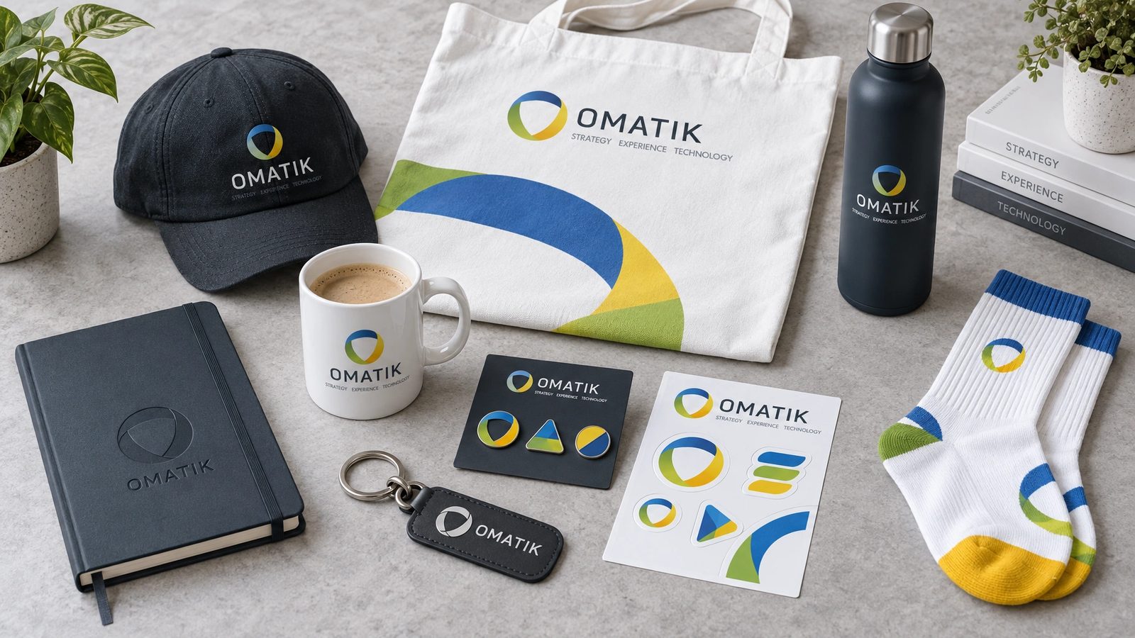
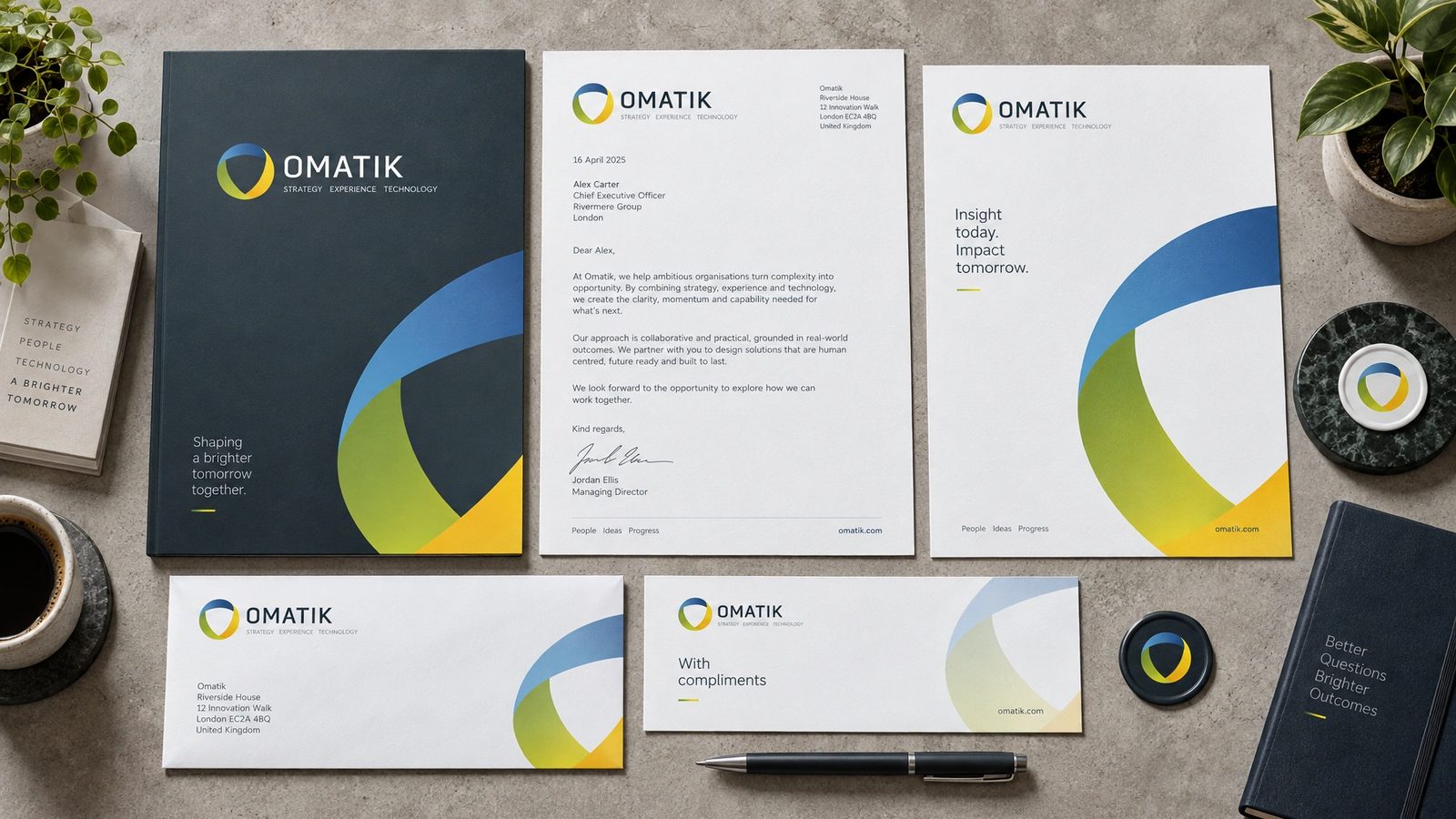
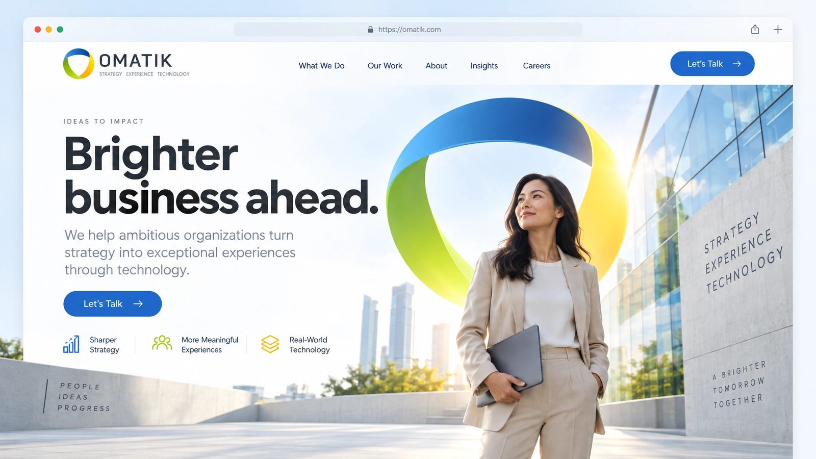
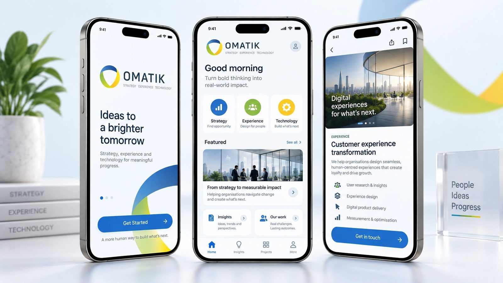
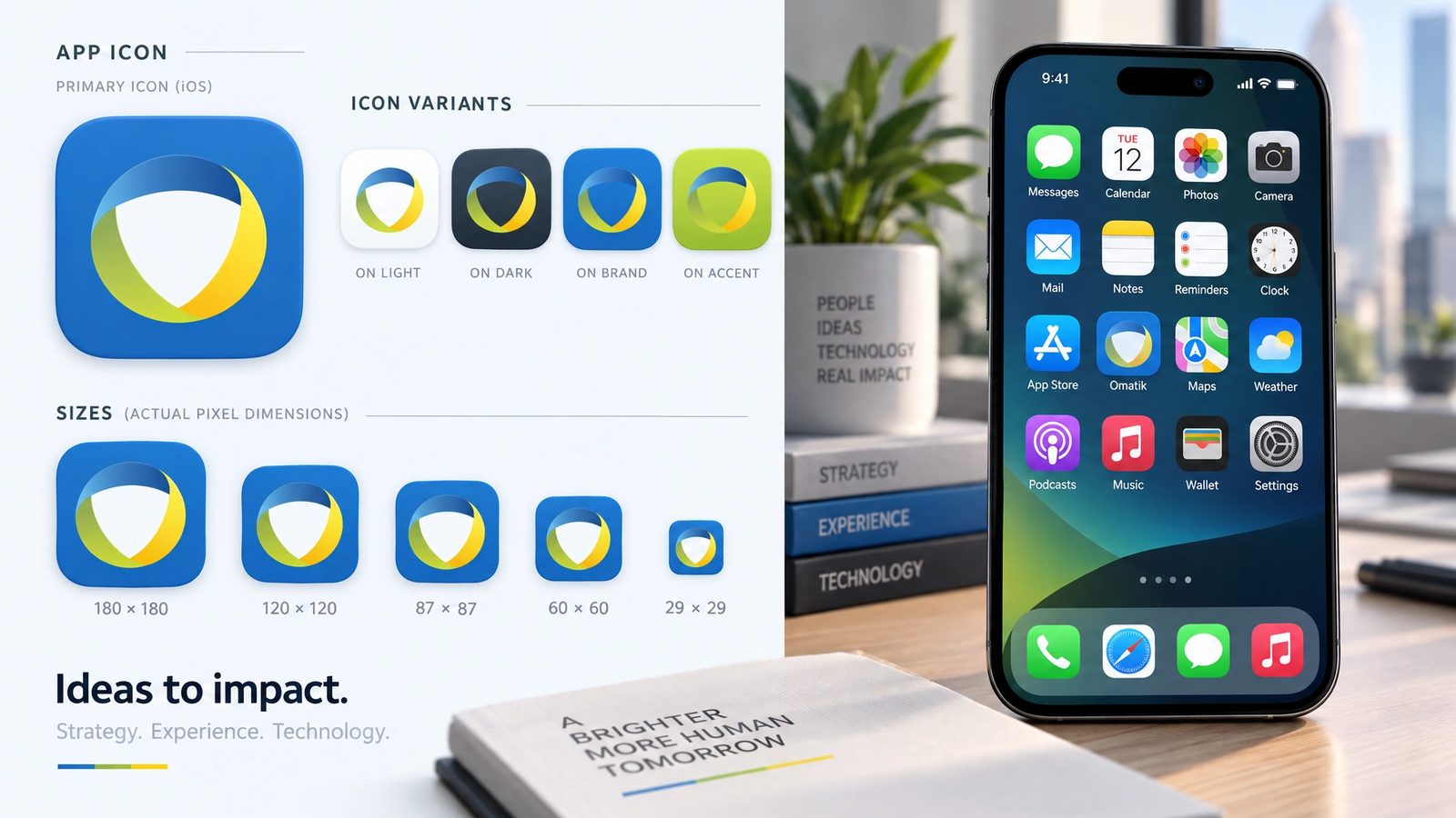
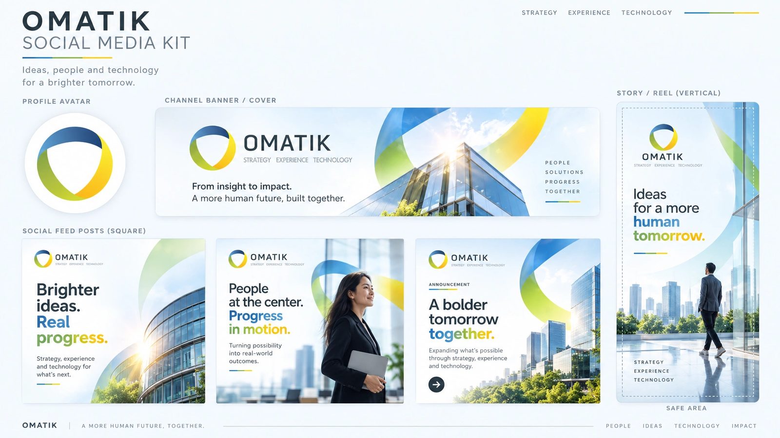
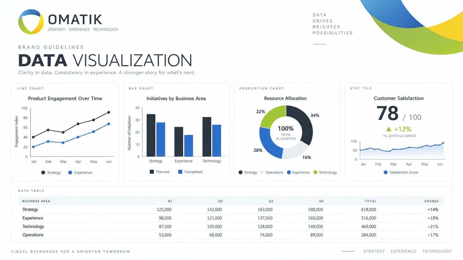
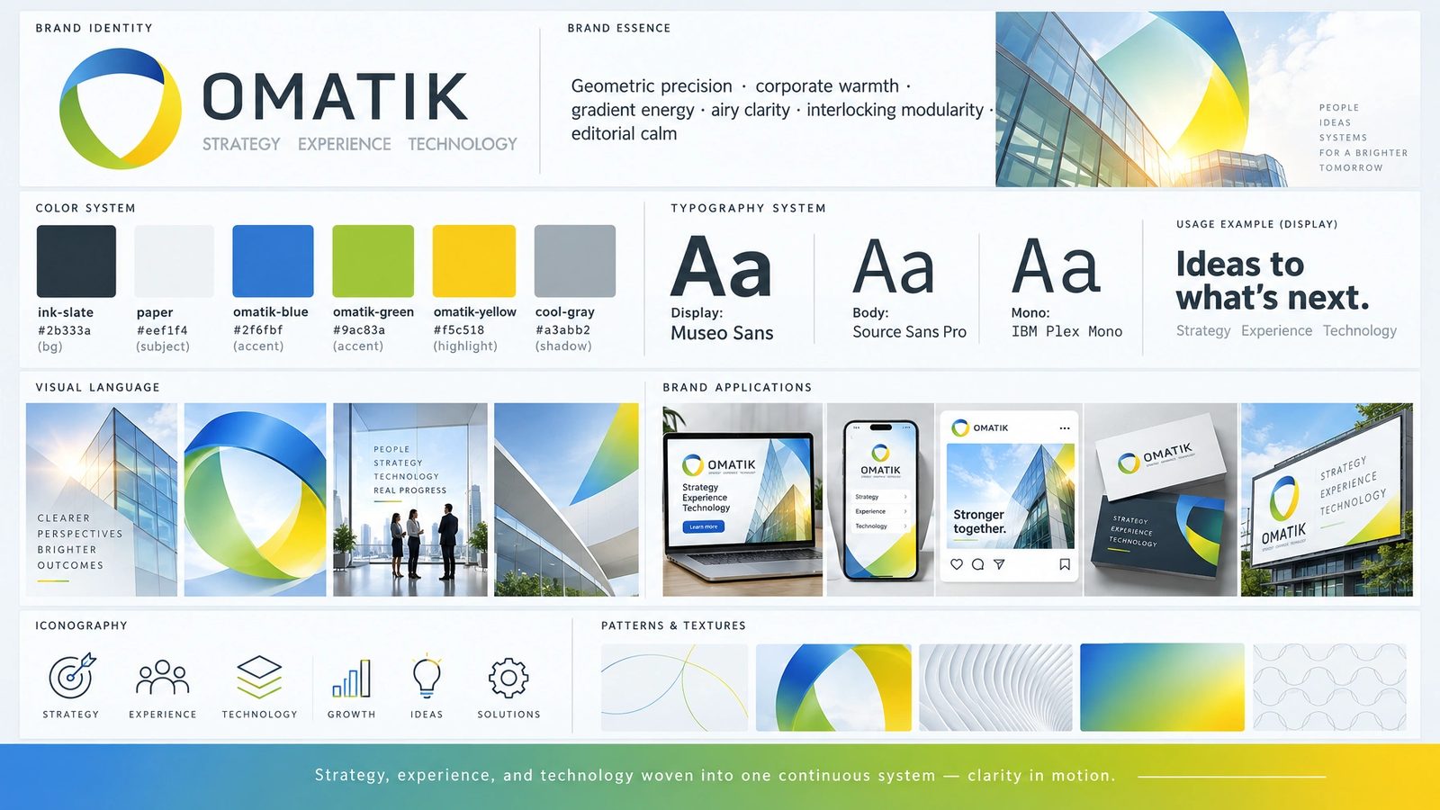
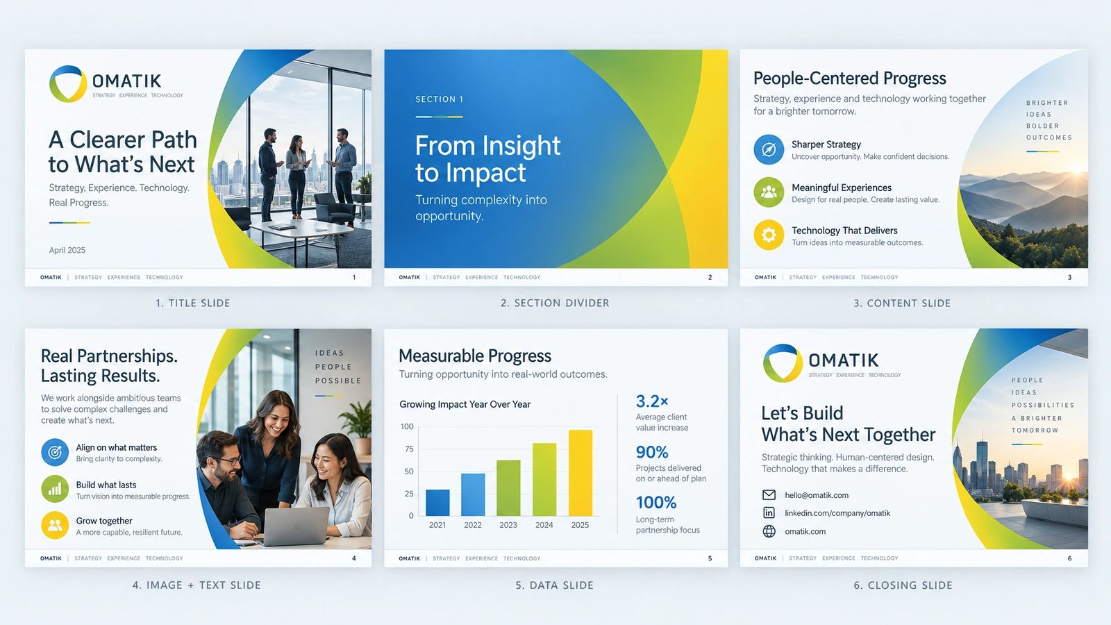
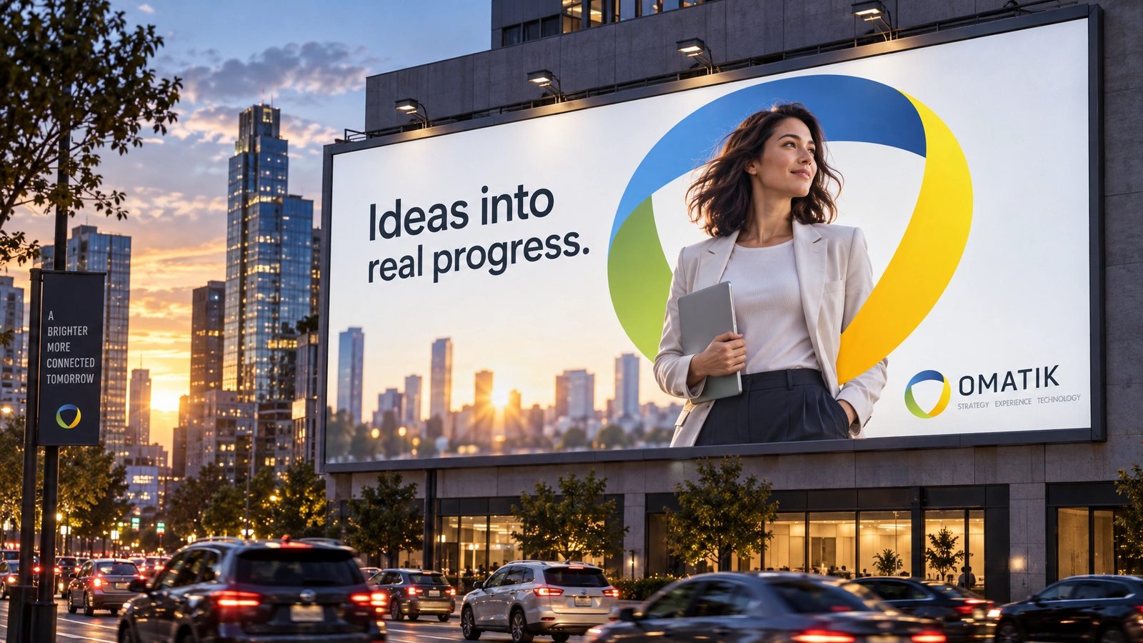
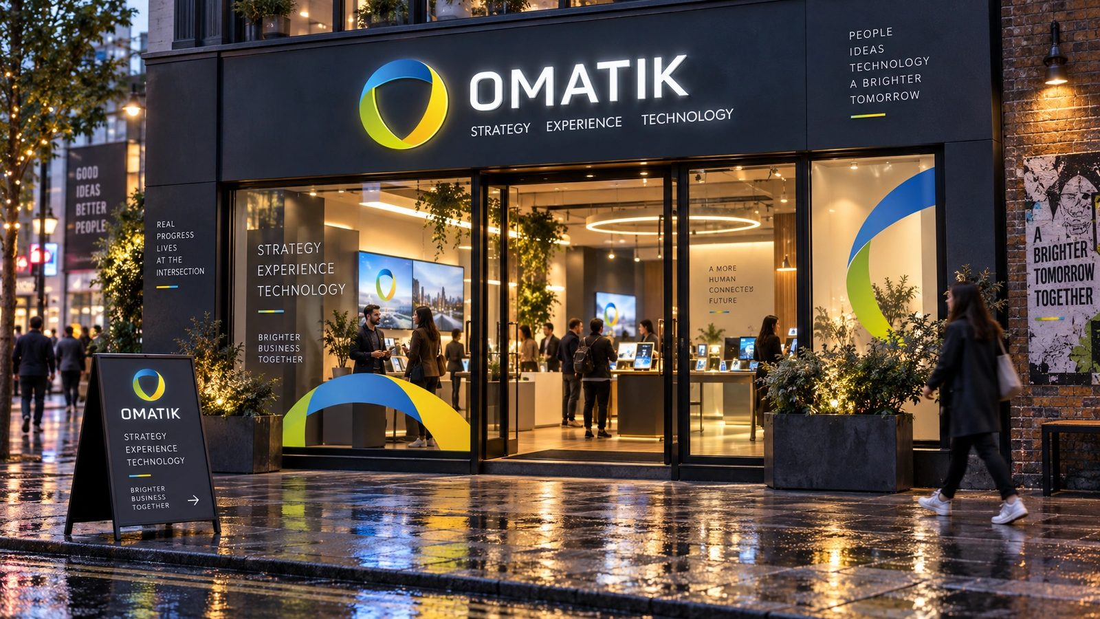
The mark, concepts and cards are the design. The brand world is a 2026 study made with my own tool from them, not work delivered to the client.
Strategy, experience and technology, woven into one continuous system.
Omatik, the brand line
Role
Levid Media for the identity. Northlit in 2026 for the brand world.
Creative direction
Founder and creative director at Levid Media, the agency that took the brief.
Identity
Mark exploration, the ribbon shield, the wordmark and lockup, and cards in light and dark, designed end to end.
Brand DNA
Extracted from the identity in Northlit and locked: palette with roles, display and body type, imagery rules, anti-defaults.
Twenty surfaces
Palette, type, icons, rules, logo system, cards, stationery, packaging, merch, social kit, data visualisation, a presentation, web, app and app icon, guidelines, billboard and signage.
- Logo design
- Brand identity
- Consultancy branding
- Brand DNA extraction
- Northlit
Next
The identity lives in the archive with the rest of the agency years.
Browse the archive →