 ISAAC WOOTEN

Game Boy Micro
Nintendo of America, 2005. A product site for the smallest Game Boy, built around one idea: show how small it is, and the brand world that idea implied.
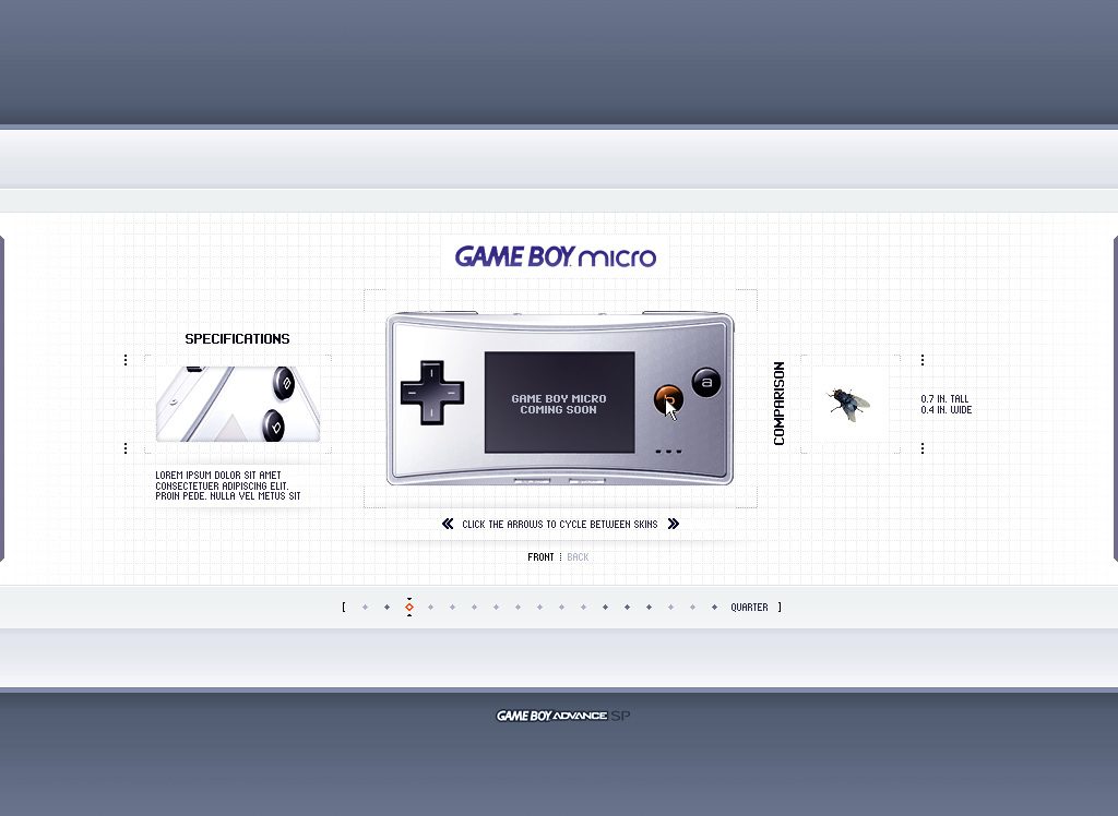
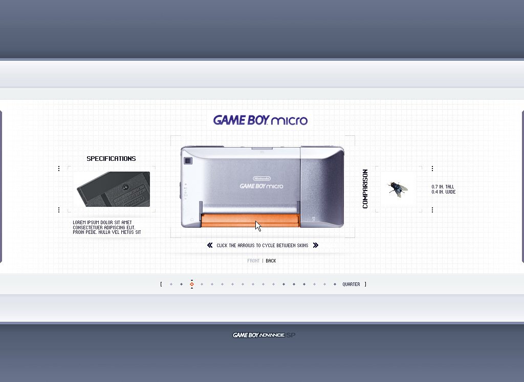
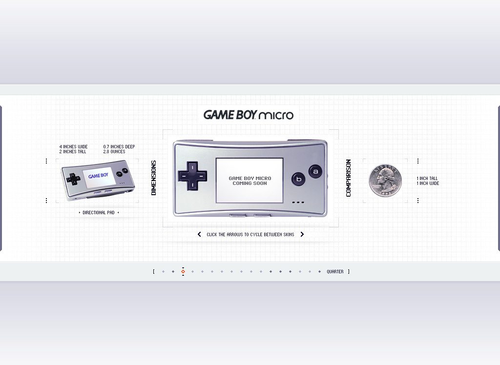
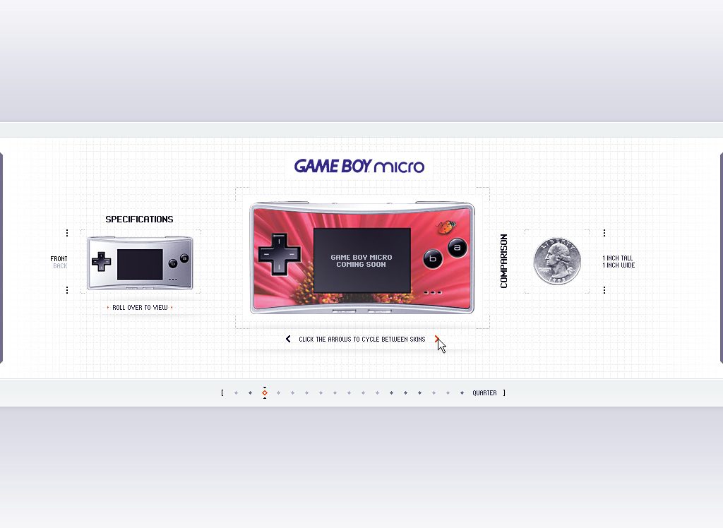
A product you had to see to believe, shown at actual size. The Game Boy Micro was a Game Boy Advance shrunk to four inches wide. I designed its product site, which went live for the launch, as an online technical designer on Nintendo of America’s Online Publications team: the device in brushed silver on a faint grid, skins you cycle with arrows, front and back, specifications, and a comparison panel that sets it beside a quarter and a fly. These screens were captured before launch, while it still said Coming Soon. In 2026 I extracted the site’s DNA and rendered the brand world it implied.
The brief
When the product is the smallest thing on the page, make size the story.
Photographs flatter a small device; they can’t tell you it fits in a coin pocket. So the page is a precise stage rather than a lifestyle shot: the Micro rendered large and clean at the centre, an instrument-panel frame of dotted crop marks around it, specifications on one side and a comparison on the other, where it sits next to a quarter or a housefly. A dotted scale along the bottom steps through the comparisons, and arrows cycle the faceplates, silver to graphite to a red floral skin, because the swappable face was the product’s personality.
Size as the story
A quarter, a fly and exact dimensions do what adjectives can’t: 4 inches wide, 2 tall, 2.8 ounces.
Skins you cycle
Arrows swap the faceplate in place, so the device’s expressive surface is the interaction.
Front and back
A toggle turns the Micro over to show the cartridge slot and the Nintendo mark on the brushed rear.
Blueprint clarity
Platinum and slate, an indigo wordmark, graph-paper grids and crop marks: catalogue-grade, nothing extra.
The site
Brand system
The Game Boy Micro identity is Nintendo’s. What interested me was how much brand the site implied, so I started from these screens and the wordmark: platinum and brushed silver, micro indigo and graphite with a signal-orange highlight, clean studio renders, grids and crop marks, and the scale comparison as a signature motif, extracted and locked as brand DNA. Then every surface was rendered from that source: palette, type, icons, logo system, cards, stationery, packaging, merch, social, data, a presentation, product UI, out of home, and the brand world itself. Tap any tile to open it.
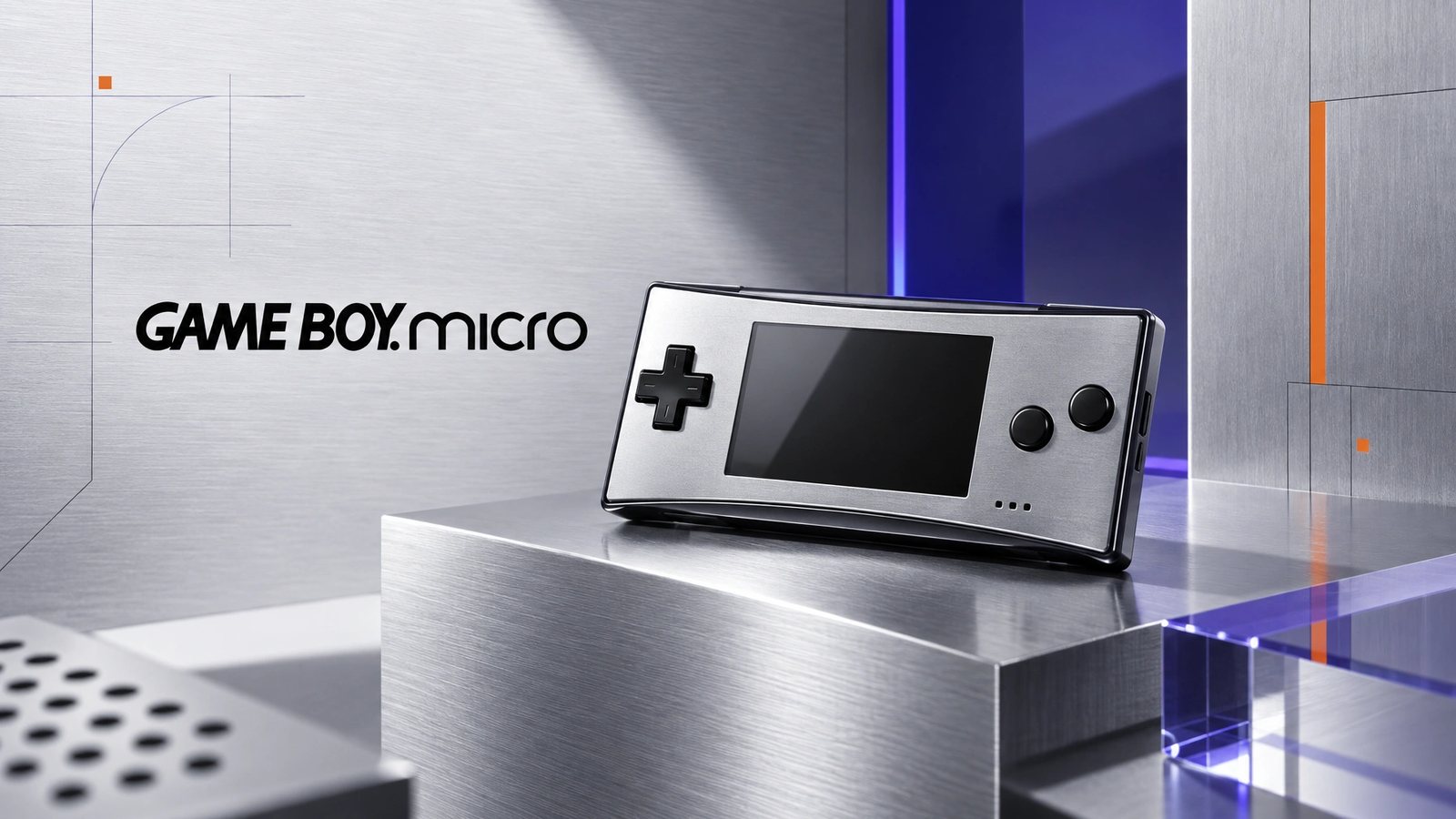 Brand world · rendered from the locked brand DNA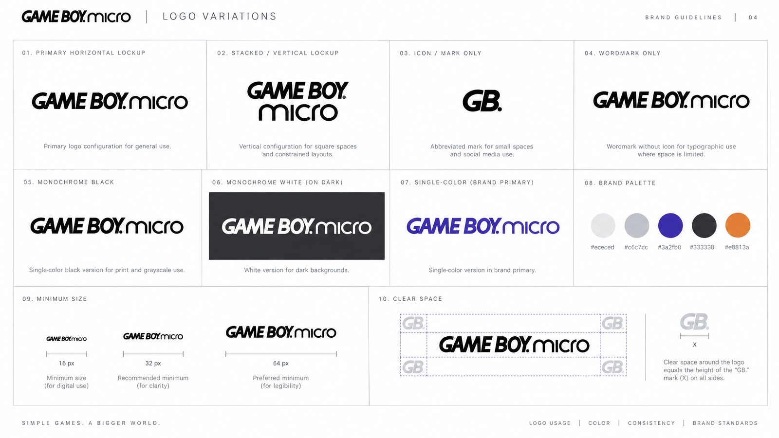
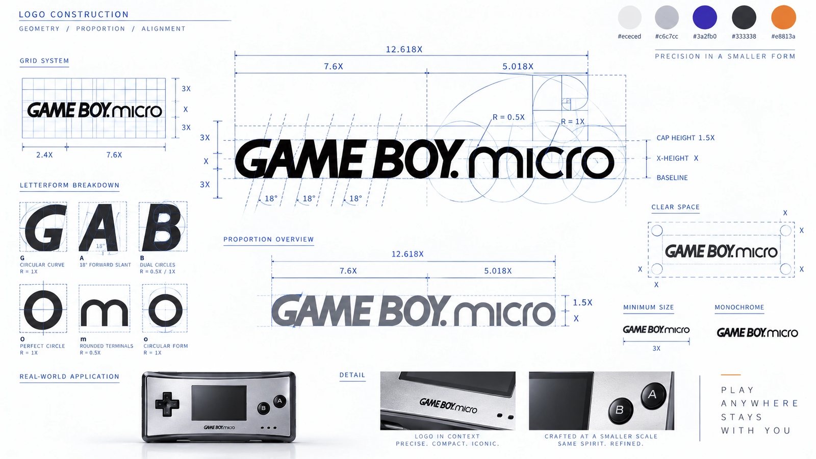
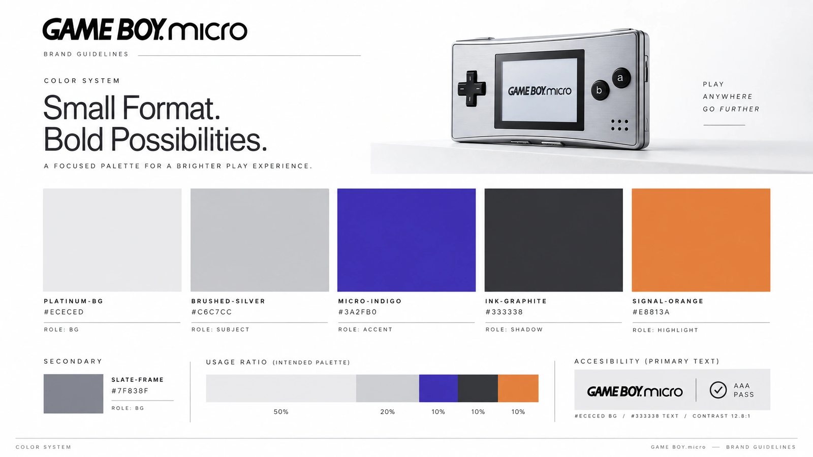
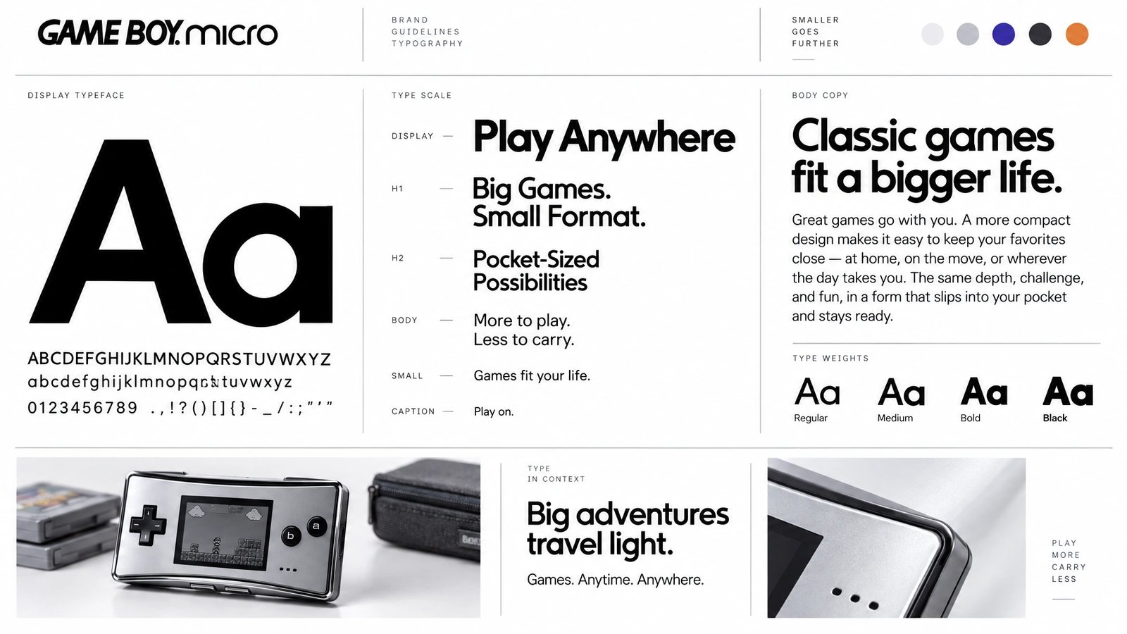
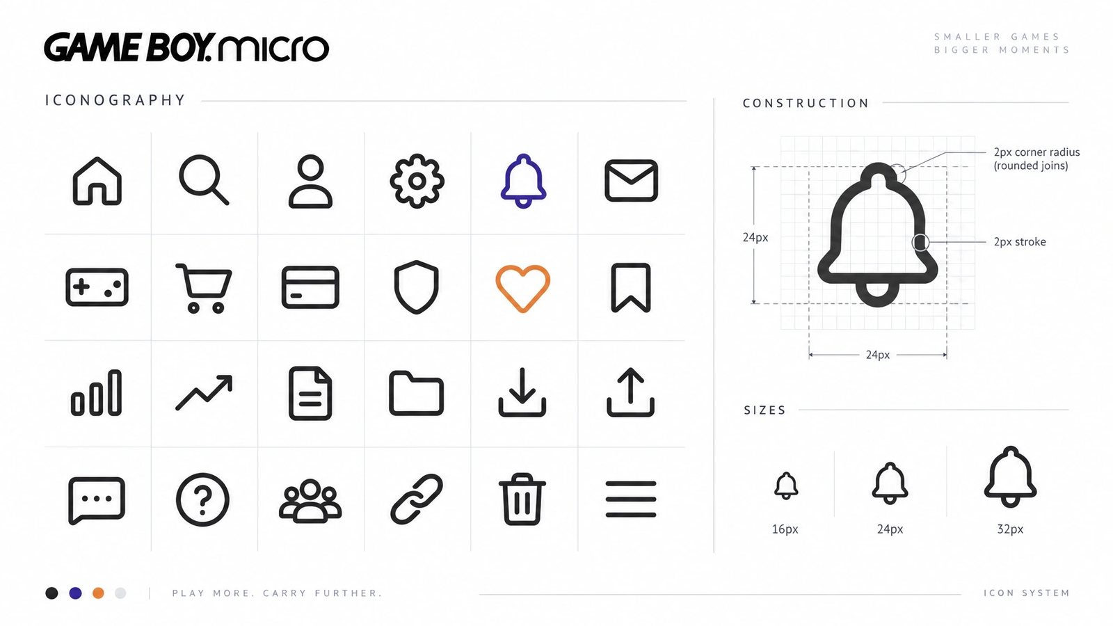
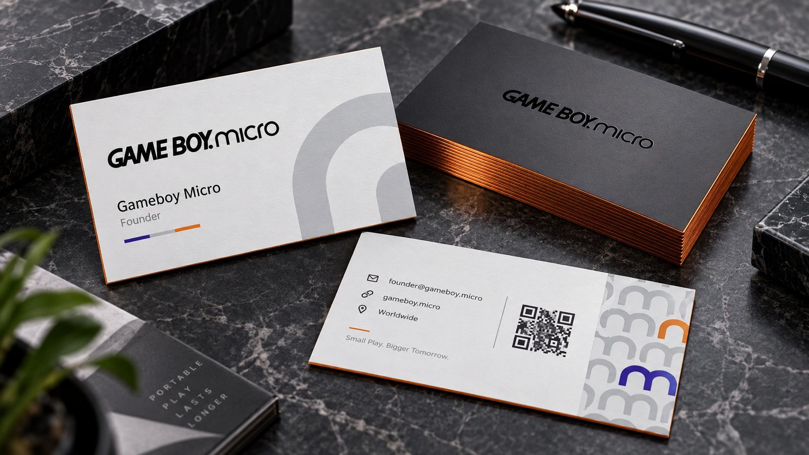
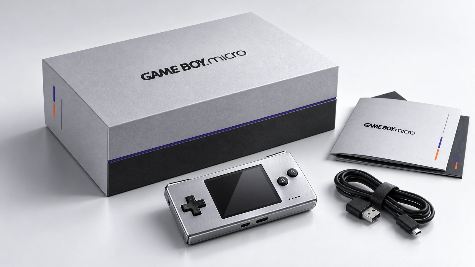
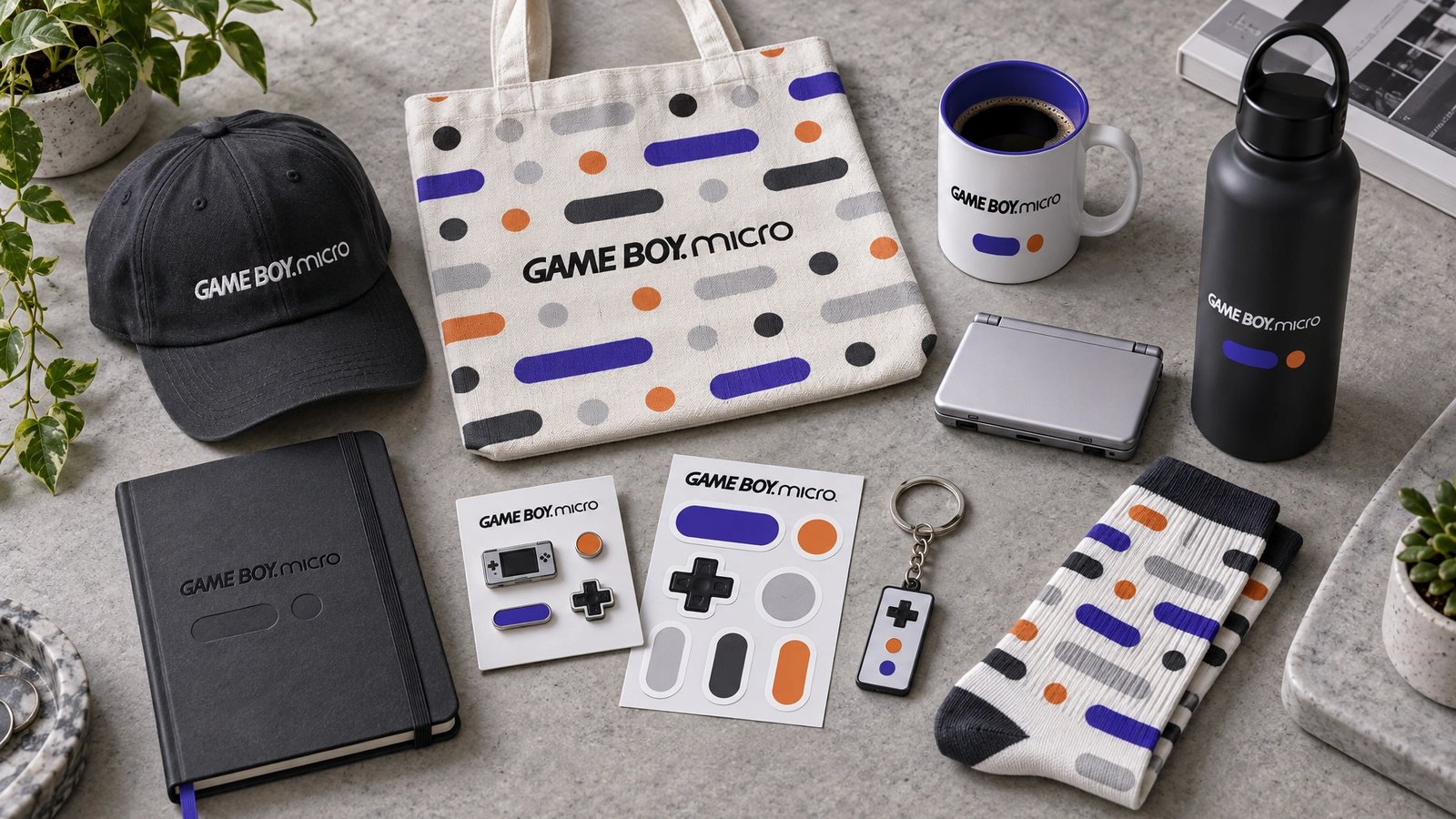
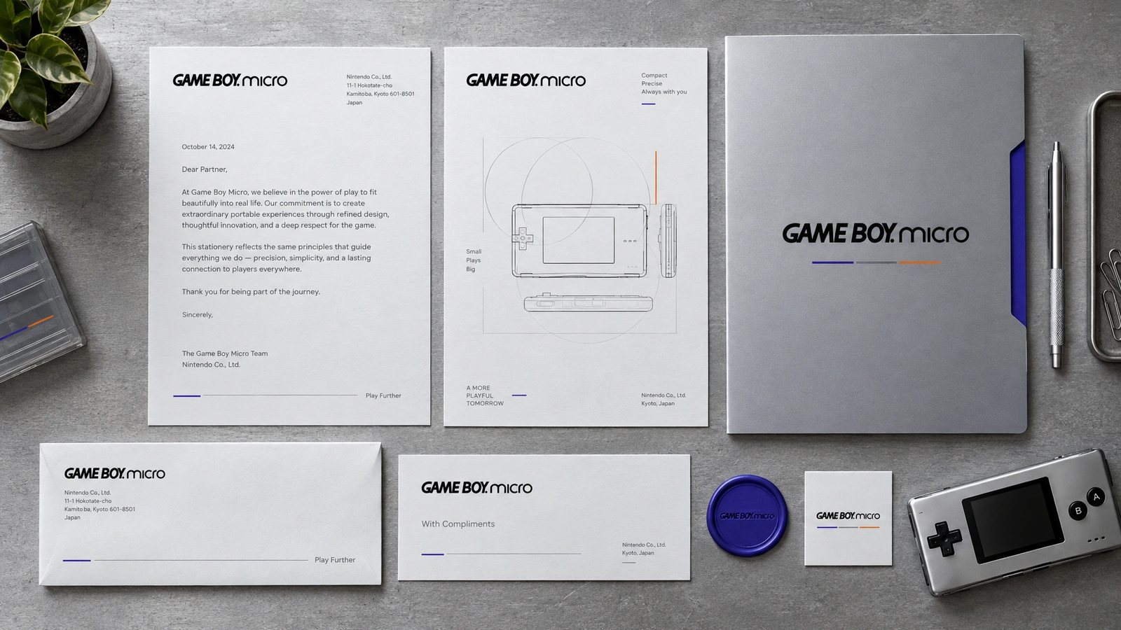
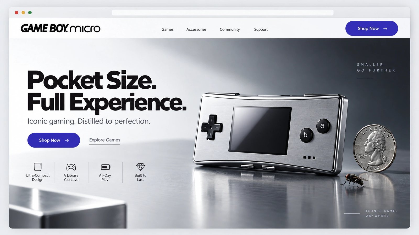
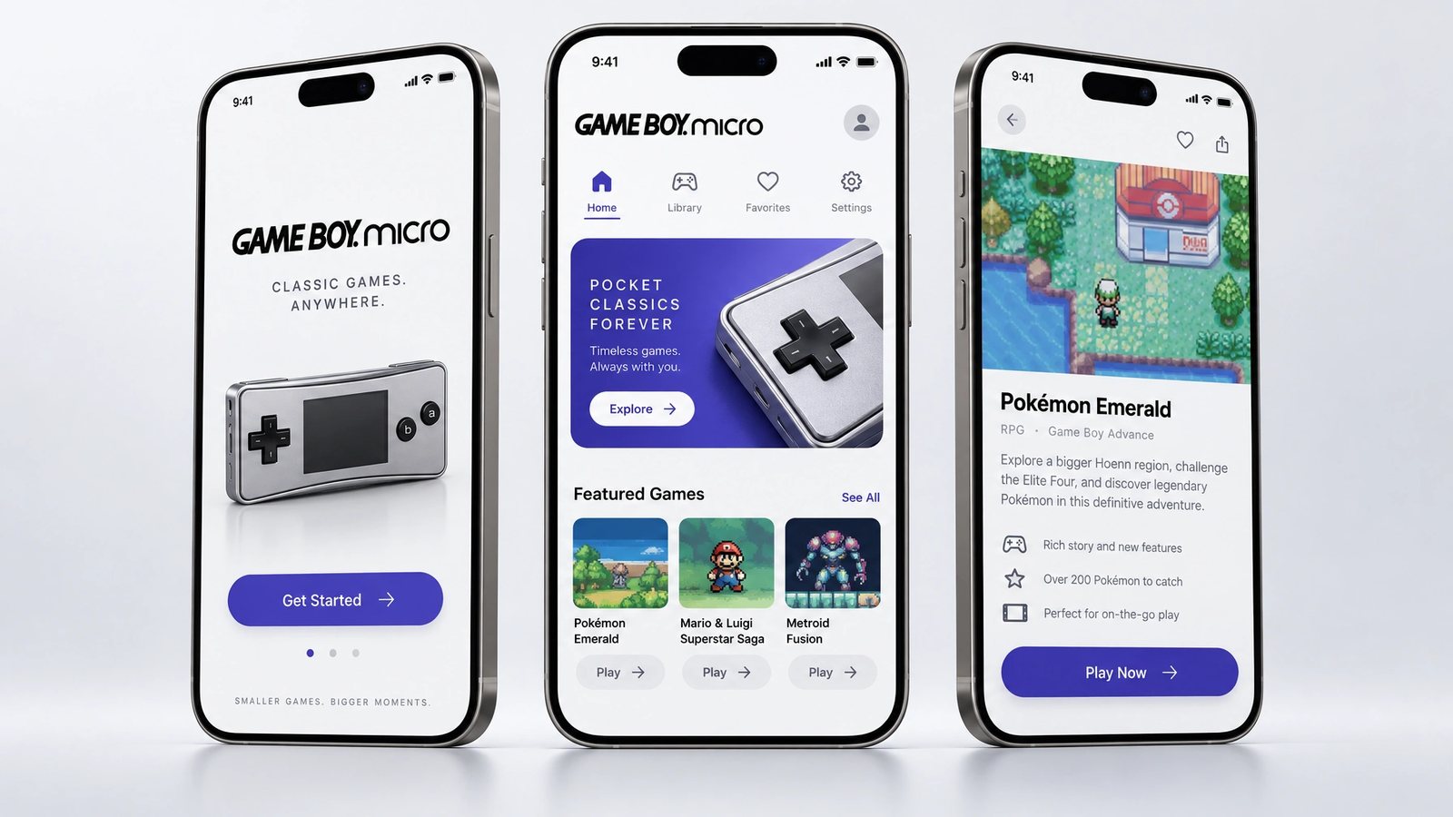
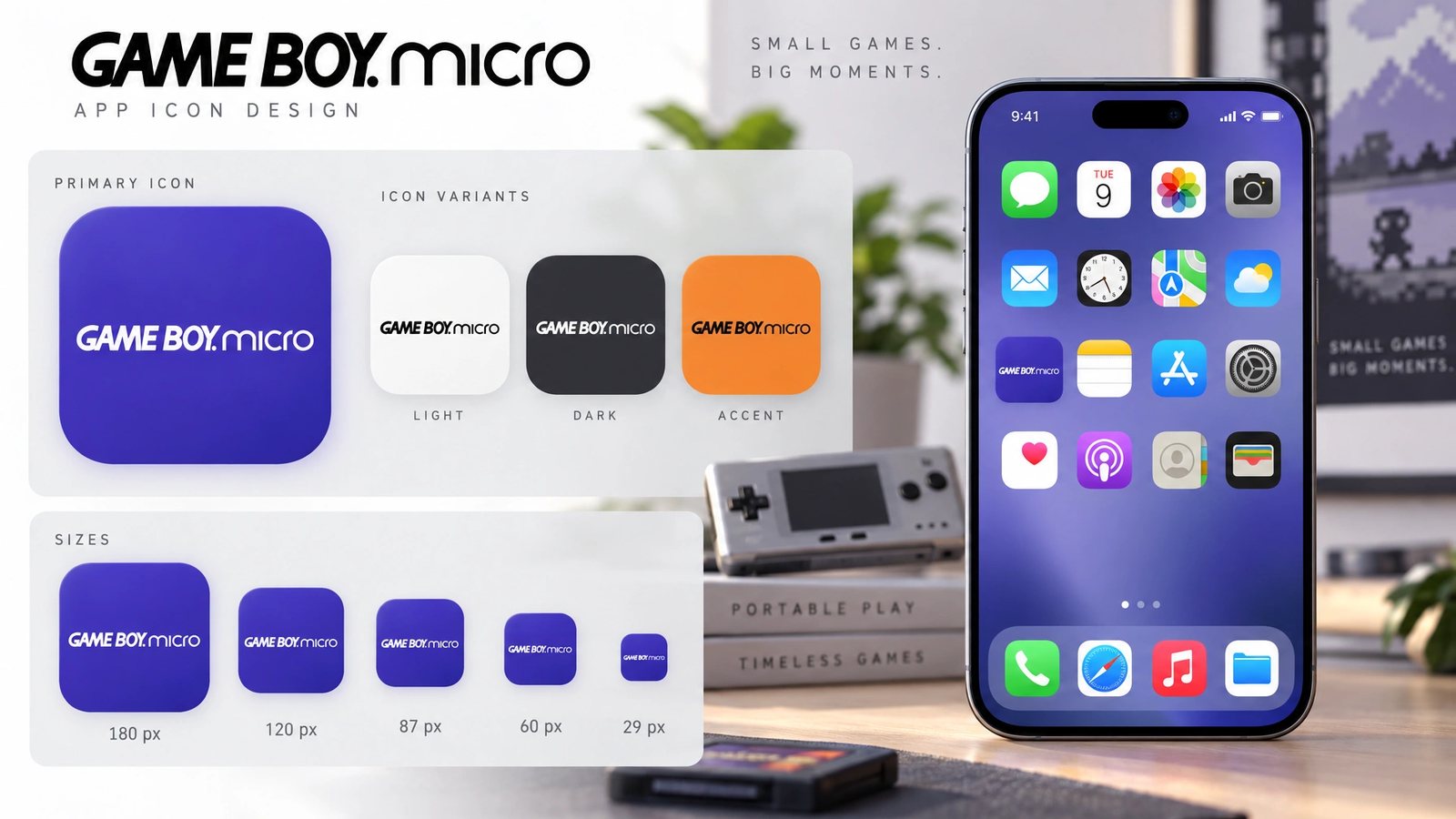
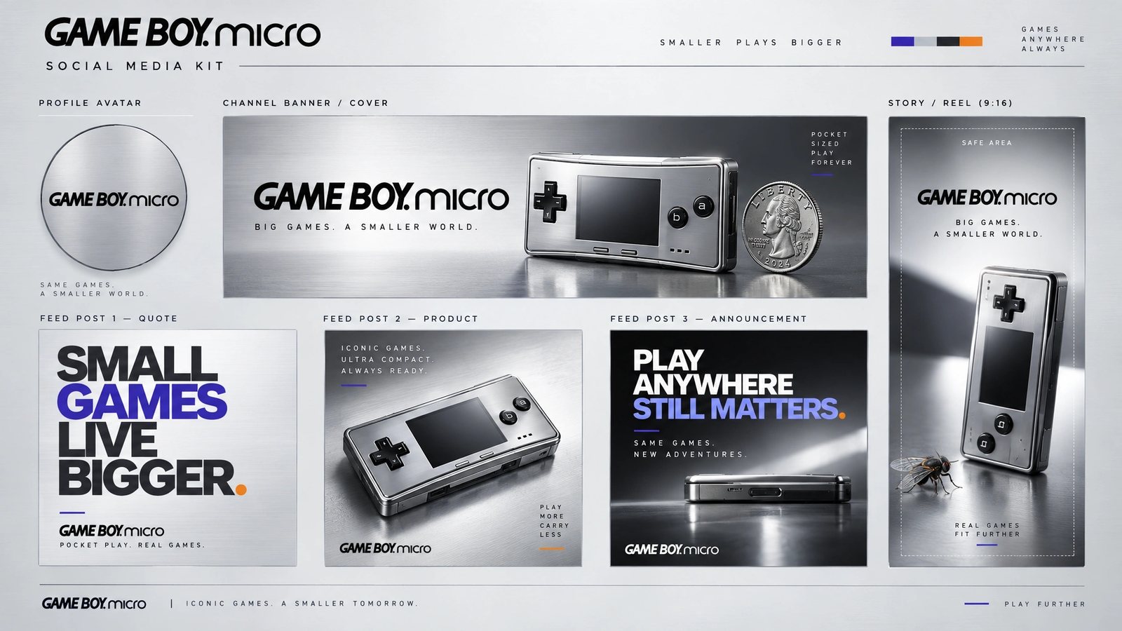
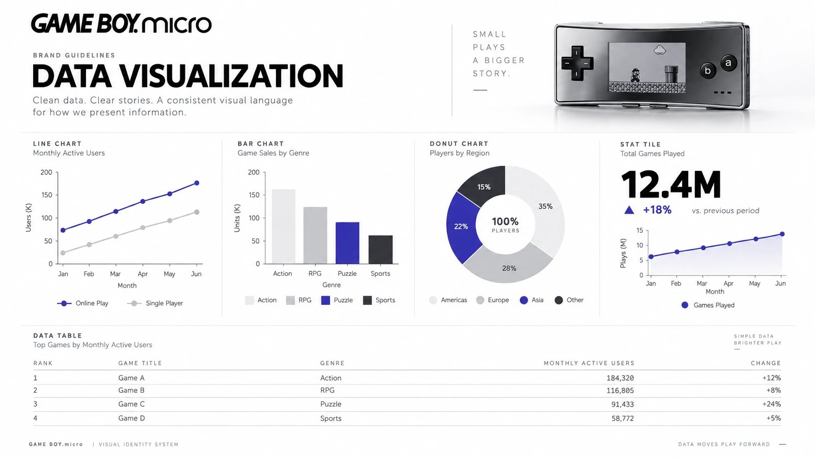
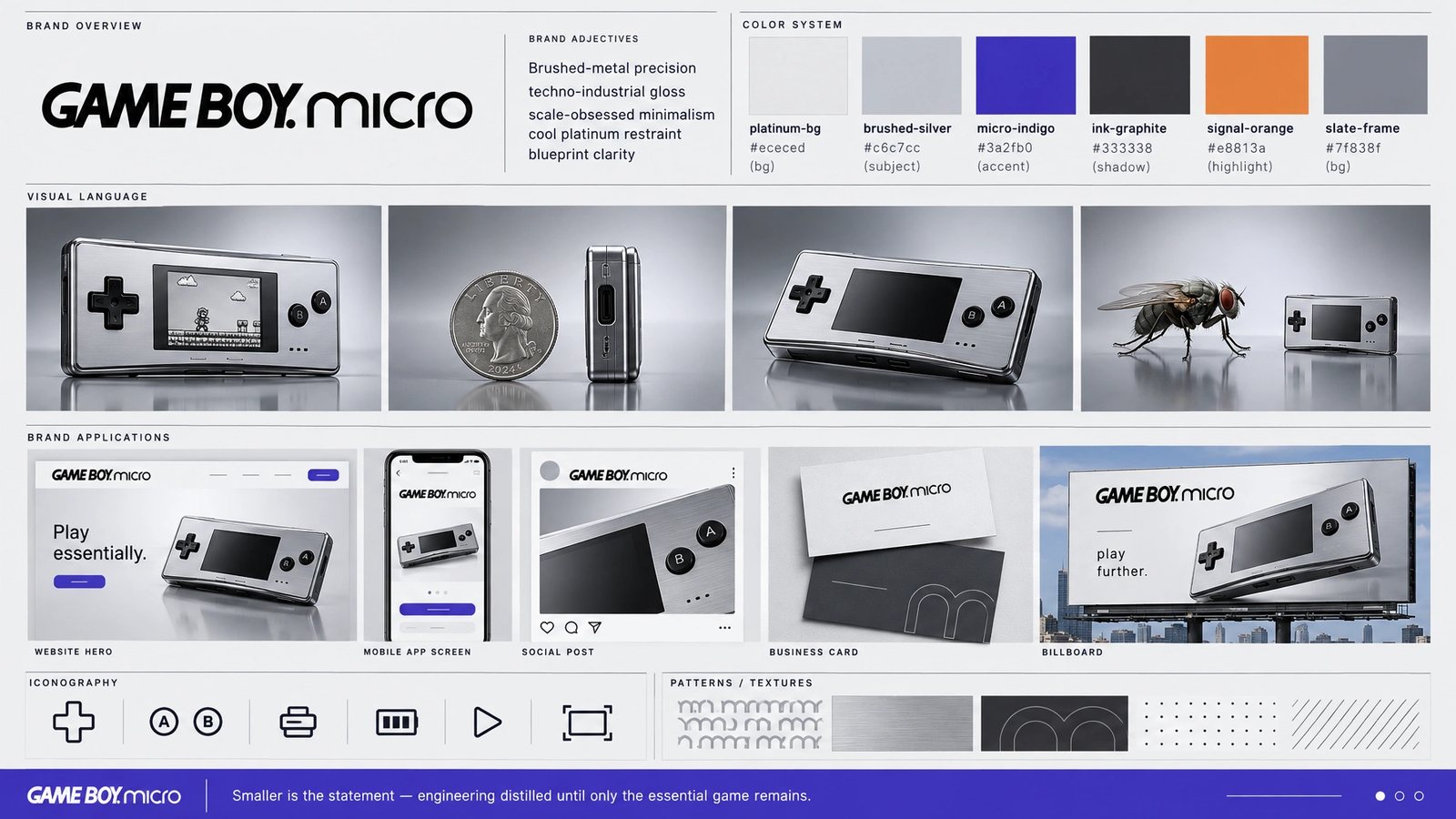
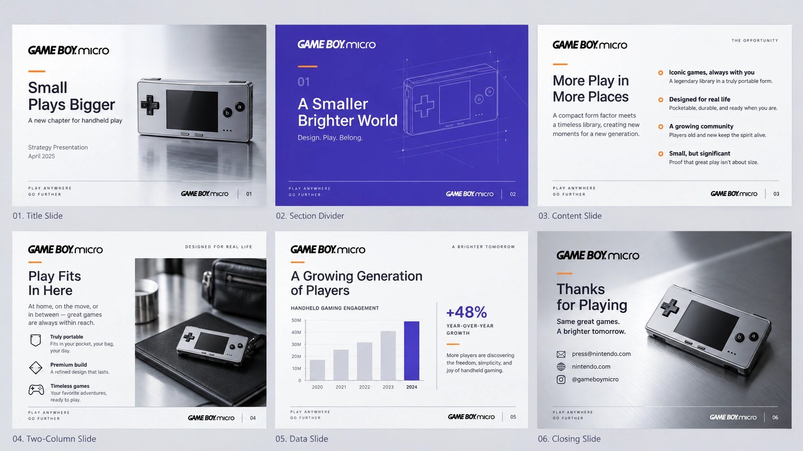
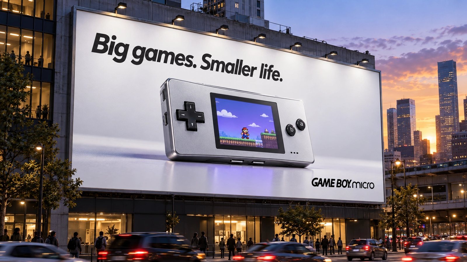
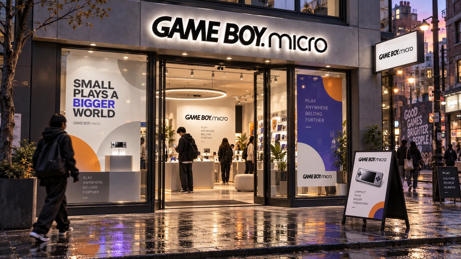
The Game Boy Micro name, logo and product belong to Nintendo. The site above is my design work; the brand world is a 2026 study made with my own tool from them, not work for Nintendo.
Smaller is the statement.
Game Boy Micro, the brand DNA
Role
Nintendo of America for the site. A 2026 study for the brand world.
Online Publications
Online technical designer and Flash developer at Nintendo of America, 2005 to 2007, on Nintendo.com, Wii.com and NintendoWifi.com.
Product-site design
The layout, the scale comparisons, the skin cycler and the front and back views, designed for the launch and taken live.
Brand DNA
Extracted from the site and locked: palette with roles, type, imagery rules, anti-defaults.
Nineteen surfaces
Palette, type, icons, logo system, cards, stationery, packaging, merch, social kit, data visualisation, a presentation, web, app and app icon, guidelines, billboard and storefront.
- Web design
- Interaction design
- Flash
- Product launch
- Brand DNA extraction
- Brand systems
Next
The site lives in the archive with the rest of the Nintendo years.
Browse the archive →