 ISAAC WOOTEN
RED Digital Cinema
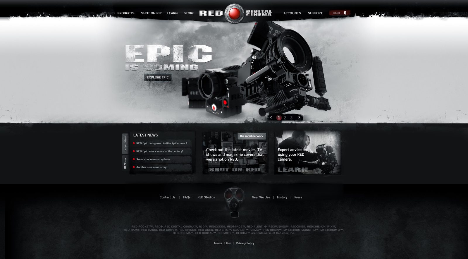
RED Digital Cinema, 2008. A new direction for red.com, a camera configurator and the first look of the 2009 cameras, and the brand world they implied.
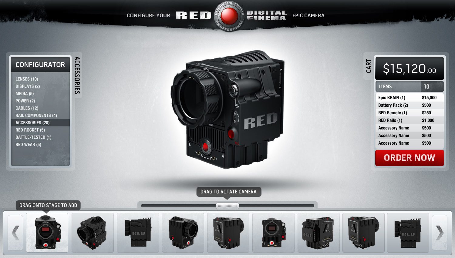
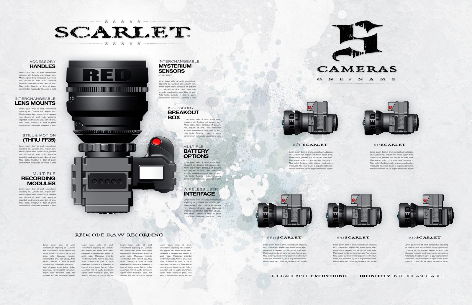
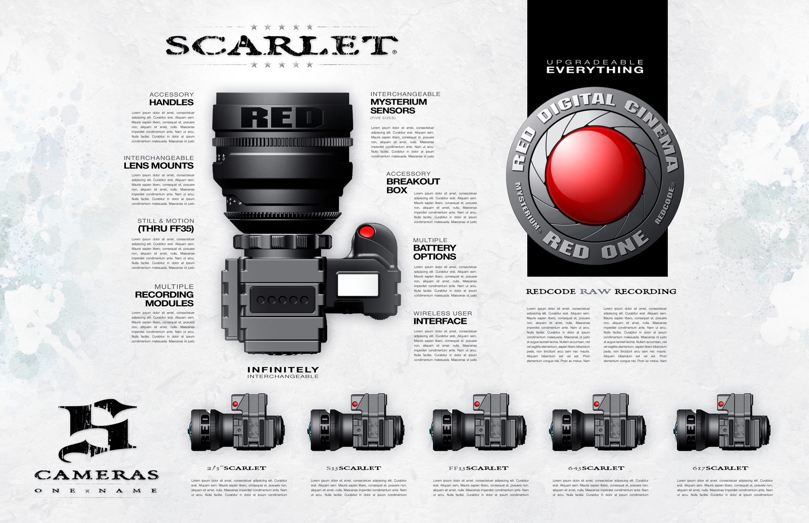
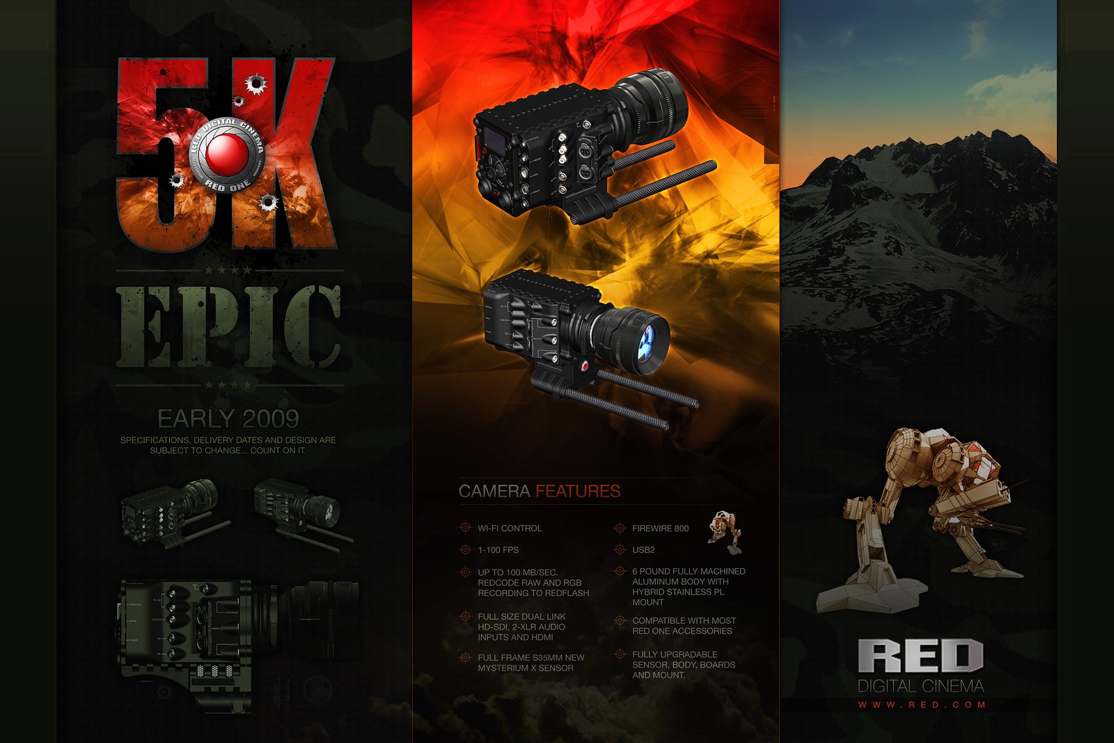
A camera company that talked like a film crew. RED was taking on 35mm film with digital cameras, and red.com was where filmmakers came for the news, the specs and the order button. In 2008 I joined as a senior web designer and developer: I kicked off the new direction for red.com, built the PHP framework behind version 2.0, and did concept and brand work for the 2009 cameras, Scarlet and EPIC, including a configurator where you build a camera by dragging parts onto it. In 2026 I extracted the work’s DNA and rendered the brand world it implied.
The brief
Make the product feel machined, and let the people who use it feel at home.
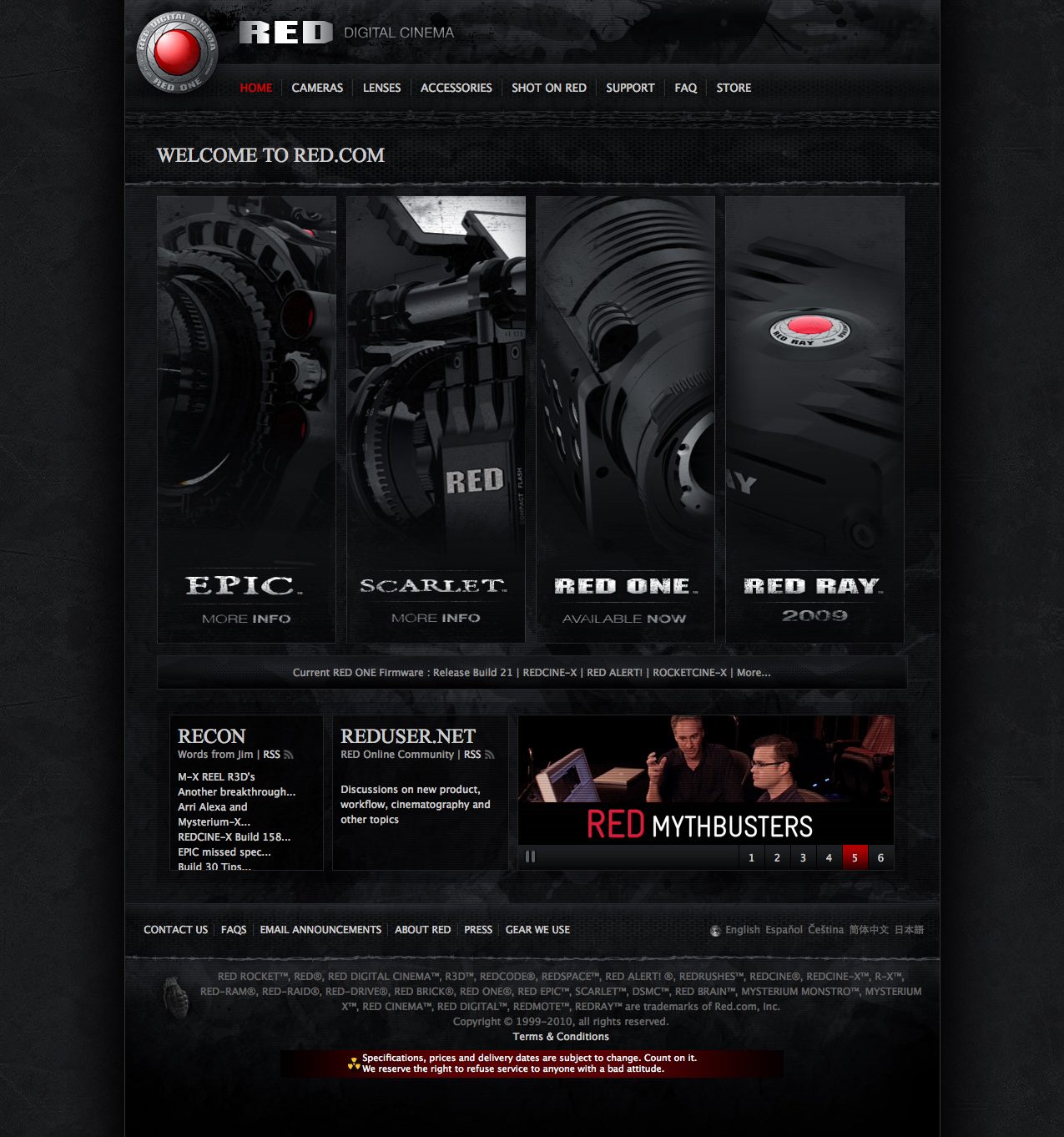
RED’s audience was cinematographers, and its voice was theirs: blunt, technical and a little defiant, down to the footer that reserved the right to refuse service to anyone with a bad attitude. The site had to hold four cameras, a firmware stream, a founder’s forum posts and a community, without losing the weight of the hardware. The answer was matte black and signal red, grunge and machined-metal texture, the camera always the hero, and type as heavy as the product. For the 2009 line, the same language went modular: Scarlet as five cameras under one name, EPIC as 5K, and a configurator that turned a spec sheet into something you put together.
Black and red
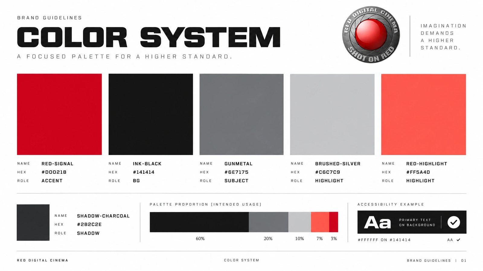
Matte black, gunmetal and one signal red, with the badge’s red lens as the only bright thing on the page.
Machined texture
Brushed metal, concrete and torn edges, so the page feels like the camera body.
Build a camera
The configurator puts the EPIC on a stage and lets you drag lenses, media, power and rails onto it, with the cart adding up beside it.
A new framework
The PHP framework behind red.com 2.0, so the new direction had something to stand on.
The work
Brand system
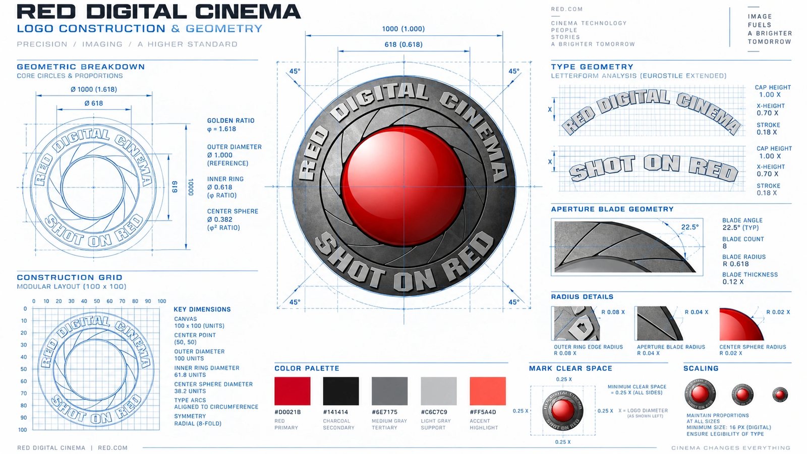
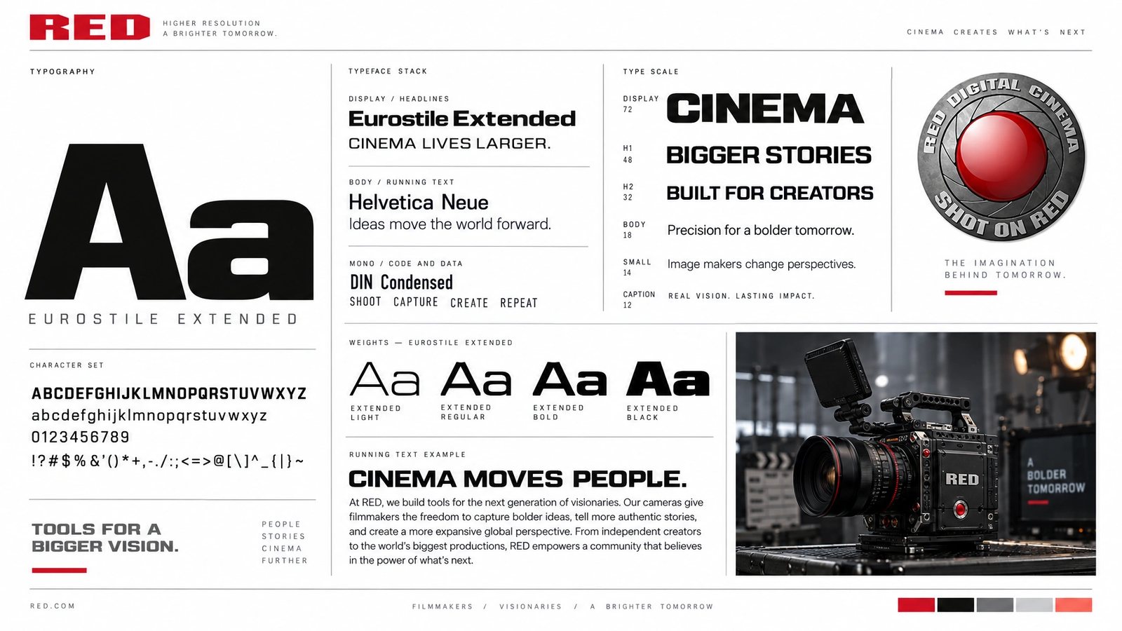
The RED identity is RED’s. What interested me was how much of a system the site and the camera collateral implied, so I started from them and the Shot on RED badge: signal red on ink black, gunmetal and brushed silver, extended industrial display type over a neutral sans, spotlit camera bodies against concrete and smoke, extracted and locked as brand DNA. Then every surface was rendered from that source: the logo system, colour, type, cards, stationery, guidelines, packaging, merch, web, app, social, editorial, out of home, a trade-show booth, and the brand world itself. Tap any tile to open it.
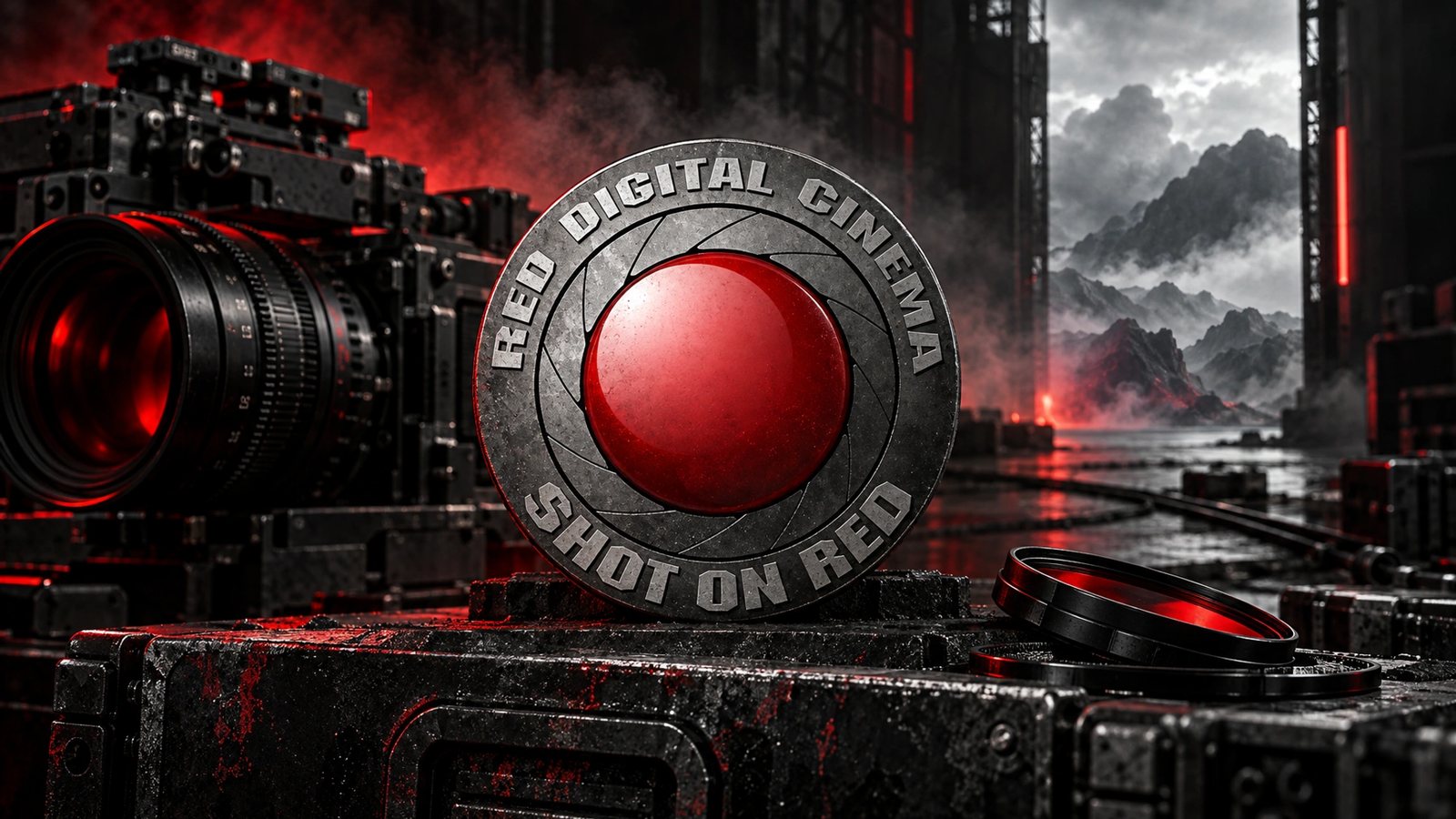 Brand world · rendered from the locked brand DNA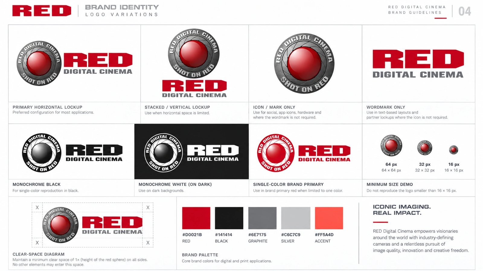
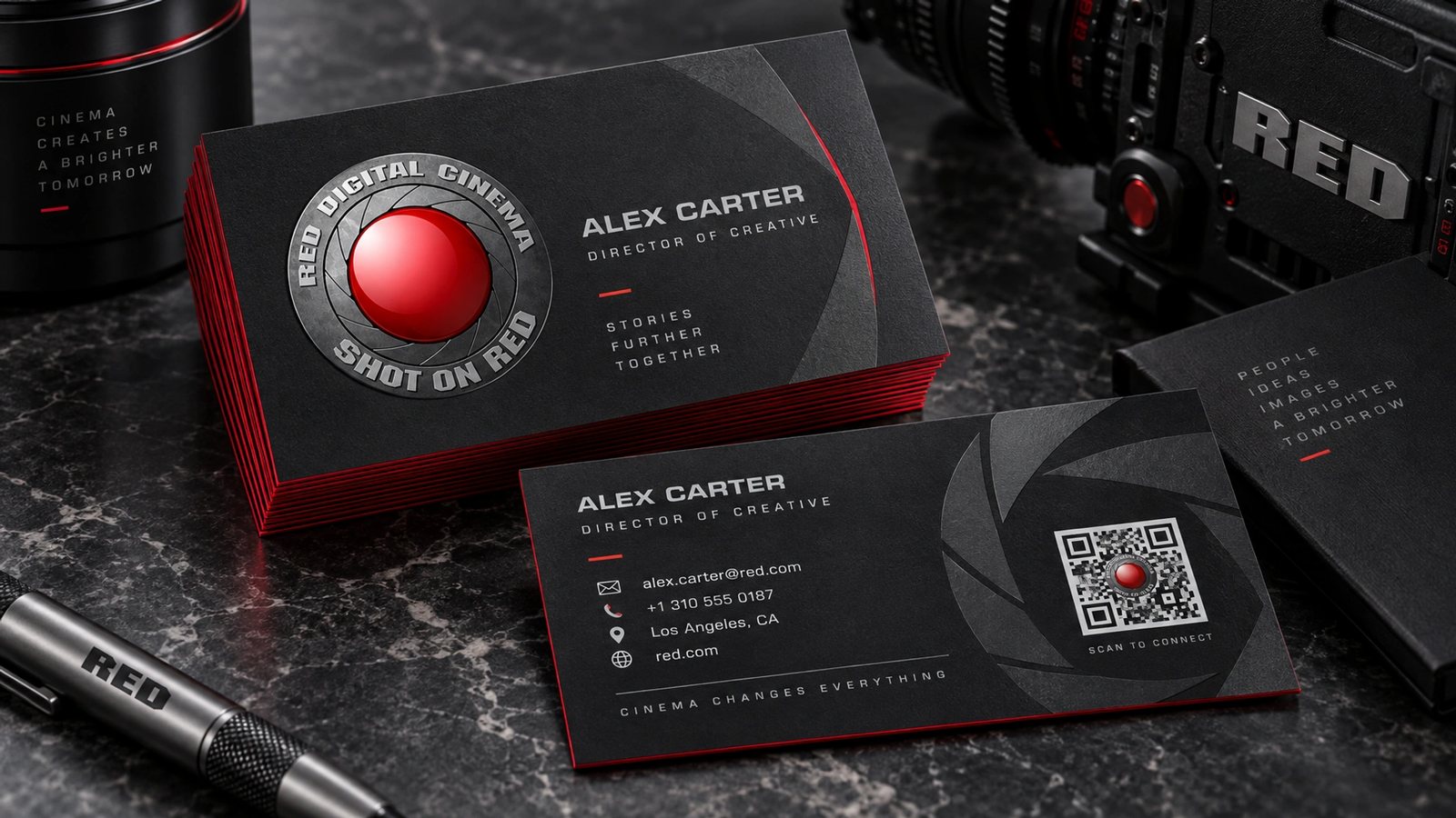
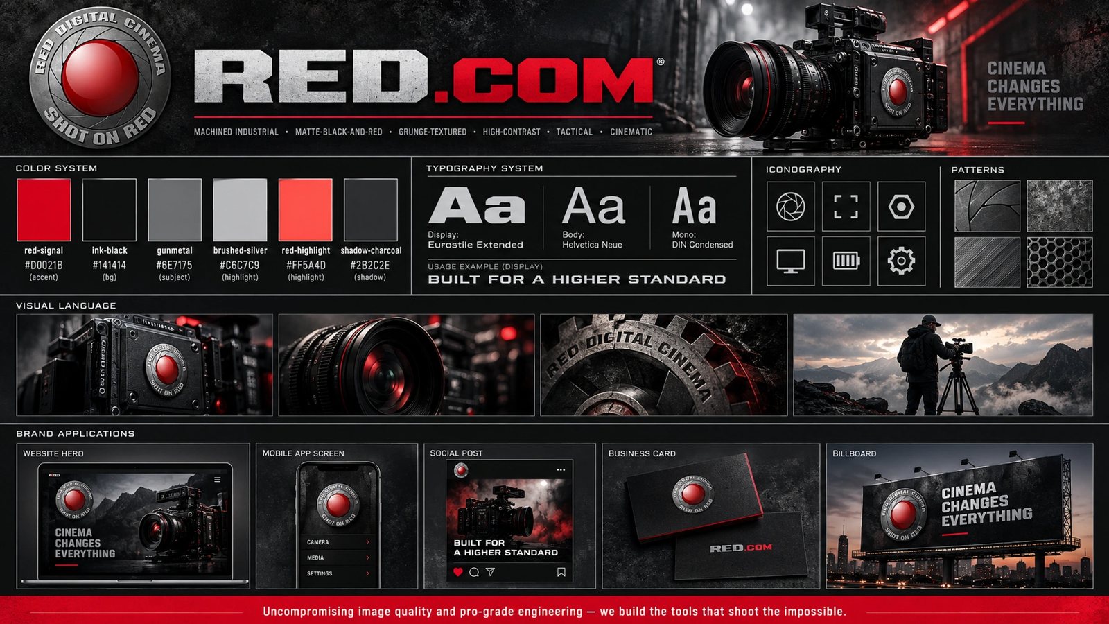
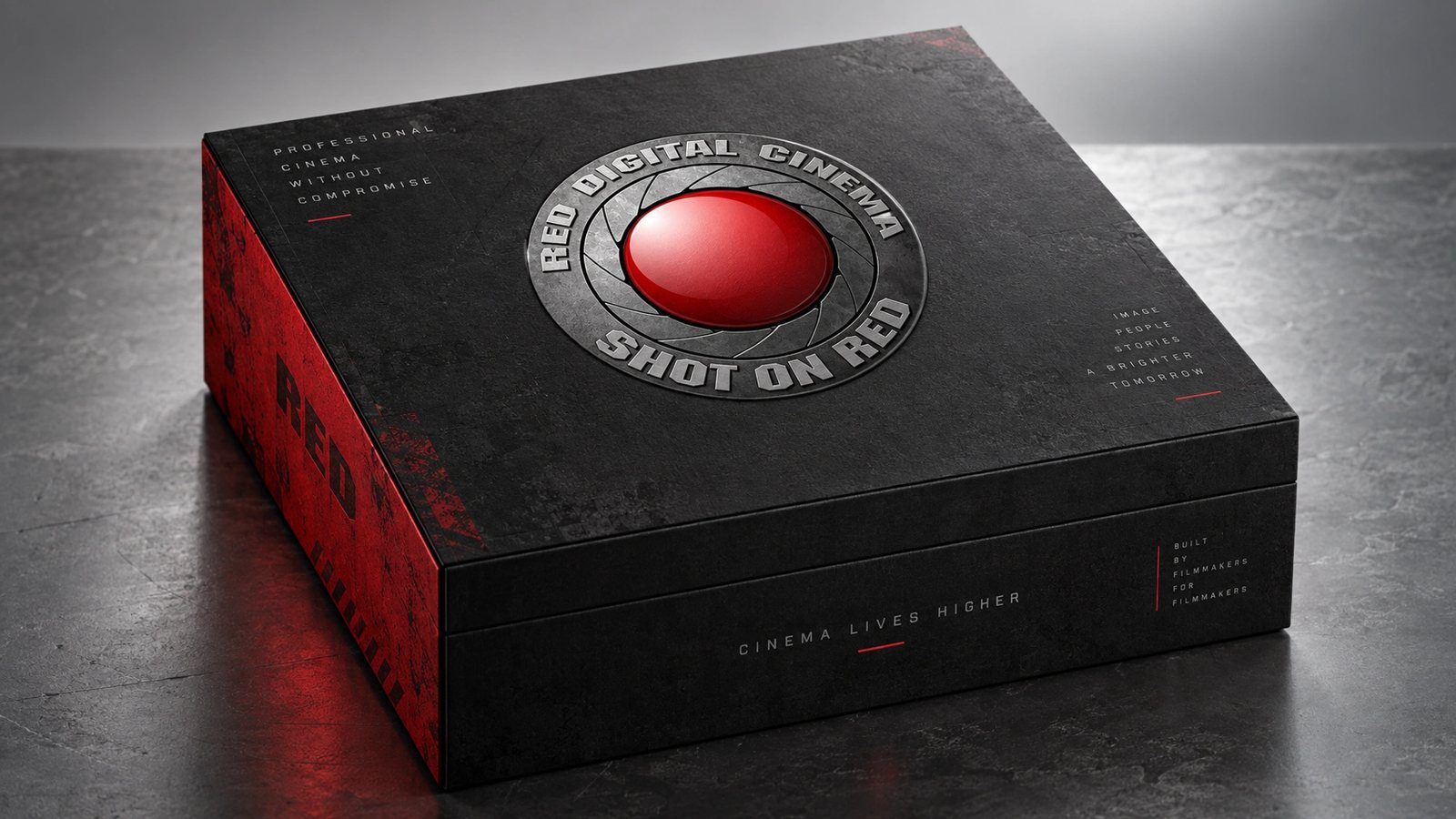
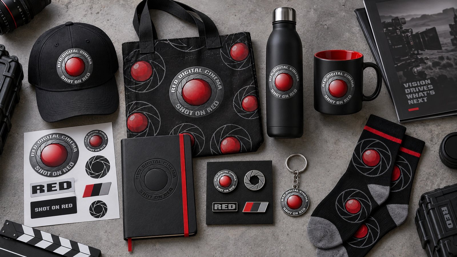
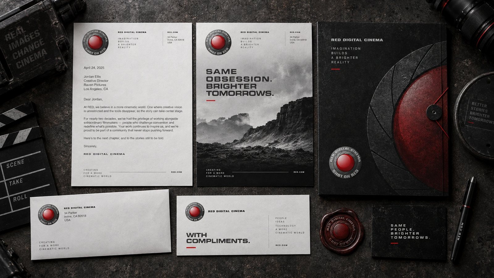
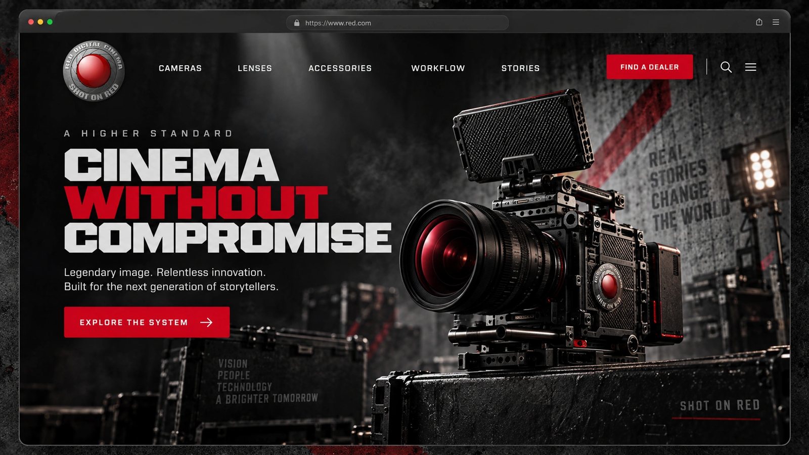
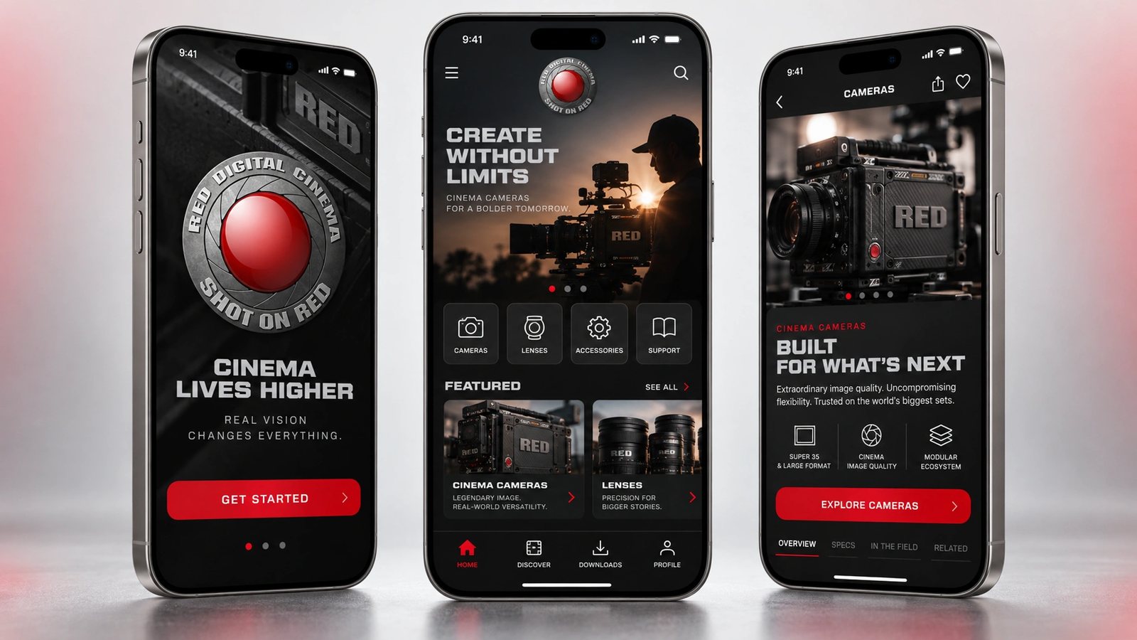
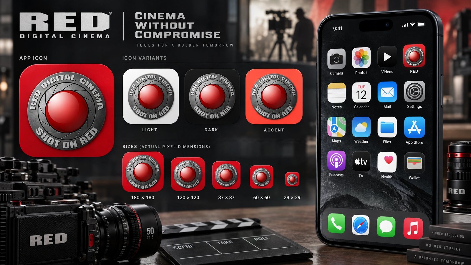
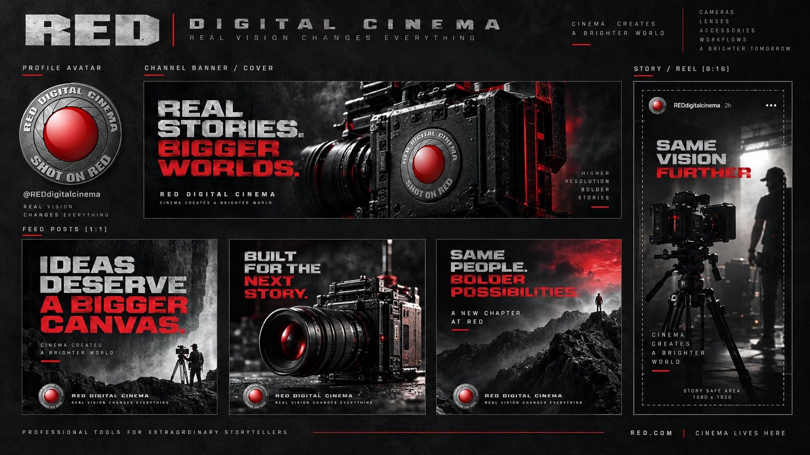
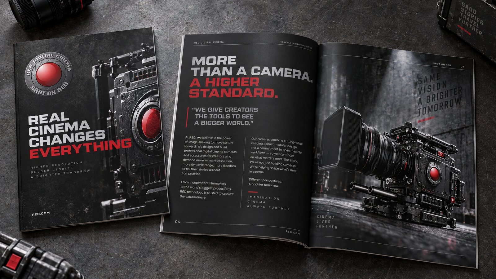
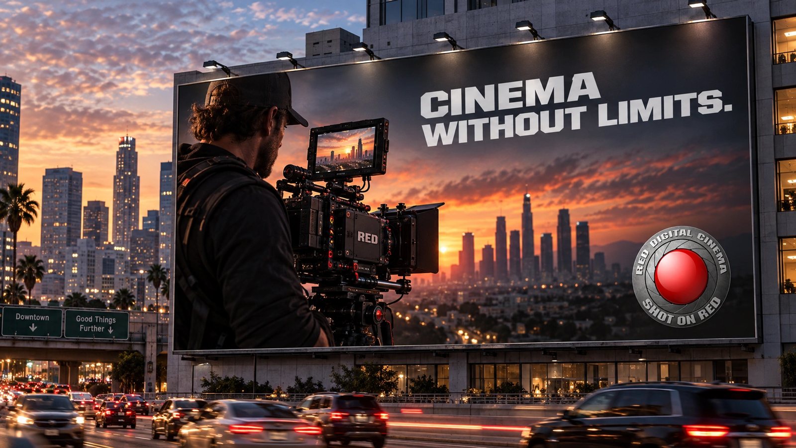
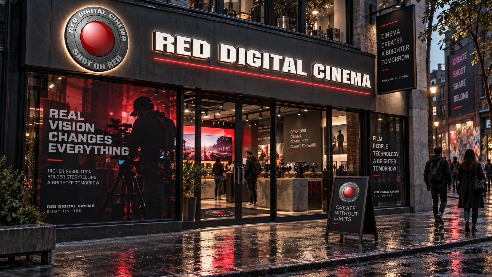
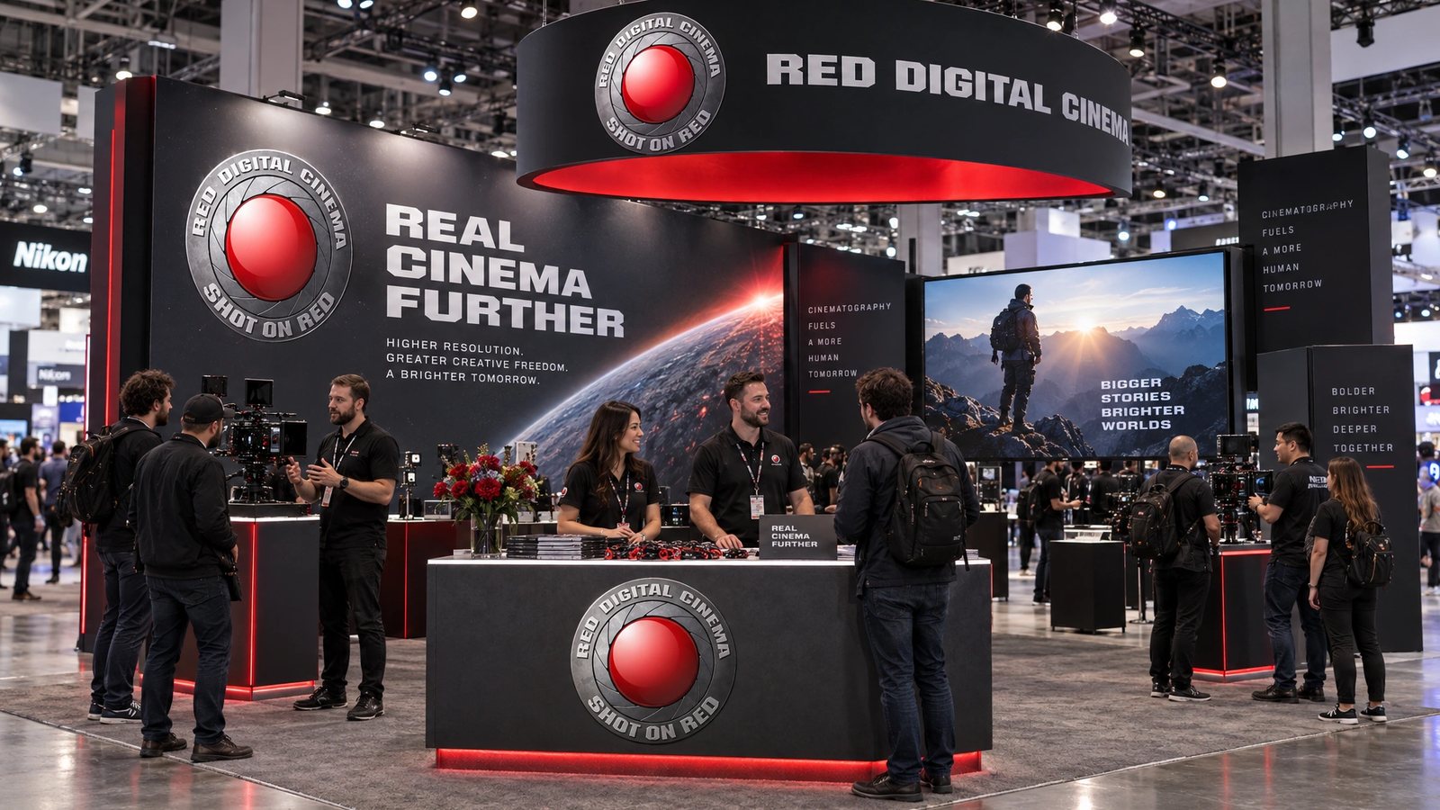
The RED name, logo and cameras belong to RED Digital Cinema. The site and collateral above are my design work; the brand world is a 2026 study made with my own tool, not work for RED.
We build the tools that shoot the impossible.
RED Digital Cinema, the brand DNA
Role
RED in 2008 for the site and the cameras. A 2026 study for the brand world.
Senior web designer and developer
August to December 2008, on red.com and the 2009 camera launches.
Design and engineering
The new direction for red.com, the PHP framework behind version 2.0, and the camera configurator.
Concept and brand
Concept and brand work for Scarlet and EPIC: brochure spreads, feature callouts and launch pieces.
Eighteen surfaces
Logo system, colour, type, cards, stationery, guidelines, packaging, merch, web, app and app icon, social kit, an editorial spread, billboard, storefront and a trade-show booth.
- Web design
- PHP
- Interaction design
- Print collateral
- Brand DNA extraction
- Brand systems
Next
The work lives in the archive with the rest of the studio years.
Browse the archive →